Power Apps Navigation Menu Component

“Don’t repeat yourself” is a coding principle smart developers use to avoid doing the same work twice. Canvas app components are a great example of this. You can make a component and re-use it on several screens as well as in other apps entirely. In this article I will show you how to make a Power Apps navigation menu component.
Introduction: The Company Portal App
The company portal app is used by employees at a technology firm to lookup information that is relevant to them in several areas: news, travel, budgets, etc. Employees go to different screens by selecting an option from the navigation menu.

Creating The Component & Properties
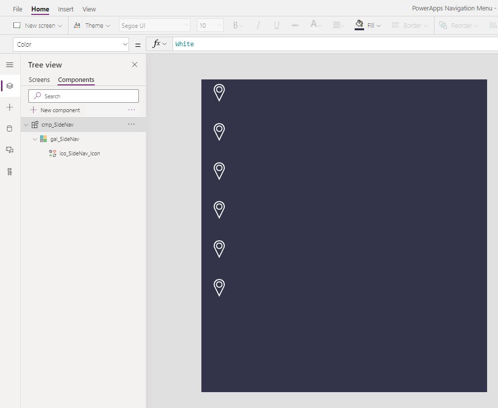
Open Power Apps Studio and create a new canvas app from blank. Then go to the Components menu and make a new component called cmp_SideNav.
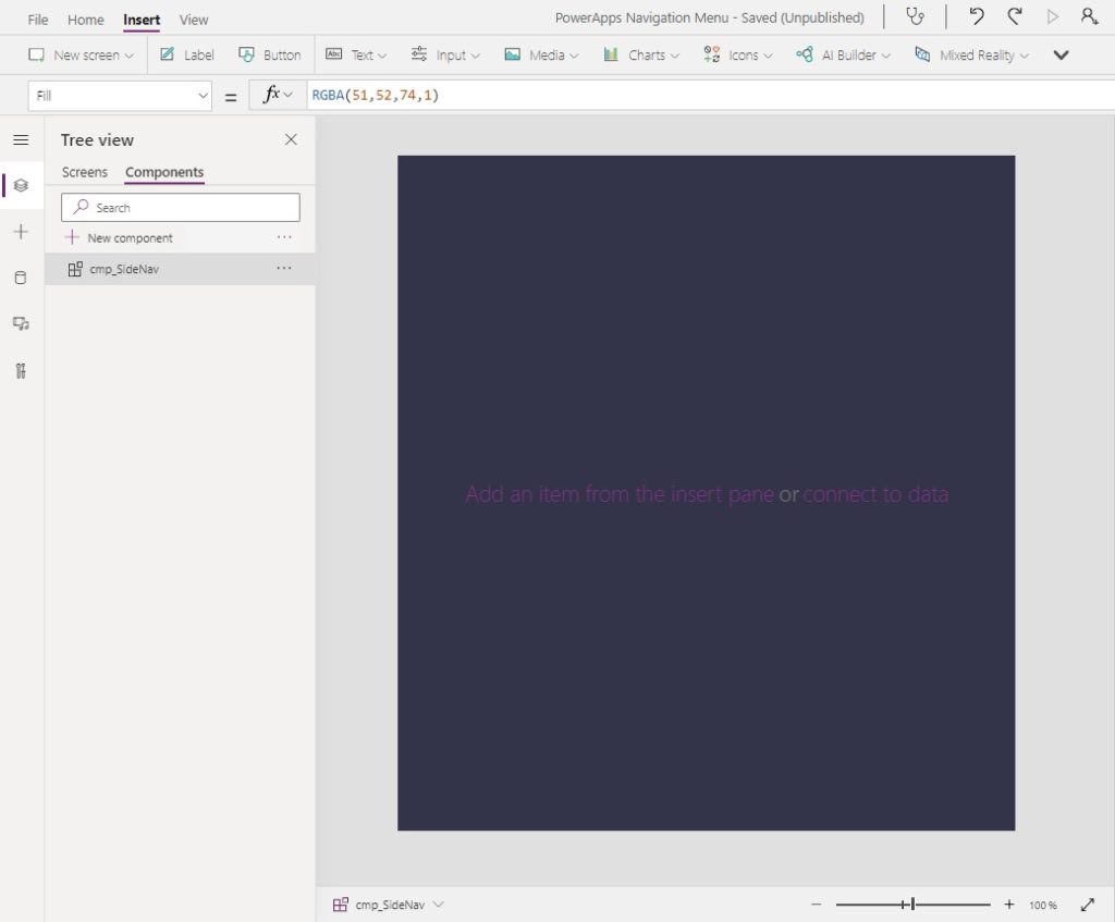
Set the Fill property of the component to a dark blue color using the RGBA value below.
RGBA(51, 52 ,74, 1)
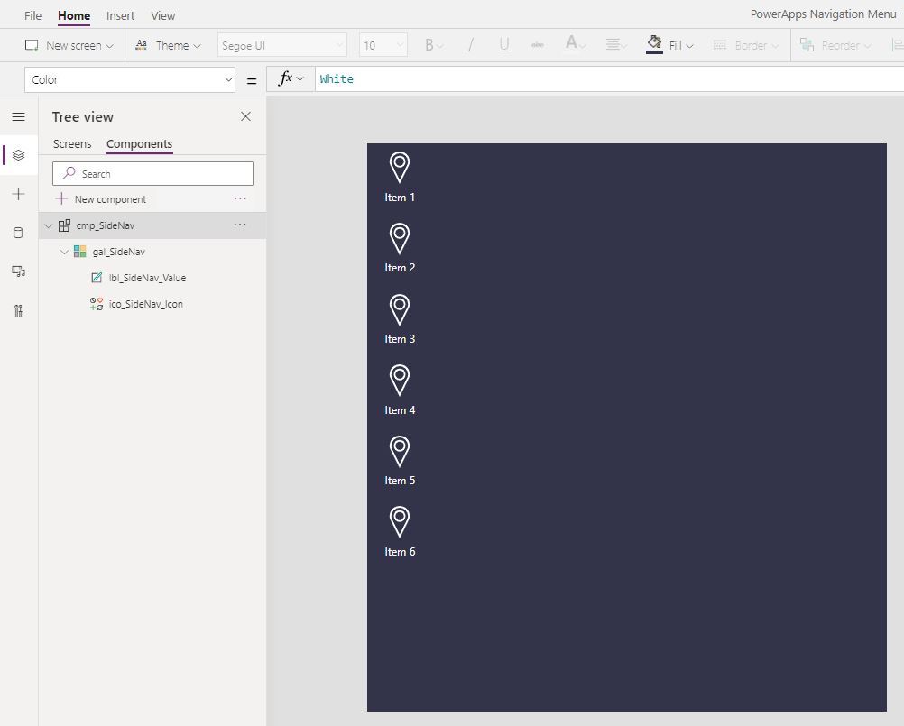
Then make a new custom input property called Items with the data type Table.
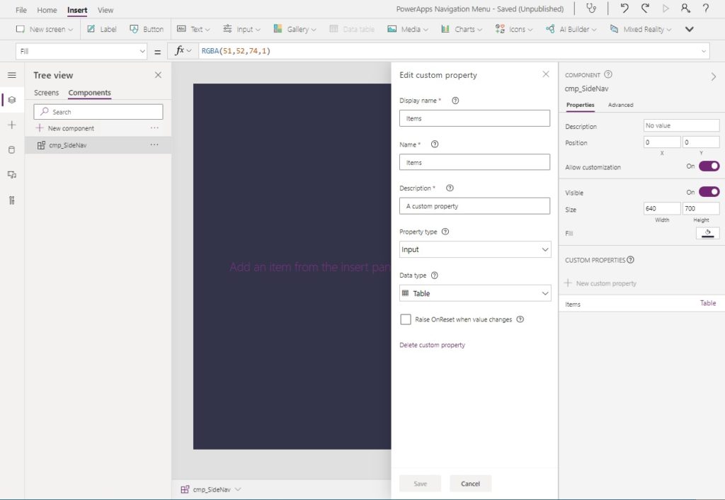
The Items property will hold information about what icon & text to display in the menu and which screen to navigate to. Use this code in the Items property so we have some fake values to design the menu with.
Table(
    {Value: "Item 1", Icon: Icon.Waypoint, Screen: App.ActiveScreen},
    {Value: "Item 2", Icon: Icon.Waypoint, Screen: App.ActiveScreen},
    {Value: "Item 3", Icon: Icon.Waypoint, Screen: App.ActiveScreen},
    {Value: "Item 4", Icon: Icon.Waypoint, Screen: App.ActiveScreen},
    {Value: "Item 5", Icon: Icon.Waypoint, Screen: App.ActiveScreen},
    {Value: "Item 6", Icon: Icon.Waypoint, Screen: App.ActiveScreen}
 )Code language: CSS (css)
Next, create 4 additional custom input properties to store the menu colors…
- Color
- CurrentIndicator Color
- HoverFill
- SelectedFill
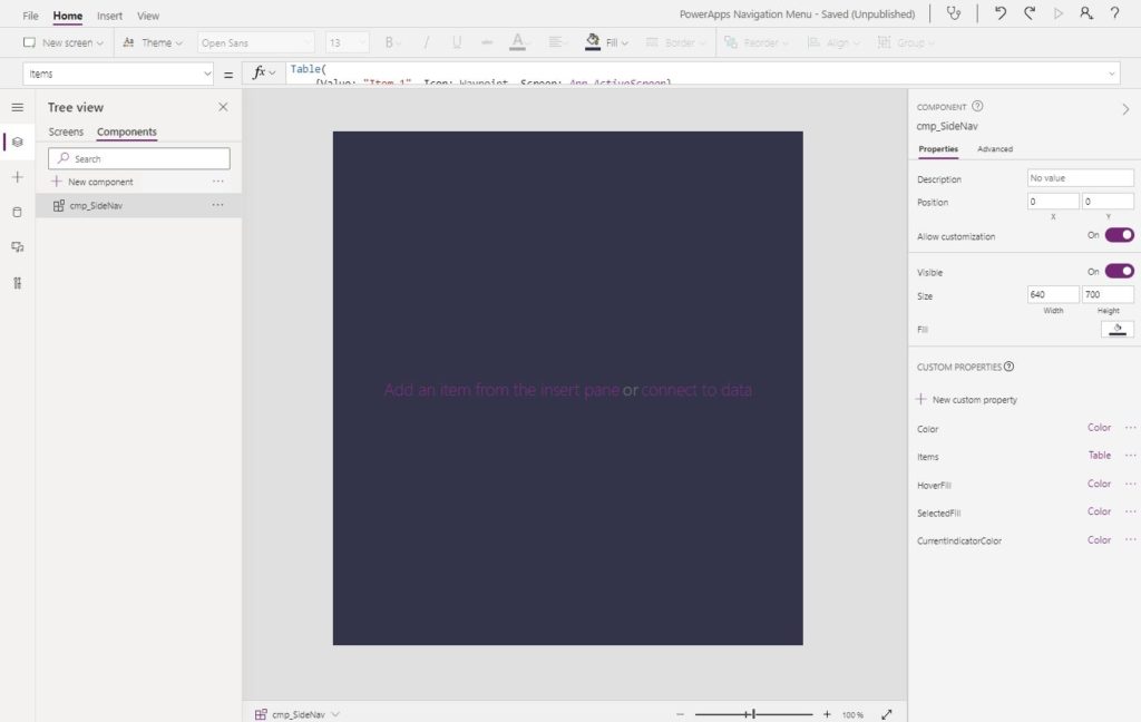
… and input these values into the component properties.
| Name | Value |
| Color | White |
| CurrentIndicatorColor | ColorFade(RGBA(29,161,242,1),70%) |
| HoverFill | RGBA(255,255,255,10%) |
| SelectedFill | RGBA(255,255,255,10%) |
Adding Icons And Text
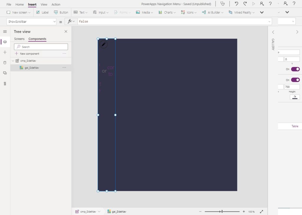
The side navigation menu will use a gallery to show icons and text describing the menu option. Place a blank vertical gallery onto the component.
Populate the Items property of the gallery using this code.
cmp_SideNav.ItemsCode language: CSS (css)
Use this code in the OnSelect property to Navigate the user to the selected screen…
Navigate(ThisItem.Screen)Code language: CSS (css)
…and then fill-in these remaining properties.
Height: Parent.Height
Width: 80
ShowScrollbar: false
TemplatePadding: 0
TemplateSize: Parent.Height/8.5Code language: HTTP (http)
Now insert a new icon into the gallery…
…and with the following properties and values.
Color: cmp_SideNav.Color
Icon: ThisItem.Icon
Height: 35
Width: 35
X: (Parent.TemplateWidth-Self.Width)/2
Y: 15Code language: HTTP (http)
Then add a new label beneath the icon…
…and give it these properties.
Text: ThisItem.Value
Align: Center
Size: 10
Width: Parent.TemplateWidth
X: 0
Y: 50Code language: HTTP (http)
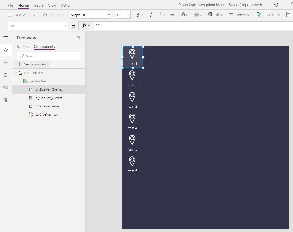
Our component is starting to look like a menu!
Current Screen Indicator
When a menu item is selected a thin vertical rectangle will appear beside it to indicate the current screen.
Add a new custom property called Default with the type Text. This property will store the name of the current screen.
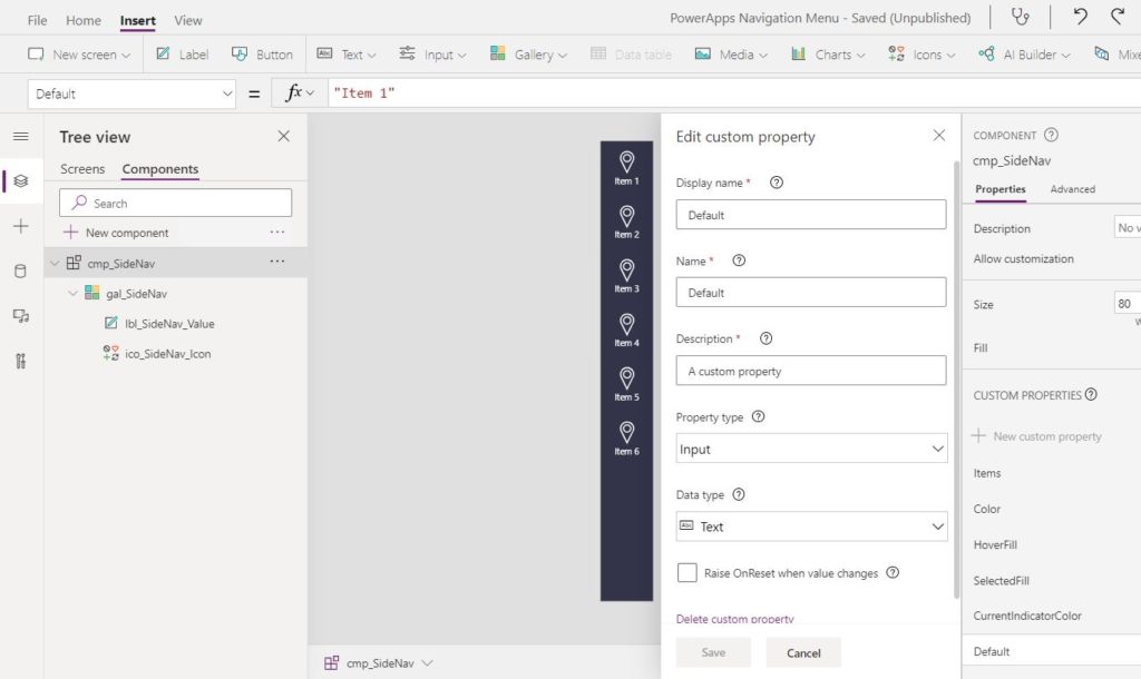
Put the name of the 1st menu option in the Default property so there is a value to build the component with.
"Item 1"Code language: JSON / JSON with Comments (json)
Insert a label into the gallery with no text…
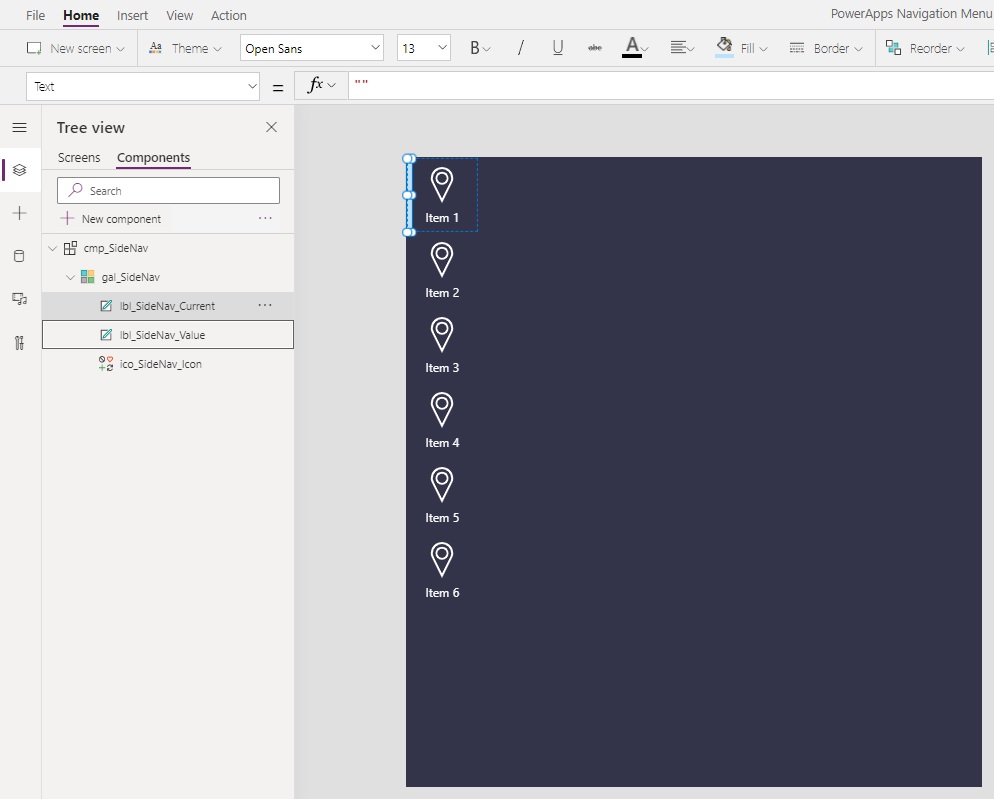
…and use these properties to define its size, visibility and style.
Fill: cmp_SideNav.CurrentIndicatorColor
Height:  Parent.TemplateHeight
Visible: ThisItem.Value=cmp_SideNav.Default
Width: 5Code language: HTTP (http)
HoverFill And SelectedFill
Hovering the mouse over top of a menu item should make it become highlighted. Selecting a menu item should highlight the option too.
Insert a label without any text into the gallery…
…and fill-in these properties to get the desired hovered and selected effects.
Height: Parent.TemplateHeight
Width: Parent.TemplateWidth
Fill:  If(ThisItem.Value=cmp_SideNav.Default, cmp_SideNav.SelectedFill, Transparent)
HoverFill: cmp_SideNav.HoverFill
PressedFill: cmp_SideNav.SelectedFillCode language: HTTP (http)
Write this code in the OnSelect property of the label to navigate to another screen when clicked.
Navigate(ThisItem.Screen)Code language: CSS (css)
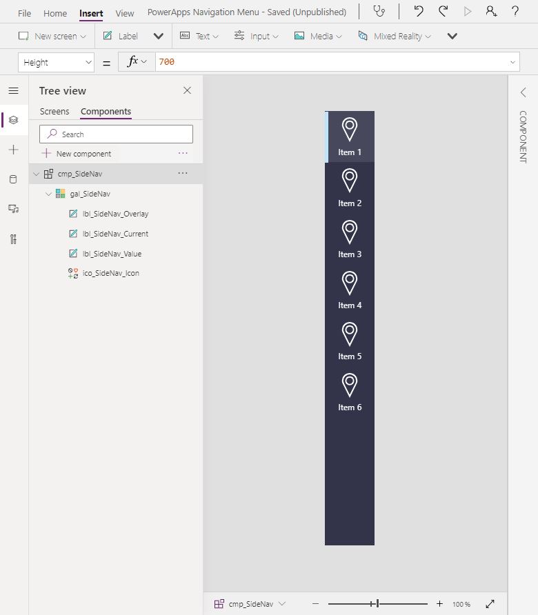
Finally, shrink the gallery size to the following proportions.
Height: 700
Width: 80Code language: HTTP (http)
Now we are ready to try out the menu in an app!
Test The Component In An App
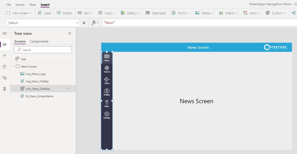
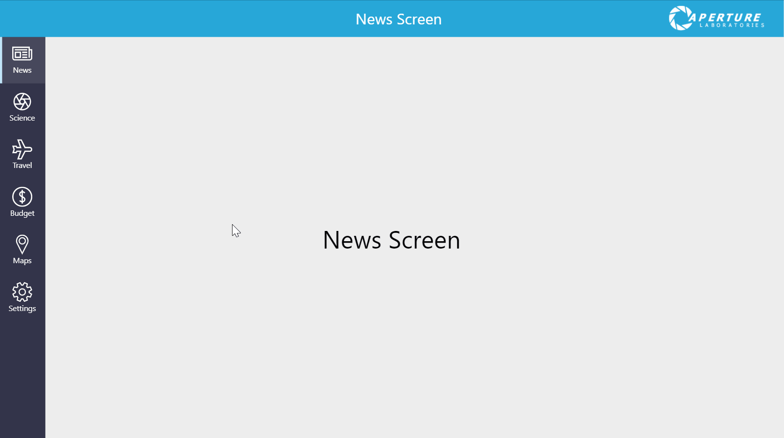
The navigation component brings the user to a new screen when clicked. Make these new screens in order to test the component.
- News Screen
- Science Screen
- Travel Screen
- Budget Screen
- Maps Screen
- Settings Screen
The menu options will be stored as a table inside of a variable as opposed to a collection because they are not meant to be changed while the app is running. Put this code in the OnStart property of the app. Then run App OnStart.
Set(colSidebarMenu,
  Table(
    {Value: "News", Icon: Icon.Newspaper, Screen: 'News Screen'},
    {Value: "Science", Icon: Icon.CameraAperture, Screen: 'Science Screen'},
    {Value: "Travel", Icon: Icon.Airplane, Screen: 'Travel Screen'},
    {Value: "Budget", Icon: Icon.Money, Screen: 'Budget Screen'},
    {Value: "Maps", Icon: Icon.Waypoint, Screen: 'Maps Screen'},
    {Value: "Settings", Icon: Icon.Settings, Screen: 'Settings Screen'}
  )
)Code language: CSS (css)
Insert the component onto the “News Screen” and use colSidebarMenu in the Items property.
Set the Default value to News so it matches the text on the menu option.
"News"Code language: JSON / JSON with Comments (json)
Then go to the science screen, insert the component with colSidebarMenu in the Items property…
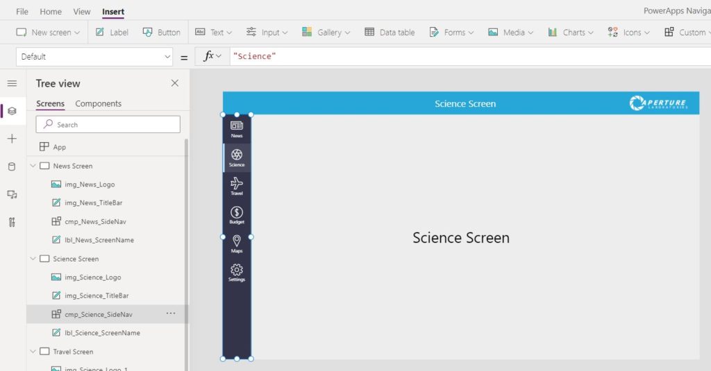
…and set the Default value to News so it matches the text on the menu option. Repeat this process for all of the screens in the menu.
"Science"Code language: JSON / JSON with Comments (json)
Now we have a working navigation menu component.
Want To Learn More About Power Apps Canvas Components?
This tutorial is part of a free online course called Learn Power Apps Canvas Components By Making 5 Components. The best way to learn isn’t by watching videos, or by reading articles. The best way to master Power Apps canvas components is by building real-world projects. So that’s exactly what we’ll do. Go ahead and get started on the other lessons below. I know you’re going to get alot of this free course.
Did You Enjoy This Article? 😺
Subscribe to get new Copilot Studio articles sent to your inbox each week for FREE
Questions?
If you have any questions or feedback about Power Apps Navigation Menu Component please leave a message in the comments section below. You can post using your email address and are not required to create an account to join the discussion.


Nice job Matthew!
I tried following your instructions but as a newbie your instructions at the step where you insert the component into the screens isnt clear enough.So i couldn’t get it working..
I got confused with the fake data you initially added and then the real data for the menu.I set the variable of the Table in the OnStart of the apps but the final icons and data doesnt appear when i insert the component
Can you please clarify this step?
Hello Patrick,
You must run App OnStart for the icons to appear.
Hi Matthew,
I did exactly as you explain but the sidebar menu is not visible and there isn’t any error on the app. Where I made mistake?
Necdet,
Can you please tell me what section of the article you got stuck at?
Sidebar Nav doesn’t display the icon. But all the other functions on the sidebar Nav working. When I play the apps from editing it display all screen but when I directly from the app play I got a white screen. Nothing to see.
Amazing as always!
Thank you!
Also there seems to be a few glitches when I tried to create it…but it would work with a after a few tweaks.
Would you please share the glitches? I would like to improve the article based on your feedback.
Hi Matthew,
On the section HoverFill And SelectedFill, I did not found where to put this on the label:
SelectedFill: cmp_SideNav.SelectedFill
But the component works fine anyway without to highlight the item option.
Emilio,
You are correct that there is no SelectedFill property in the label. It should be PressedFill instead. I have now made the correction. Thank you for letting me know!
Nice article
in the Icon/text section should Icon: cmp_SideNav.Color not be
Color: cmp_SideNav.Color
Fixed. Thank you!
How can i replace one of the menuitems to launch an external URL link. screen:App.ActiveScreen only works for Screens
Maggie,
To do this you would need to add an extra field to the colSidebarItems collection called “Link”.
{Value: “News”, Icon: Icon.Newspaper, Screen: App.ActiveScreen, Link: “https://www.matthewdevaney.com”}
Then change the OnSelect property of the Icon to this code:
If(IsBlank(ThisItem.Link), Navigate(ThisItem.Screen), Launch(ThisItem.Link))
Hi Matthew, thanks for the article, it helped a lot! Hey, I’ve found 2 issues on the article that I had to fix to make it work:
1) Icon: cmp_SideNav.Color > Should be cmp_SideNav.Icon
2) Fill: CurrentIndicatorColor > Should be cmp_SideNav.CurrentIndicatorColor
Marcus,
Thank you for raising these issues. They are now fixed.
Matthew thank you for this. I can easily utilize this for Intake form navigation. What I’m not sure of is where I ran aground. All is working as it should but the icons didn’t change after I ran the app on start. They are all still showing as waypoint. All other areas hover, changing of screens, etc. are working just fine.
Thank you.
Matthew,
I found it. In the step you have to add the icon when you pick an icon for that Icon in the Icon = “name of the icon” example your example has Waypoint thus Icon=Waypoint. However seems one needs to update once add the Icon the Icon=ThisItem.Icon. Then in the screens section they show up properly based on the table on App OnStart.
Craig,
I’ve added your suggestion to the article. Thank you!
Hi Matthew,
I have a very similar navigation component that I have built. I am also trying to set the visibility of the navigational items (for an admin item) as well as re-use a form. My main issue is I cannot seem to find a way to add an item to the table that will add a Newform(Formname) to the end of one of the nav items. I have tried adding FormMode and FormName so it can be truly dynamic and setting them as
ThisItem.FormMode(ThisItem.FormName) as well as setting FormName as char(40) & FormName & char(41) & char (53) but neither way works.
I was reading your other tutorial on using behaviors and wondering if the answer is somewhere in between.
Any insight you can give to send me down the right track so I can trigger NewForm from the navigation component would be greatly appreciated.
Works perfect! Thank you!!
Thank you for these instructions! You explained it very well and simply.
Hi Matt,
Great article. I was able to create the component however it does not navigate to the other screens when I select the icons. Also when I try to change the items value for the component to the global variable it says no data was found :/
Hey, I did everything what you’ve mentioned but when I insert the component in my app nothing is displayed. Could you help me?
Thank you, Matthew. I followed the instructions but unfortunately, it didn’t work for me. I only wanted the background colour on hover and selected without the indicator. I am however getting an error on Fill: If(ThisItem.Value=cmp_SideNav.Default cmp_SideNav.SelectedFill, Transparent)
I also wanted to use this but without the menu item loading a new page on click similar to how tabs work with the values coming from Excel table. I attached the design. Do you know if this is possible at all? Thanks in advance.
Followed your instructions and everything looks correct, but when the component is added to the screen, the OnSelect property is dropped from the gallery and the menu doesn’t work. The Hover action is working but the screen, overlay, default and Current items don’t change. Not sure what I did wrong here.
Hi Dale, did you manage to resolve this, if so, how?
I have run into the same problem and looking to rebuild the nav pane in a different way as it’s not fit for purpose?
Replace “Transparent” for “Color.Transparent”
Thank you, cheers.
Hi Matt,
Is it possible to use this component with a combination of icons that go to a PowerApps screens as you described above and also have some of those icons goto a external website link?
Melissa,
You’d have to alter the collection definition to something like this…
Set(colSidebarMenu,
Table(
{Value: “News”, Icon: Icon.Newspaper, Screen: ‘News Screen’, Website: Blank()},
{Value: “Science”, Icon: Icon.CameraAperture, Screen: Blank(), Website: “https://www.google.com”},
{Value: “Travel”, Icon: Icon.Airplane, Screen: ‘Travel Screen’, Website: Blank()},
{Value: “Budget”, Icon: Icon.Money, Screen: ‘Budget Screen’, Website: Blank()},
{Value: “Maps”, Icon: Icon.Waypoint, Screen: ‘Maps Screen’, Website: Blank()},
{Value: “Settings”, Icon: Icon.Settings, Screen: ‘Settings Screen’, Website: Blank()}
)
)
Then in the OnSelect property do something like:
If(
IsBlank(ThisItem.Screen),
Launch(ThisItem.Website),
Navigate(ThisItem.Screen)
)
Hi this was a very good tutorial, however I can’t seem to find the TemplateHeight property to insert this “TemplateHeight: Parent.Height/8.5″
Esoteric,
Please put this code inside the “TemplateSize” property of the table.
Hi, thanks for sharing. I have implemented this and thought it was great (and it is great, don’t get me wrong)!
But then, I used the App Monitor, and with all the Screen references in the App OnStart, it has to evaluate everything on all the screens during the app load. At first I was wondering what was happening, so then I changed all the menu items to reference just one screen, and the amount that had to load reduced by an order of 10. I have a very busy app with 9 screens with an average of about 50 controls per screen. We really need the “Navigate” function to accept strings so that the App OnStart will not load every single screen. I have upvoted here: https://powerusers.microsoft.com/t5/Power-Apps-Ideas/Let-Navigate-also-use-variables/idi-p/732599#M32207
Hi, How to include custom icons in the Table?
Saburamani,
Use an Image control to show the SVG rather than the icon control.
Matt – this was great. The only issue I am having is where it goes or how to run APPSTART. I added it to OnStart and it is showing but it’s not working and everything is done properly. Should I know move it to StartScreen?
It looks great but I can’t get the dang buttons to work!
Sonia,
If you click on the three dots beside the App object you can run OnStart or you can also close and restart your app. Please try one of these options.
I found it but that didn’t help. Both my navigational pieces are there they just aren’t going where I want them. Gonna try it again but your instructions are very clear! I watched Reza’s video too but I prefer written instructions. Thank you.
Sonia, did you manage to make this work? I have the same problem, I did everything as is, the menu appears but the navigation does not work
Erik,
Please share the code you used in the Items property of your gallery. Also share the code you used in the OnSelect property of lbl_SideNav_Overlay
Thanks for you response.
– Items property in gallery: cmp_SideNav.Items
– OnSelect property in lbl_SideNav_Overlay: Navigate(ThisItem.Screen)