How To Build Responsive Power Apps Forms From Scratch

Power Apps using a responsive design look amazing on all devices whether they are on computer, a tablet or a phone. They are made possible by responsive containers. When a screen changes size, the responsive container also re-sizes itself and tell the controls inside of them their new position in the app layout. To demonstrate how to build responsive Power Apps I have come up with a tutorial where you will build a simple form form scratch.
Introduction: The Safety Incident Report App
Workers at a construction company use the Safety Incident Report app to submit details about Heath & Safety incidents. The responsive app changes its user interface to fit any screen size.
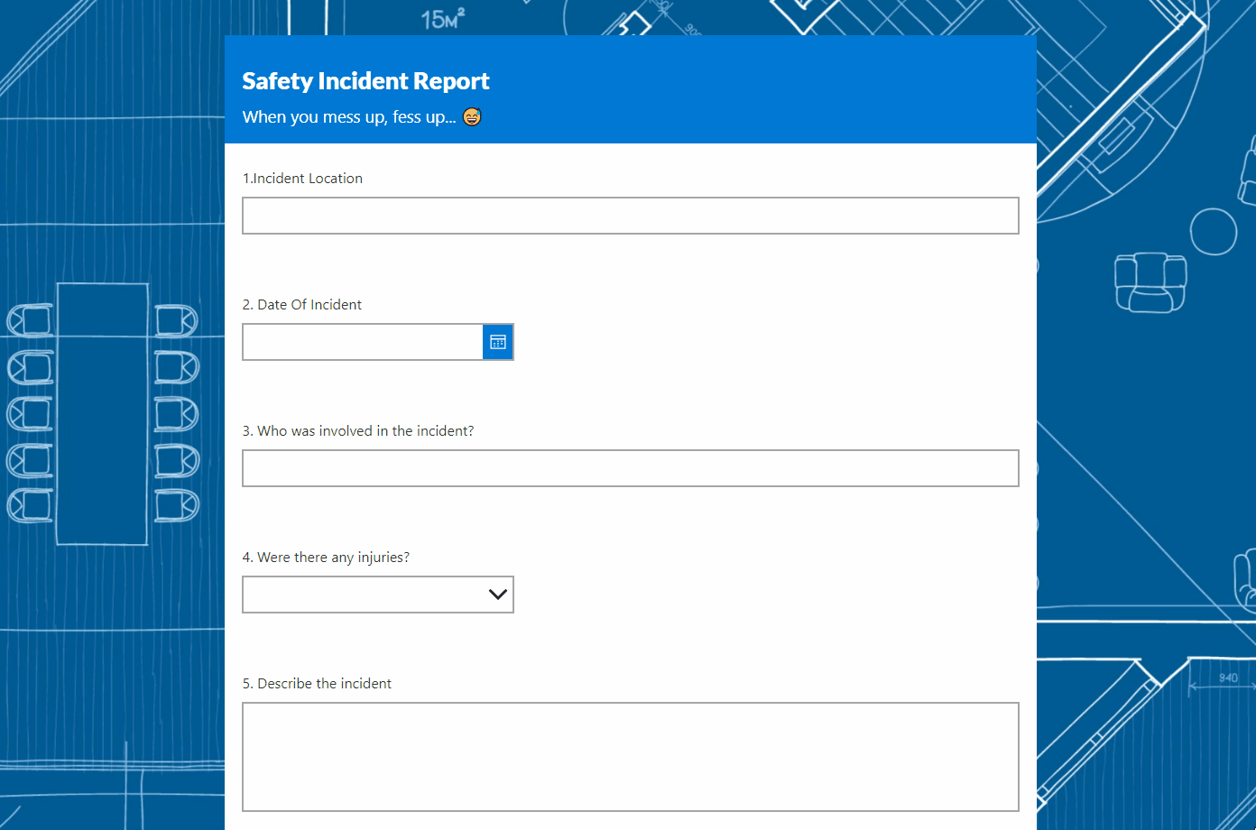
The form can also floats on top of a background image and can scroll up-and-down.
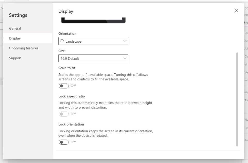
Enable Responsive Design In The Power Apps Settings Menu
Open Power Apps and create a new app from blank. Open the settings menu and navigate to the display tab. Turn off the Scale to Fit option. Now the screen will expand to fill the browser window at any size.
Insert The Main Responsive Container And Make It Fit The Screen
Go to the Media menu and upload the construction blueprint background image.
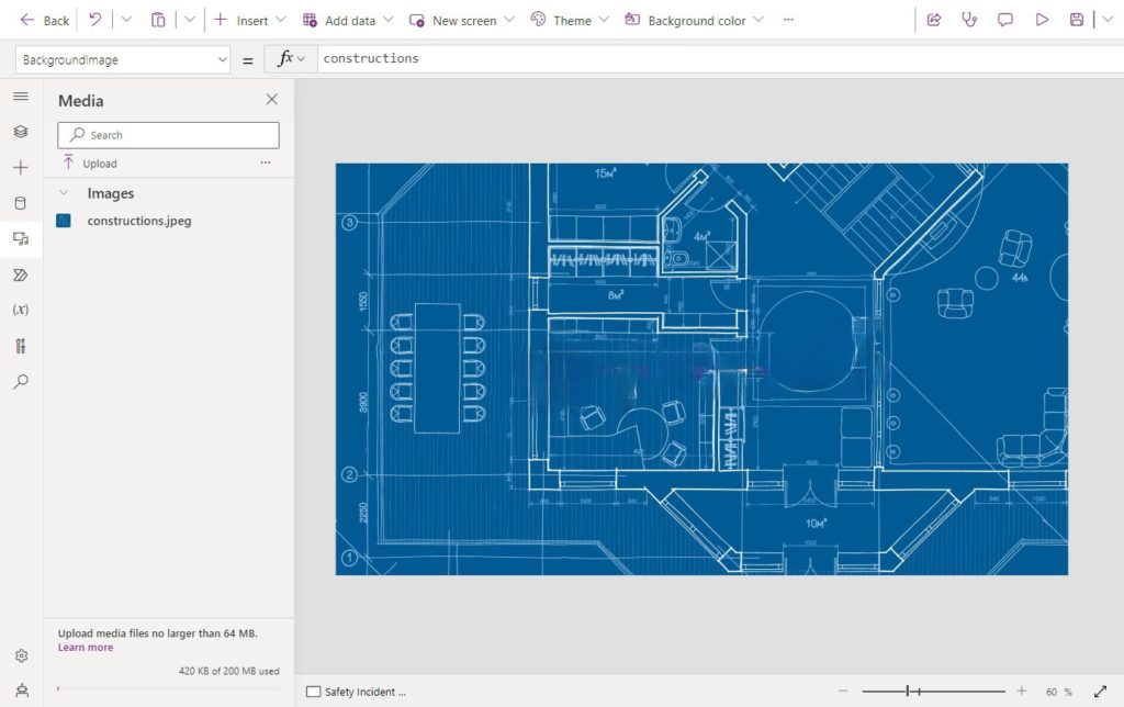
Select the screen and use the construction blueprint image as the BackgroundImage. Set the ImagePosition property to Fill.
BackgroundImage: constructions
ImagePosition: ImagePosition.FillCode language: HTTP (http)
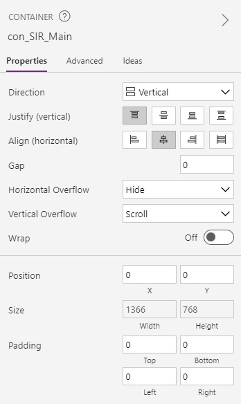
Add a vertical container to the screen named con_SIR_Main.
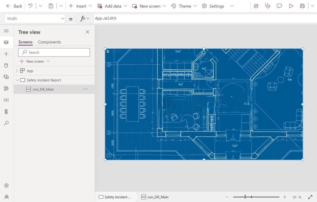
Make the container cover the entire screen using these values in its properties.
Height: App.Height
Width: App.Width
X: 0
Y: 0Code language: HTTP (http)
Set the LayoutJustifyContent property to Top, the LayoutAlignContent property to Center, and the LayoutOverflowY (Vertical Overflow) property to Scroll.
Add The Responsive Form Container And Limit Its Maximum Width
The Safety Incident Report form will float on top of the background image and always remain centered. Add a vertical container named con_SIR_Form inside the container con_SIR_Main.
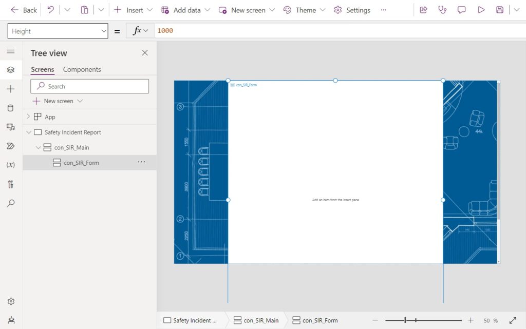
Give the con_SIR_Form container these properties.
Fill: Color.White
Height: 1000Code language: HTTP (http)
Set the LayoutJustifyContent property to Top and the LayoutAlignContent property to Start.
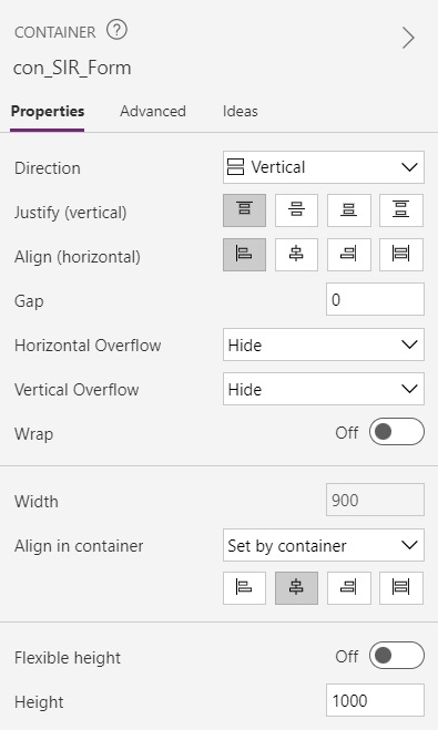
The form will fill the entire width of the screen on small and medium screens. But when the screen size is large or extra large we want the form to stop expanding and have gutters to appear on the left-and-right side of the form.
Use this code in the Width property of the con_SIR_Form container.
Min(Parent.Width, Index(App.SizeBreakpoints, 2).Value)Code language: CSS (css)
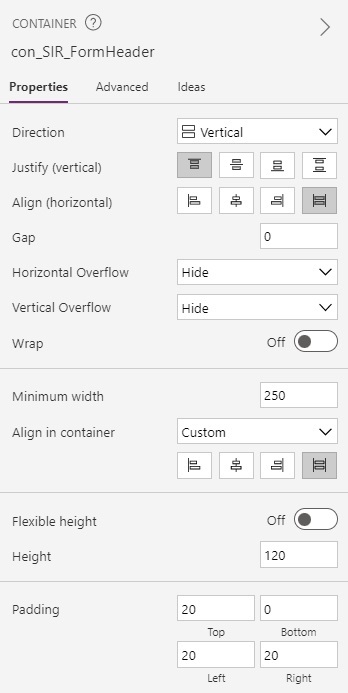
Create The Responsive Form Header
A solid colored header is displayed at the top of the form showing its title and description. Insert a new vertical container named con_SIR_FormHeader into the con_SIR_Form container.
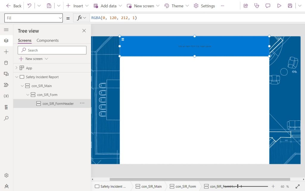
Use this code in the following properties of the con_SIR_FormHeader container.
Fill: RGBA(0, 120, 212, 1)
Height: 120Code language: HTTP (http)
Set the LayoutJustifyContent property to Top and the LayoutAlignContent property to Stretch and the AlignInContainer property to Stretch. Use the padding property values shown below.
Insert two new labels into the con_SIR_FormHeader container.

Write this code in the following properties of the top label.
Font: Font.'Lato Black'
Size: 20
Text: "Safety Incident Report"Code language: HTTP (http)
Use this code in the following properties of the bottom label.
Font: Font.'Segoe UI'
Size: 14
Text: "When you mess up, fess up... 😅"Code language: HTTP (http)
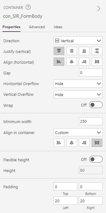
Setup The Responsive Form Body Container
Another container below the form header will hold the form’s fields. Place a new vertical container named con_SIR_FormBody inside the con_SIR_Form container.
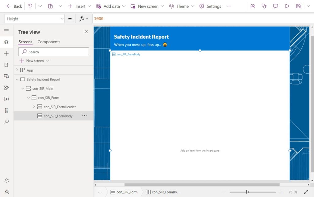
Use this code in the following properties of the con_SIR_FormBody container.
Color: Color.White
Height: 1000Code language: HTTP (http)
Set the LayoutJustifyContent property to Top and the LayoutAlignContent property to Start and the AlignInContainer property to Stretch. Use the padding property values shown below.
Add a new button to the con_SIR_FormBody container with the text Submit.
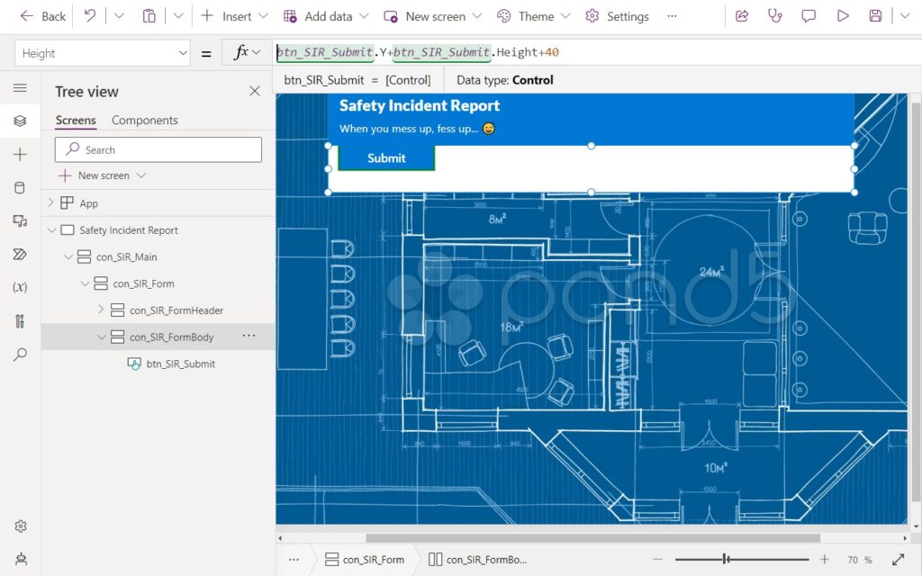
We want the con_SIR_FormBody container’s height to always be 40 pixels taller than the position of the submit button.

Use this code in the Height property of the con_SIR_FormBody container.
btn_SIR_Submit.Y+btn_SIR_Submit.Height+40Code language: CSS (css)
We also want to ensure the con_SIR_Form container expands to the size of it’s child conatiners con_SIR_FormHeader and con_SIR_FormBody.
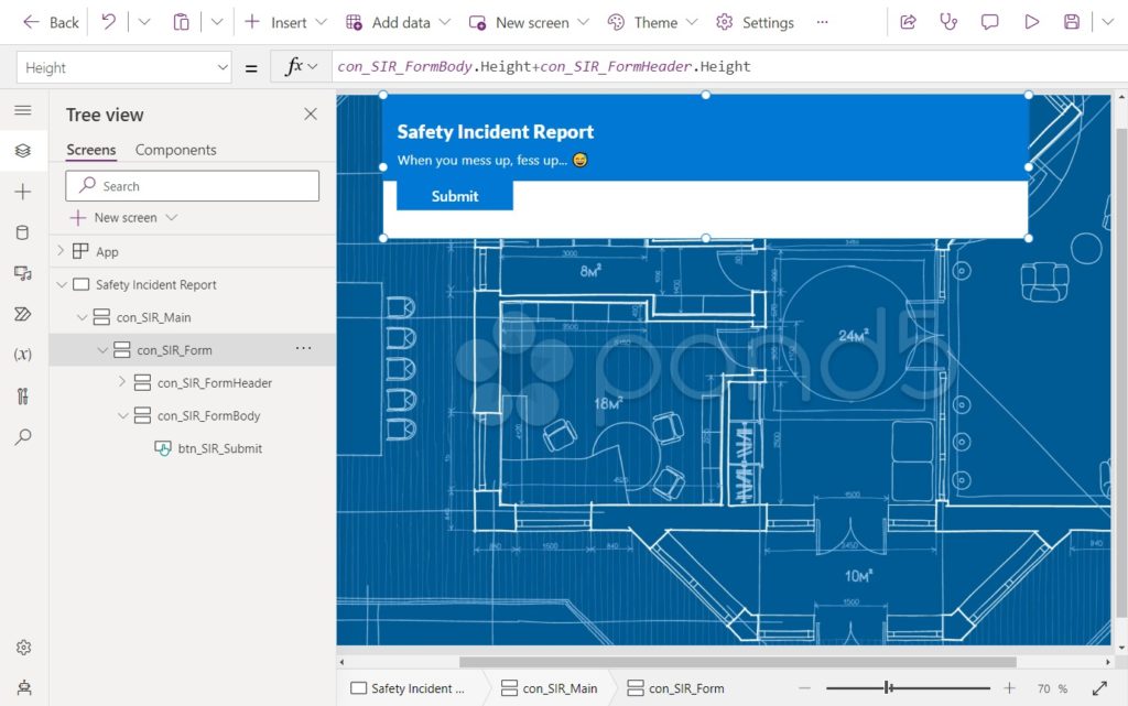
Use this code in the Height property of the con_SIR_Form container.
con_SIR_FormBody.Height+con_SIR_FormHeader.HeightCode language: CSS (css)
Add A Text Input Field To The Responsive Form Container
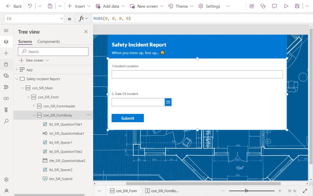
The first question on the form captures a response using a text input control. It will always stretch to fill the entire width of the form. Insert three new controls at the top of the con_SIR_FormBody container:
- Label – lbl_SIR_QuestionTitle1
- Text Input – txt_SIR_QuestionValue1
- Label – lbl_SIR_Spacer1
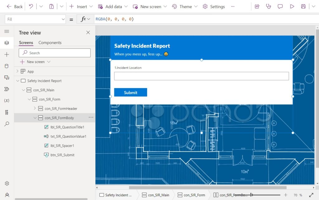
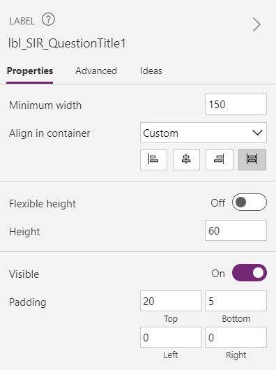
Use this code in the following properties of the title label called lbl_SIR_QuestionTitle1.
AlignInContainer: AlignInContainer.Stretch
Font: Font.'Segoe UI'
Height: 60
PaddingTop: 20
PaddingBottom: 5
Size: 12
Text: "1. Incident Location"Code language: HTTP (http)
Set the AlignInContainer property to Stretch. Use the padding property values shown below.
Write this code in the following properties of the text input txt_SIR_QuestionValue1.
AlignInContainer: AlignInContainer.Stretch
Font: Font.'Segoe UI'
Height: 40
Size: 12Code language: HTTP (http)
Then use this code in lbl_SIR_Spacer1.
AlignInContainer: AlignInContainer.Stretch
Height: 40Code language: HTTP (http)
Insert A Date Picker Field Into The Responsive Form Container
The second question on the form receives a response using the date picker control. This datepicker will have a fixed width. Insert three new controls at the into the con_SIR_FormBody container:
- Label – lbl_SIR_QuestionTitle2
- Date Picker – txt_SIR_QuestionValue2
- Label – lbl_SIR_Spacer2
Use this code in the following properties of the title label called lbl_SIR_QuestionTitle2.
Font: Font.'Segoe UI'
Height: 40
PaddingTop: 20
PaddingBottom: 5
Size: 12
Text: "2. Date Of Incident"Code language: HTTP (http)
Write this code in the following properties of the text input txt_SIR_QuestionValue2.
AlignInContainer: AlignInContainer.Left
Font: Font.'Segoe UI'
Height: 40
Size: 12
Width: 300Code language: HTTP (http)
Then use this code in lbl_SIR_Spacer2.
AlignInContainer.Stretch
Height: 40Code language: CSS (css)
Add The Remaining Questions To The Responsive Form Container
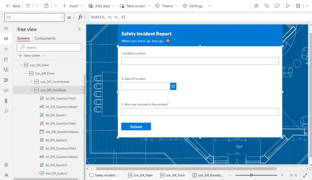
Question #3 in the form is setup exactly like Question #1 with a label, a text input and a label.
Question #4 in the form is follows the same design as Question #2 having a label, a dropdown and a label.
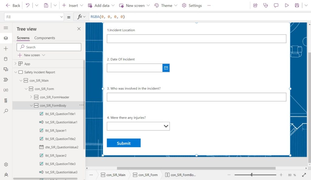
Set the Items property of the drp_SIR_QuestionValue3 dropdown control to this code.
[Blank(), "Yes", "No"]Code language: JSON / JSON with Comments (json)
The final question #5 has the same elements as Question #1 but it a multi-line text field.
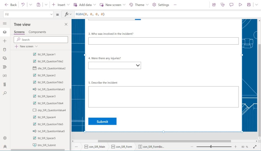
Use this code in the following properties of the txt_SIR_QuestionValue5 text input to change it from single line text to multiple lines of text.
Height: 120
Mode: TextMode.MultiLineCode language: HTTP (http)
Position The Responsive Form Top And Bottom Gutters
With all of the form input fields added there’s just one thing left to do. We want to gutters appear at the top and bottom of the responsive form so it does not touch the edges of the screen. Insert a new horizontal container named con_SIR_Header into the con_SIR_Main container.
Use this code in the Height property of con_SIR_Header container.
40
The top gutter should only appear when the screen size is Large or Extra Large. Write this code in the Visible property of the con_SIR_Header container.
App.ActiveScreen.Size>=ScreenSize.Large
Add a new horizontal container named con_SIR_Footer into the con_SIR_Main container.
Use this code in the Height property of con_SIR_Footer container.
40
The bottom gutter should only appear when the screen size is Large or Extra Large. Write this code in the Visible property of the con_SIR_Header container.
App.ActiveScreen.Size>=ScreenSize.Large
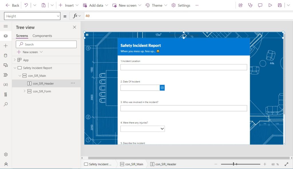
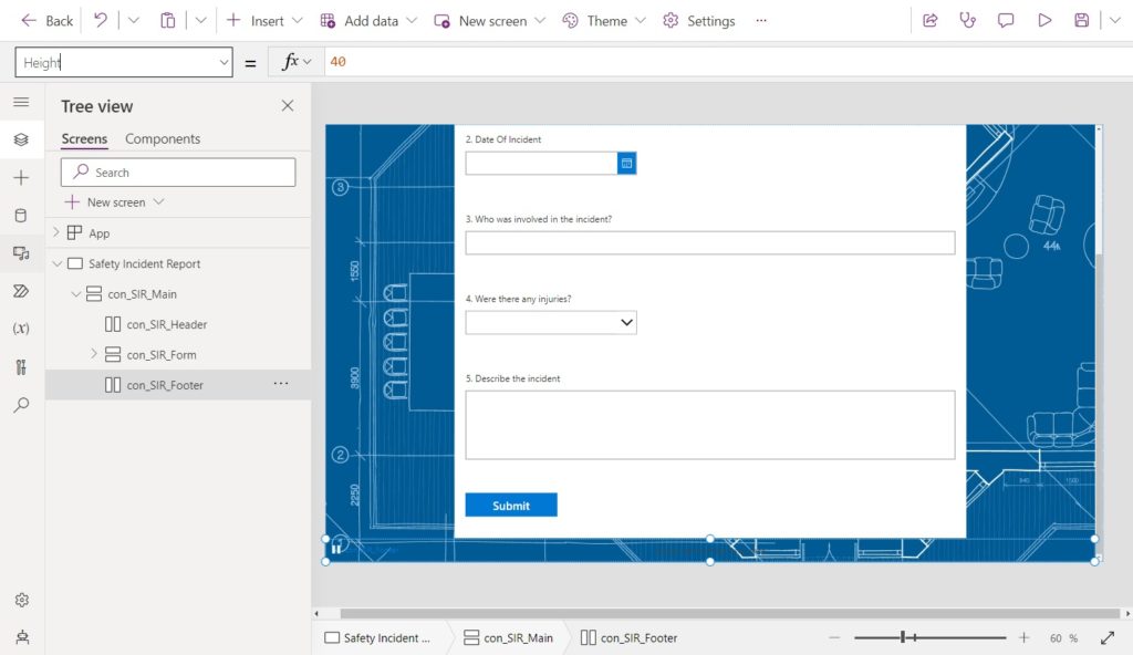
Test The Power Apps Responsive Form
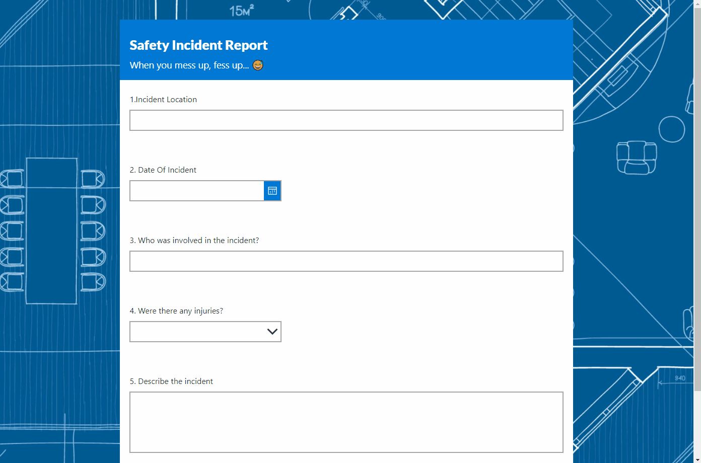
Preview the responsive form to test it out. When the screen width expands and shrinks the form should change its size like this.
The form should also float on top of the background and scroll like this.
Did You Enjoy This Article? 😺
Subscribe to get new Copilot Studio articles sent to your inbox each week for FREE
Questions?
If you have any questions or feedback about How To Build Responsive Power Apps Forms From Scratch please leave a message in the comments section below. You can post using your email address and are not required to create an account to join the discussion.


Great Article Matthew
Al Amin,
I am always waiting for that first comment on my blogs. Thank you for the kind words 😊
Great article
The part I struggle with is when we want to wrap the columns of a form dependant upon the width of the parent container / device – do you already have an article that discusses this topic? (i.e. in tablet mode it shows as 3 columns but then in mobile mode it shows as a single column)
Dave,
I know exactly what you are asking for. I’ve considered writing about it in the past. But judging by the number of questions I get on articles using containers many readers find written content on this topic tough to understand.
Video is another option. I’m starting to amass some gear that would make recording possible. No promises just yet. It is however a possiblity!
Agreed – an addendum or another article about how to adapt this to Edit/Display forms in general would be really helpful.
Eric,
I think it would be more of an addendum since Edit/Display Forms have responsive largely built-in. The trick is to know which formulas to use for the Height and Width of the top-level form control. The rest is already done for us 🙂
Do you have a short summary about how that formulas should be like for the form control? 😀
Jan,
Is this tutorial what you are looking for?
https://www.matthewdevaney.com/everything-you-need-to-know-about-power-apps-patch-forms/
It looks like between the time you wrote this and posted it, Microsoft has changed some terminology. LayoutJustifyContent takes “Start” not “Top” and LayoutAlignContent has become LayoutAlignItems. Also, some defaults for the Vertical Container have changed – you need to explicitly set Align in container to Center and Flexible Height to Off. (This is just in creating the con_SIR_Form container.)
Thank you! I was stuck on getting the background to show, figured out to switch flexible height off but didn’t realize the set Align in container to Center.
Matthew, this is GREAT, just what I need for a new app I’m working on! This is my first app using controls only and not an Edit form. Question: How would I disable the Submit button until all the controls are complete? Thank you, thank you!
Patti,
You would disable the submit buttonby using some code like this in its DisplayMode property:
If(
Or(
IsBlank(TextInput1.Text),
IsBlank(TextInput2.Text),
IsBlank(TextInput3.Text)
),
DisplayMode.Disabled,
DisplayMode.Edit
)
A wonderful article and information examples were easy to follow. I added three new screens and some icons; have trouble wiring up cancel, edit and delete.
Kelvin,
Thanks for the comments. Maybe I will create a video on responsive in the future
Hi Matthew,
in my Scenario, I have a test device with an aspect ratio of 19.5:9 instead of common devices being 16:9. When I develop my screen size is 1136 x 640 (meaning 16:9).
Then I need to test it on that 19.5:9 device, but really the device on which the app should run in the end is a 16:9 aspect ratio.
How can this be handled in the development process?
Is it possible to get the aspect ratio of the device when starting the app and thus load the app correctly with all elements being displayed no matter the aspect ratio?
I realized that many of the new devices have that 19.5:9 ratio (Google Pixel, Iphones..etc.). How would you set up the screen size to cover phones like this? Would you do a custom screen size of the phones resolution just to fix the aspect ratio?
Can you share best practices for testing and ensuring the responsiveness of Power Apps forms on various screen sizes and devices?
I’m having problem with the scrolling because it does not appear during the preview of the app. During the app preview for mobile mode, I couldn’t see the button Submit so it should have scroll bar for me to scroll and I did set the first container for Vertical Overflow to Scroll. Any idea why I don’t see the scroll bar? thanks.
Phillip,
This seems like an issue with the Preview Mode rather than anything you are doing. If the vertical overflow is set to scroll then you should see the scroll bar.
thank you Matthew for replying back. I think you are right.. It must be something with preview or my PowerApps. I will try to troubleshoot some more after returning some items for Amazon.. again thanks.
I found the problem. For my app to work with vertical scroller, I need to enable the Vertical Overflow to value Scroll for the Container2 which is the second container, not the first container Container1. But your tutorial shows enabling the vertical scroller for container con_SIR_Main which is the first container.
thank you for your tutorial that I can use for references to make the form
Phillip,
You’re welcome. Thanks for sharing what the root cause turned out to be so that others can benefit 🙂
This is wonderful Matt. You can be sure that your template will be put to good use here at the Australian National University.
Just for an added touch, I’ve managed to make the width of buttons dynamic by applying your example of the screensize detection formula.
The app will centre the buttons on the page and apply the buttons set width value for larger screen sizes. For smaller screen sizes it will stretch them across the page.
i.e. If(App.ActiveScreen.Size>=ScreenSize.Large,AlignInContainer.Center,AlignInContainer.SetByContainer)
Andrew,
I love it. Please continue to post helpful tips such as this one 🙂
when I customize SharePoint Form using PowerApps, it is showing Double Scroll bar. How to get rid of this. Is the above example best fit to resolve the issue.
Please help
Jayant,
This post is off-topic and will be deleted.
ok, Is there any way to remove one scroll bar? I am not getting any useful resource.
Hi Matthew! Thank you for sharing such an erudite post and detailed tutorial instructions.
I don’t mean to nitpick, but I noticed a typo:
“To demonstrate how to build responsive Power Apps I have come up with a tutorial where you will build a simple form form scratch.”
The second “form” should be “from“.
Keep up the great work!