Purpose
A Power Apps tab list control displays a set of tabs, each representing a different section or page within an app. Its purpose is to allow users to easily navigate between related content and switch between different views or modes.
Properties
| AccessibleLabel Screen readers will voice this text when a user selects the control |
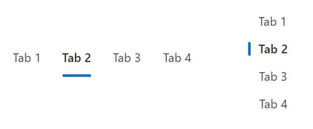
| Alignment Sets the tab bar orientation from left-to-right or from up-to-down Options: = “Horizontal” 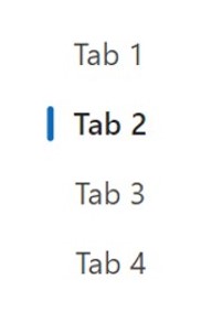 = “Vertical”  |
| ContentLanguage Describes the language used to the audience (e.g. “en-US”) |
| DefaultSelectedItems Initial values displayed in the control before the user interacts with it |
| DisplayMode Selects the mode: Edit, View or Disabled. In Edit mode the user can input values. In View mode the user can only see the values and in Disabled mode the control is greyed-out. |
| Height Distance from the top of the control to the bottom |
| Items Table containing values displayed inside the radio group Example: [“Tab 1”, “Tab 2”, “Tab 3”, “Tab 4”] |
| OnChange Actions that will be executed when the Value property of the checkbox changes |
| OnSelect Actions that will be executed when the radio group is pressed. |
| Render Size Determines the tab bar control size Options: = “Small” = “Medium” = “Large” |
| Visible Determines whether to show or hide the control |
| Width Distance from the left side of the control to the right side |
| X Distance from the left edge of the screen to the left side of the control |
| Y Distance from the top edge of the screen to the top of the control |
How To Use The Power Apps Tab List Control
1. Select the Tab List control in Power Apps studio. Create tabs by updating the Items property with a single column list.
["All", "Submitted", "Accepted", "Rejected"]Code language: JSON / JSON with Comments (json)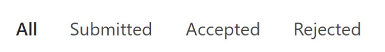
2. Set the Default property of the control to determine the initial tab being displayed
"All"Code language: JSON / JSON with Comments (json)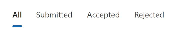
3. Get the tab list’s current value by using this code.
TabListCanvas1.Selected.ValueCode language: CSS (css)
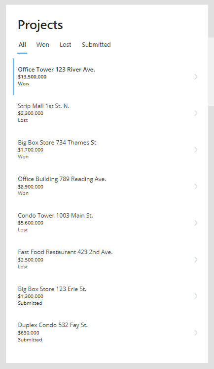
Filter A Gallery With A Tab List Control
A tab list control can be used to filter a gallery. Read this tutorial for instructions on how do it with a tab list.
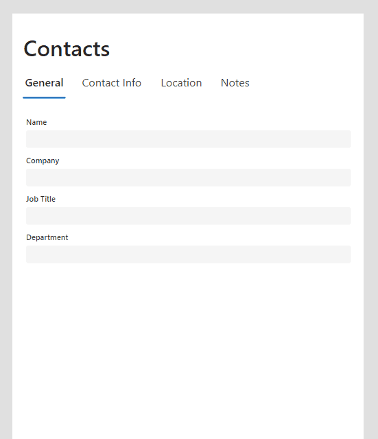
Filter A Form With A Tab List Control
By pairing a tab list control with a form control a tabbed form can be created. Read this tutorial for instructions on how do it.
Did You Enjoy This Article? 😺
Subscribe to get new Copilot Studio articles sent to your inbox each week for FREE
Questions?
If you have any questions or feedback about Power Apps Tab List – Modern Controls please leave a message in the comments section below. You can post using your email address and are not required to create an account to join the discussion.
Matt,
As always thanks for putting this information together.
I do not see Default as a property, only DefaultSelectedItems.
I tried to use the numeric key rather than the value as the DefaultSelectedItem, but no luck.
This worked for Value, Filter([“All”,”Interventions”,”Goals”,”Accommodations”,”Services”,”Enrollment”],Value=”All”).
We are currently at Authoring Version 3.23042.5.
Thanks,
Steve
Same here, no Default property.
I know it’s been a year since this reply, but thanks for sharing this to set the default value. It worked great!
This worked for me…
First([“Option1”, “Option2”])
Hey,
Thanks for sharing.
Whenever I put text values in the “Items” property it returns what I interprets as a random numeric value, anyone know why?
Robert,
The tab list control will do this until you select a field using the Edit Fields menu. I believe it’s a bug. But it’s an easy fix.
Have you tried using this inside a component to act as a screen navigation? When I try, it works in so much as it lets me navigate, however it doesn’t retain the selected item from screen to screen.
Sammy,
I prefer using the tab list only as a way to change filters in a gallery or show/hide controls on the same screen. My reason is the tab swtiching animation won’t fully complete before you change screens.
But if you still want to do it here’s how. Plcae this code in the OnSelect property of all Tab lists across all screens:
Set(
gblSelectedTab,
TabList1.Selected.Value
);
Switch(
gblSelectedTab,
“Tab 1”,
Navigate(Screen1),
“Tab 2”,
Navigate(Screen2)
)
Then use this code in the Default property of each tab list:
gblSelectedTab
Make sure to reset the Tab List in the screen’s OnHidden property so it continues to be updated.
I would assume it goes under DefaultSelectedItem. However, when I place it there. The tab list selections work as expected but the navigation feature no longer works. Please advise.
How can be reset tab value to default value . If add a separate button to do that , what is the code for this modern control.
Thank you
On each screen for the tab list controls defaultselectedItems property use this type of formula;
Last(FirstN(ColTab, n)).Value
Where n is the position number of the tab on the relevant screen.
on visible property of each screen use the following:
ClearCollect(ColTab,[“Tab1”,”Tab2”,”Tab3”])
on hidden property of each screen use the following:
Clear(ColTab))
This works perfect for me.
Looking forward to this component getting some more modifiable fields (Fill, Font, Font Size) so that it becomes worth using.
Eric,
Me too. I hope theming will be on the way soon!
Is it possible to set a selected tab via a buttons onselect property?
Corie,
Yes. Set a variable in the OnSelect property of the button. Then use that variable in the default property of the tab.
hi
how do you create next button to change on each tabs
How to beautify these TABS i.e. Color, Background etc
Kashif,
There’s not any way to do this yet.
Hii I’m using tabs from modern controls,
right now I have selected tab Item so it is showing me a form after clicking on submit button control should go on next tab item automatically how can I achieve this
To reset the default selected, just create a variable using updatecontext, just like below:
UpdateContext({vPLN_reset_tab_list_loja: [“”]});;UpdateContext({vPLN_reset_tab_list_loja: [“Geral”]})
and put into defaultselecteditem
Thank you! I have been trying this for a while 🙂
Using the TabList to navigate screens:
Created a table in App Formulas – navMenu = Table({nav: “Nav01”, Screen: scrAppScreen01}, {nav02, Screen: scrAppScreen02})
Created a global variable in App.OnStart: Set(varCurrentNav, Index(navMenu,1);
On the tablist:
Items: navMenu
DefaultSelectedItems: LookUp(navMenu, nav = varCurrentNav.nav)
OnSelect: Set(varCurrentNav, Self.Selected); Navigate(Self.Selected.Screen);
No the animation between the tablists on each screen works.
Thank you Per Inge Håland, from my experience this approach works the best so far.
Could you explain this syntax?
navMenu = Table({nav: “Nav01”, Screen: scrAppScreen01}, {nav02, Screen: scrAppScreen02})
Why is nav:”nav text” not repeated in the next bracket?
Jala,
I believe its just a typo:
navMenu = Table({nav:”Nav01″, Screen: scrAppScreen01}, {nav: “Nav02”, Screen: scrAppScreen02})
Hi,
Is it possible to automatically scroll to the top when switching between tabs? If I’m at the bottom of my first tab and press the next tab, the scollbar stays at the bottom.
Thanks,
Stefan
Is there any way to create a table, say in App.OnVisible that would let us easily clone the tab list on each new page and inherit the name / onselect from the table RATHER THAN having to define it on each and every page?
Wayne,
I think the issue you described is due to your approach. The same tab list should not be used across multiple pages. The intended approach is to use a tab list to Show/Hide controls on the same page or filter records in a gallery without changing pages.
Wayne,
This control is not meant for navigation to other pages. It’s a common misunderstanding.
This control is for filtering galleries or making page elements show/hide on the same page. See the examples I’ve now posted at the end of this article.
Is it possible to disable those tabs if there are no controls inside it?
Thanks
Any chance to use icon instead of text?
Kenneth,
No, there is no option to use an icon. But you could use an emoji in the tab name.
how to navigate using arrow control between tab
I don’t see the modern control tab you mentioned. I am not seeing the tab list at all
I created the tablist but I need to duplicate the fields in a container t enter multiple products information that is save when I hit the save button. how do I do this?
Can we limit the access to certain tabs to specific users?
Yes