Power Apps Curved Header UI Design For Mobile Apps

Recently I used a mobile app with a cool looking home screen. It had a high quality image at the top of the screen with curved shape at the bottom. I wondered if I could pull off this design using Power Apps. Spoiler alert, I did. In this article I’ll show you how to make an awesome header for your next mobile app using SVGs.
Introduction: The Home Screen
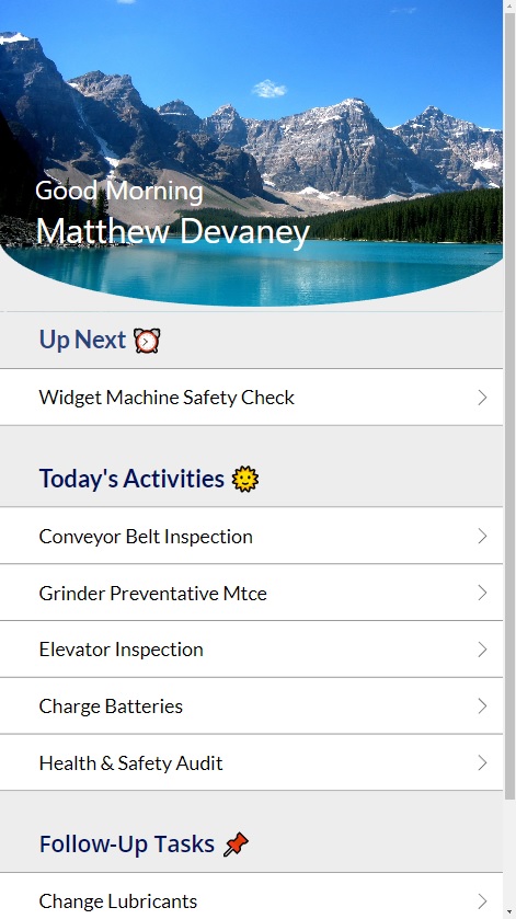
In this tutorial we will be building a home screen that shows workers the next task they should work on, any other outstanding tasks for today and any follow-up items from previous days. The header image of the home screen has a rounded bottom which is accomplished by using an SVG image.
Add A Header Image
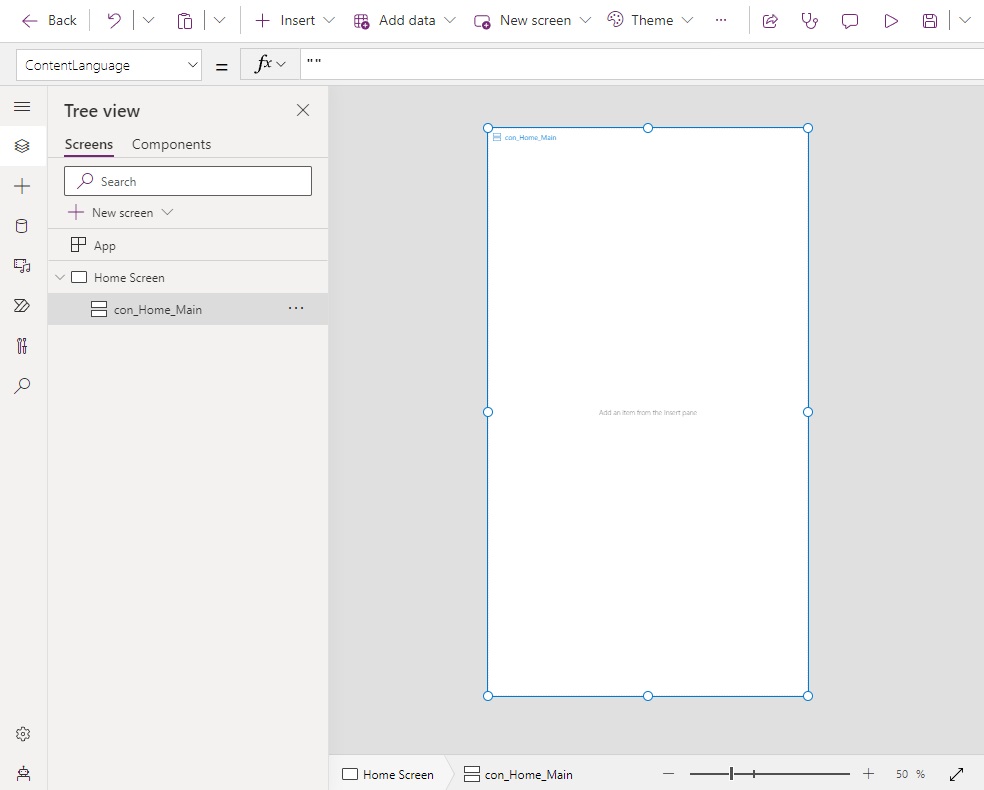
Open Power Apps studio and create a new mobile app from blank. Insert a vertical container onto the screen.
Give the vertical container these properties.
Height: Parent.Height
LayoutOverflowY: LayoutOverflow.Scroll
X: 0
Y: 0
Width: Parent.WidthCode language: HTTP (http)
Then place a directionless container inside the vertical container. Directionless containers are useful when you want to stack objects on top of one another.
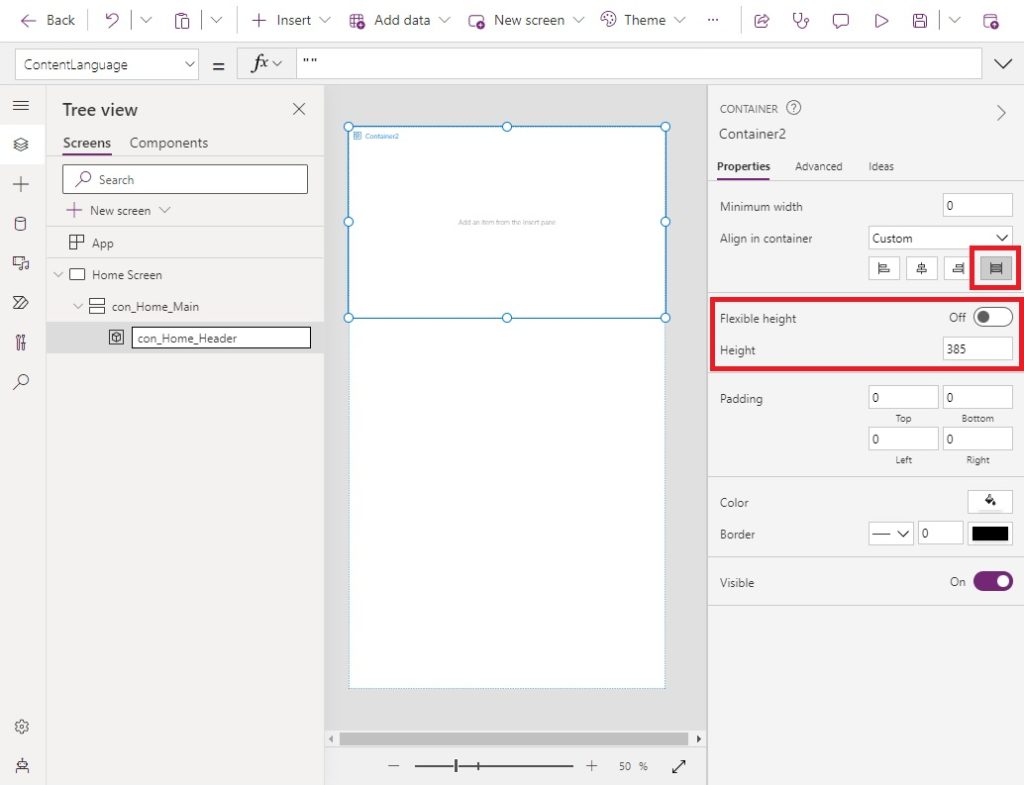
Turn off the flexible height property of the directionless container and set its properties per the code below.
AlignInContainer: AlignInContainer.Stretch
Height: 385Code language: HTTP (http)
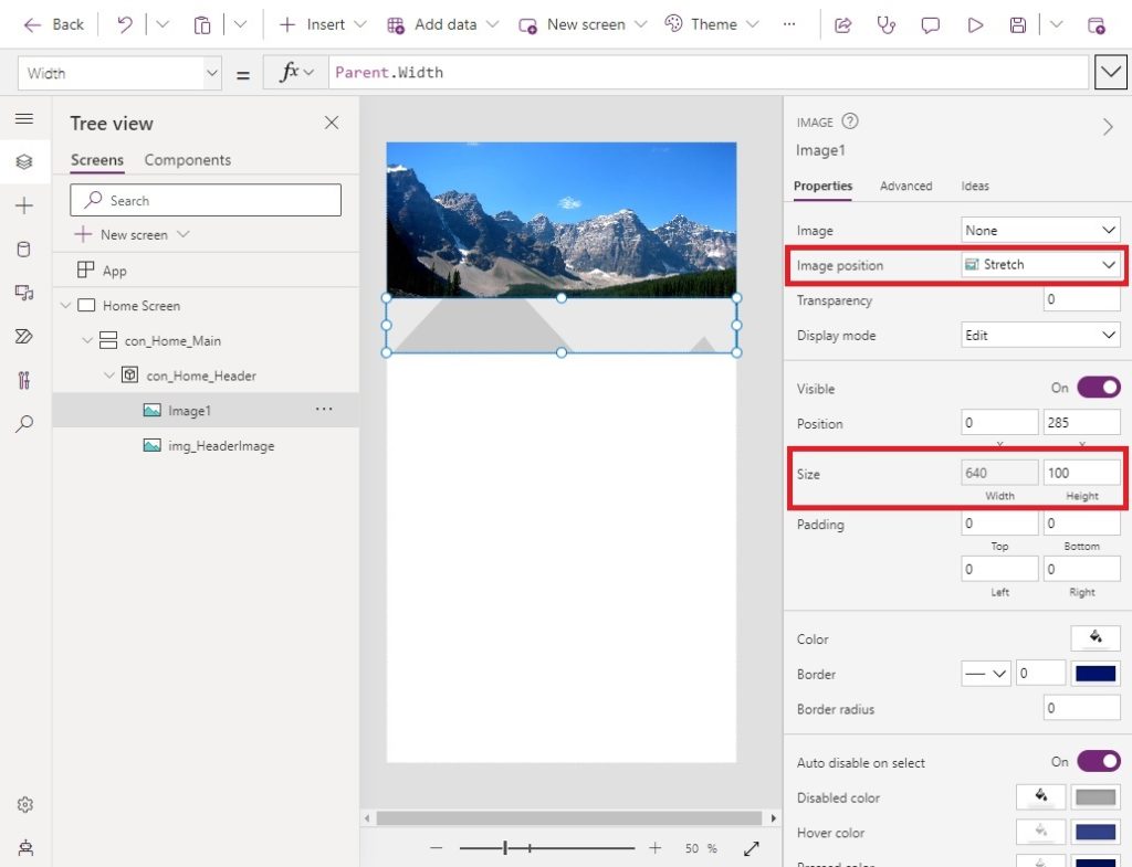
Create a blank image control and insert it into the directionless container.
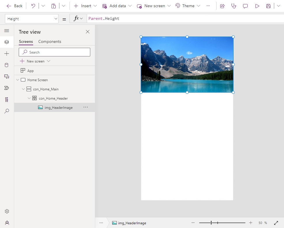
Expand the image control to fill the directionless container using these properties.
Height: Parent.Height
ImagePosition.Fill
X: 0
Y: 0
Width: Parent.WidthCode language: CSS (css)
Then choose an image to put inside the image control. The image of mountains used in this tutorial can be found below. Download the mountains image, upload it to the app and then add it to the image property of the image control.

Create A Custom Shape Divider
To create the curved image shown on the home screen we will need to generate and SVG divider image. Go to the website ShapeDivider.app and use the following settings:
- Shape – Curve
- Colour – #FFFFFF
- Flip – No
- Invert – Yes
- Top/Bottom – Bottom
- Height: 100px
- Width: 100%
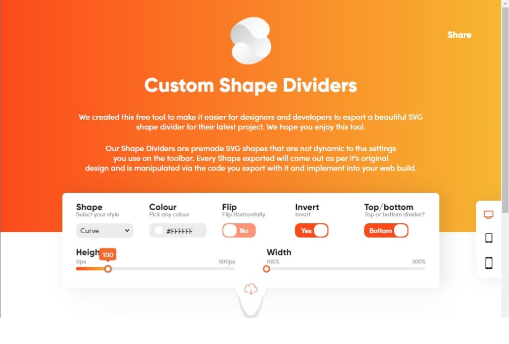
Click the download button to get the code. Choose download SVG.
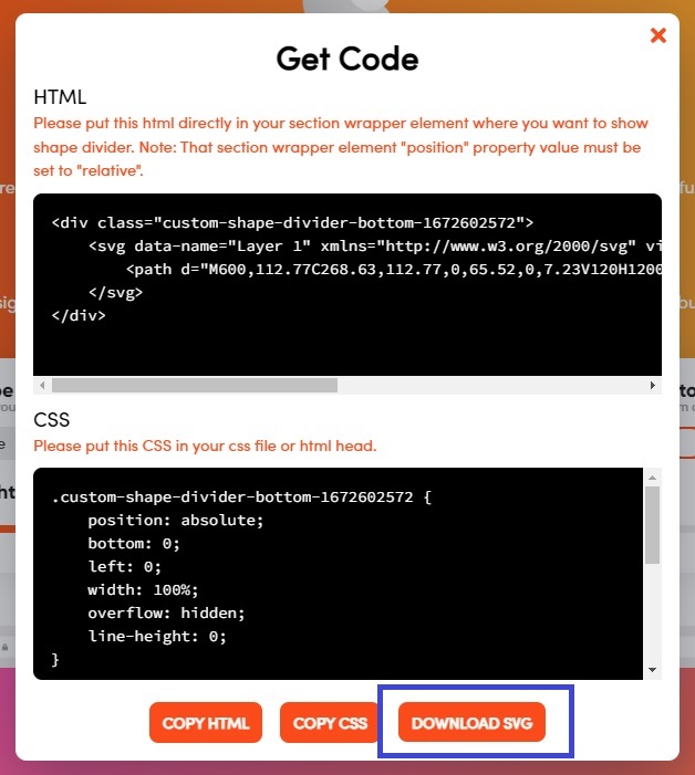
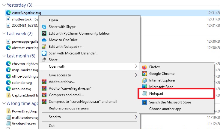
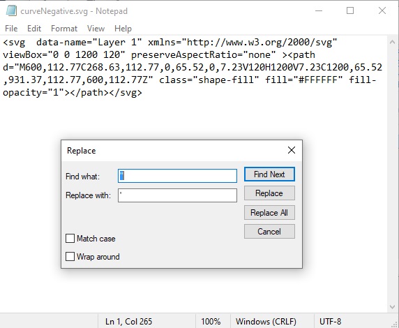
Open the SVG image file using Notepad or another text editor.
Replace all of the double-quotes in the SVG with a single-quote. Keep the file open. We will use it in a few moments.
Apply The Curved Divider Shape To The App
Insert a 2nd image control into the directionless container. Position it on top of the mountains image.
Position the image at the bottom of the direction container using these settings and stretch the image across the entire control.
Height: 100
ImagePosition: ImagePosition.Stretch
Width: Parent.Width
X: 0
Y: Parent.Height-Self.HeightCode language: HTTP (http)
Then add the SVG code we obtained from ShapeDivider.app into the Image property of the image control.
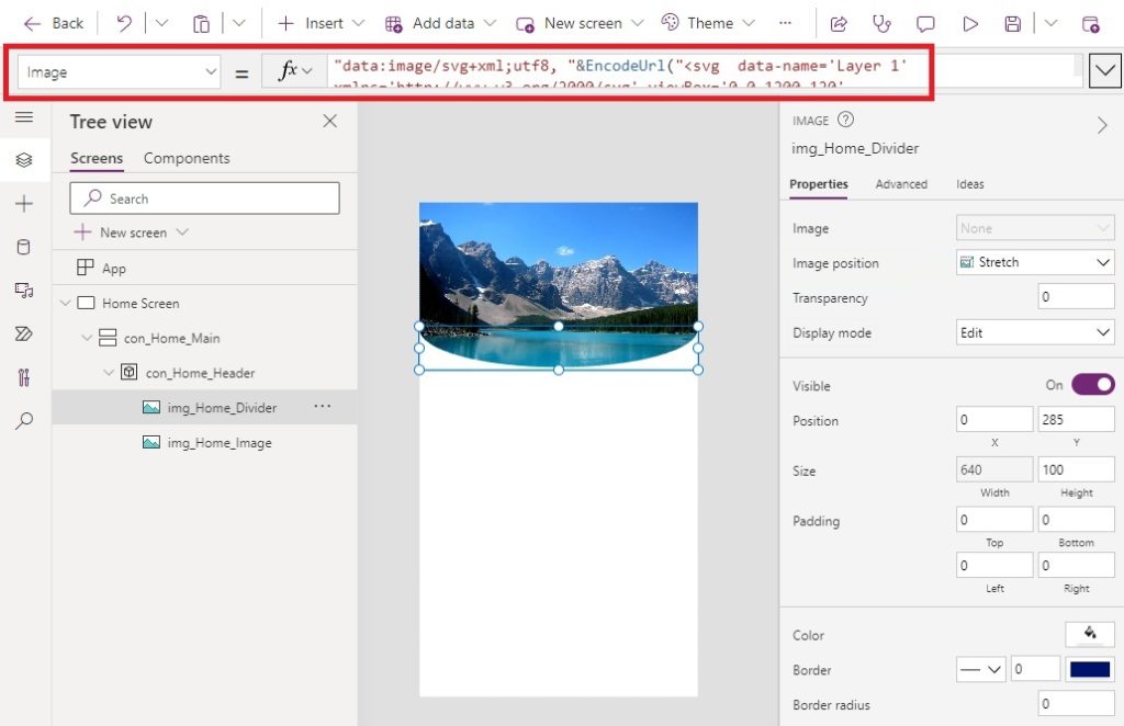
Some extra code must be added to the SVG code found in notepad. First, we must define the type of data contained in the data URL. Then we encode the SVG image as a URL string using the EncodeUrl function.
"data:image/svg+xml;utf8, "&EncodeUrl("<svg data-name='Layer 1' xmlns='http://www.w3.org/2000/svg' viewBox='0 0 1200 120' preserveAspectRatio='none' ><path d='M600,112.77C268.63,112.77,0,65.52,0,7.23V120H1200V7.23C1200,65.52,931.37,112.77,600,112.77Z' class='shape-fill' fill='#FFFFFF' fill-opacity='1'></path></svg>")Code language: HTML, XML (xml)
Additionally, we want to change the fill color of the SVG divider shape from white to light gray. Replace the fill property with the following hex code.
fill='#EDEDED'Code language: JavaScript (javascript)
Display Welcome Messages To The User
We fill finished customizing our app header by adding a welcome message.
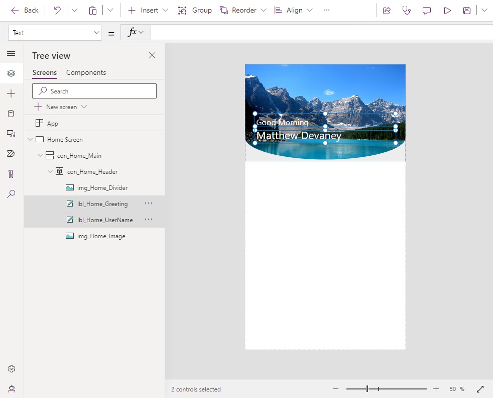
Insert a new label and give it these properties:
Color: White
Font: Font.'Segoe UI'
Size: 24Code language: HTTP (http)
Add this code to the first label’s Text property to display a welcome message based on the current time.
If(
    Hour(Now())<12,
    "Good Morning",
    Hour(Now())<17,
    "Good Afternoon",
    "Good Evening"
)Code language: JavaScript (javascript)
Insert a 2nd label and give it these properties:
Color: White
Font: Font.'Segoe UI'
Size: 32Code language: HTTP (http)
Determine the user’s name using the User function and writing this code in the Text property of the label.
User().FullNameCode language: CSS (css)
Insert A Section Header
At this point, we’ve successfully added a curved SVG divider image into the app. Now we will take a few more short steps to complete the home screen. Place a new label inside the vertical container.
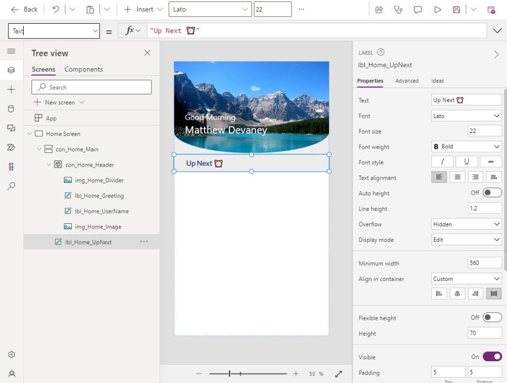
Write this in the Text property of the label. Emojis can be typed by pressing the [Windows Key] + [Period].
"Up Next ⏰"Code language: JSON / JSON with Comments (json)
Apply these properties to the label:
AlignInContainer: AlignInContainer.Stretch
Color: ColorValue("#27437D")
Fill: ColorValue("#EDEDED")
FontWeight: FontWeight.Bold
Font: Font.Lato
Size: 22Code language: HTTP (http)
Add another label to the vertical container to act as a separator.
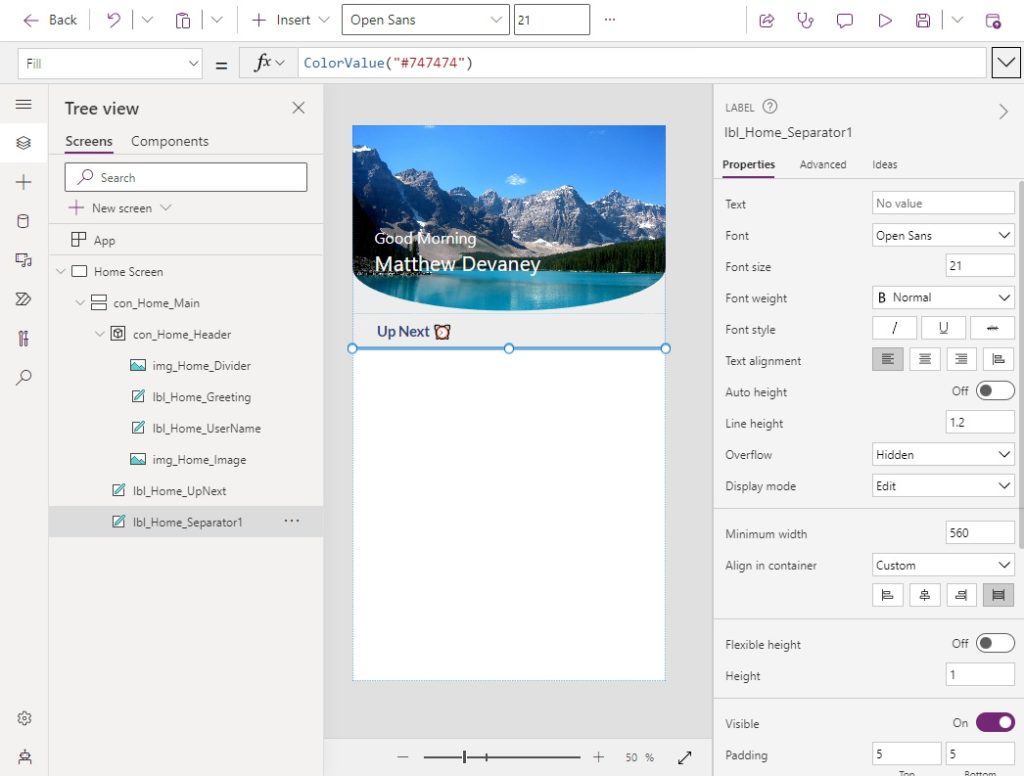
Give the separator label these properties:
AlignInContainer: AlignInContainer.Stretch
Fill: ColorValue("#747474)
Height: 1Code language: HTTP (http)
Add A Gallery Section
Insert a blank vertical gallery into the vertical container.
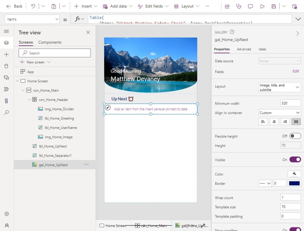
Use this code in the Items property of the gallery. This gallery will only have one item, which initially seems like a waste. But we will re-use this gallery in multiple places, so it is necessary to build.
Table(
    {Name: "Widget Machine Safety Check"}
)Code language: CSS (css)
Turn off flexible height, stretch the gallery and then set its height.
AlignInContainer: AlignInContainer.Stretch
Height: CountRows(Self.AllItems)*Self.TemplateHeightCode language: CSS (css)
Place 2 labels and an icon into the gallery.
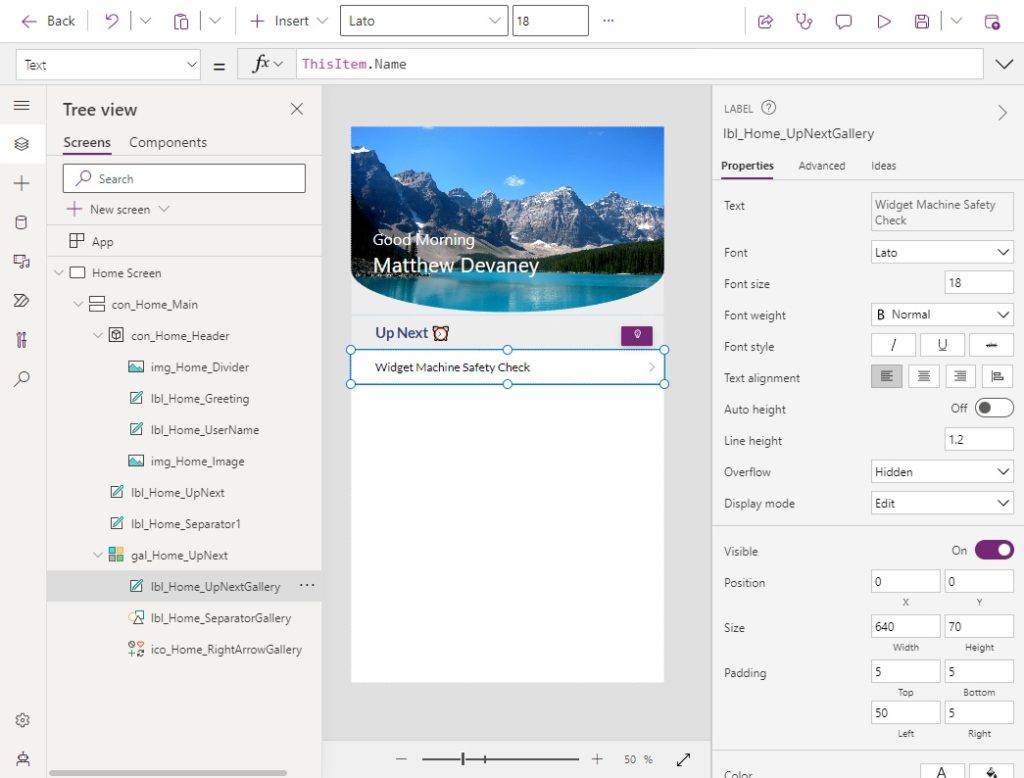
Write this code in the Text property of the first label to display the task name.
ThisItem.NameCode language: CSS (css)
Apply these properties to the first label to style its text.
Color: Black
Font: Font.Lato
Size: 18Code language: HTTP (http)
The second label acts as a separator. Give it these properties:
AlignInContainer: AlignInContainer.Stretch
Fill: ColorValue("#747474)
Height: 1
X: 0
Y: Parent.TemplateHeight-Self.HeightCode language: HTTP (http)
Use this code in the Icon property of the icon to display a chevron shape pointing to the right.
Icon.ChevronRightCode language: CSS (css)
Complete The Remaining Sections
The Today’s Activities and Follow-Up Tasks sections of the gallery are created the same way as the Up Next section of the gallery. But they use different data. Repeat the steps above to make the remaining sections of the gallery.
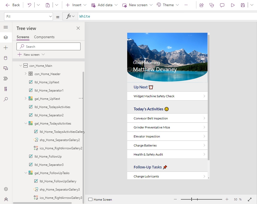
Write this text in the section header for Today’s Activities.
"Today's Activities 🌞"Code language: JSON / JSON with Comments (json)
Use this code in the Items property of the Today’s Activities gallery.
Table(
    {Name: "Conveyor Belt Inspection", Icon: Icon.Globe},
    {Name: "Grinder Preventative Mtce", Icon: Icon.ToolsWrench},
    {Name: "Elevator Inspection", Icon: Icon.Search},
    {Name: "Charge Batteries", Icon: Icon.LightningBolt},
    {Name: "Health & Safety Audit", Icon: Icon.Health}
)Code language: CSS (css)
Write this text in the section header for Follow-Up Tasks.
"Follow-Up Tasks 📌"Code language: JSON / JSON with Comments (json)
Use this code in the Items property of the Follow-Up Tasks gallery.
Table(
    {Name: "Change Lubricants", Icon: Icon.Pin},
    {Name: "Fix Hole-Puncher", Icon: Icon.Pin},
    {Name: "Review Peer Fixes", Icon: Icon.Pin}
)Code language: CSS (css)
Did You Enjoy This Article? 😺
Subscribe to get new Copilot Studio articles sent to your inbox each week for FREE
Questions?
If you have any questions about Power Apps Curved Header UI Design For Mobile Apps please leave a message in the comments section below. You can post using your email address and are not required to create an account to join the discussion.


Loved the UI and how you designed it.
That is utterly awesome!! Thanks
Hi Matthew, thank you for your posts always.
The code here for the second image:
Height: 100
ImagePosition: ImagePosition.Stretch
Width: Parent.Width
X: 0
Y: –Parent.Height–Self.Height
the (-) before the “Parent.Height-self.Height” somehow is affecting the code not until I removed the (-).
Is it a deliberate brain teaser? 😊
Hamed,
I appreciate you reporting this bug. It’s now corrected. Thank you!
Please suggest sites where we can copy,paste symbols like search icons,add icons etc inside Text Input control
Ram,
If you want 2,000 Free Power Apps icons you can use my page:
https://www.matthewdevaney.com/2000-free-power-apps-icons/