Power Apps Shimmer Control: Gorgeous Looking Loading Screens

The Power Apps shimmer control included in the Creator Kit will take your loading screen designs to the next level. Shimmers are placeholder shapes that appear where the data will eventually display. They are preferred over loading spinners because they give an indication of where the data will display. In this article I will show you how to make a skeleton screen with shimmers appear while data is loading.
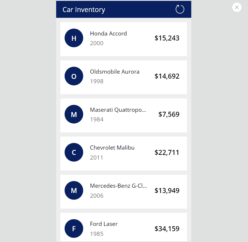
Introduction: The Car Inventory App
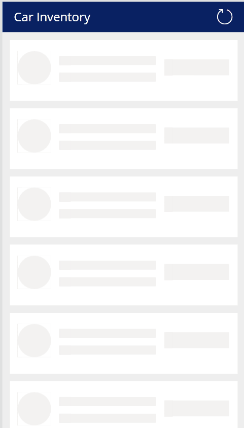
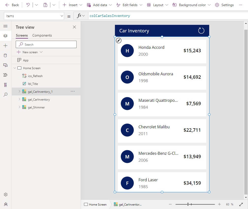
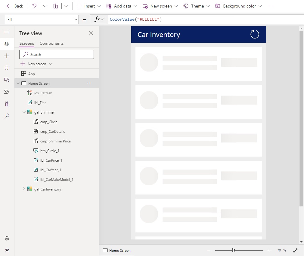
A sales team uses the Car Inventory app to check which cars are available to sell to customers. When the list of cars is loading a skeleton screen appears with shimmers for placeholders.
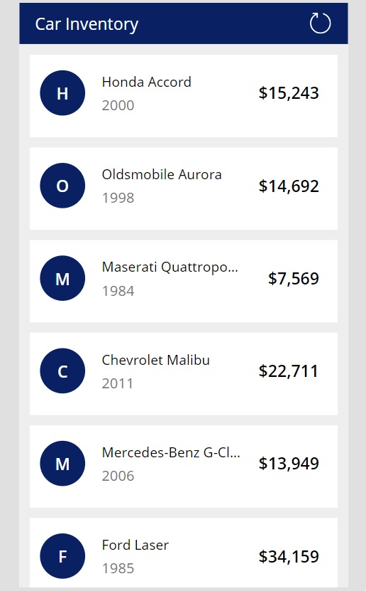
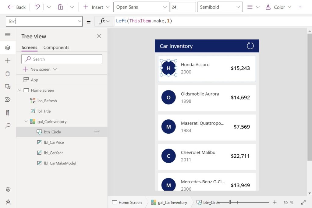
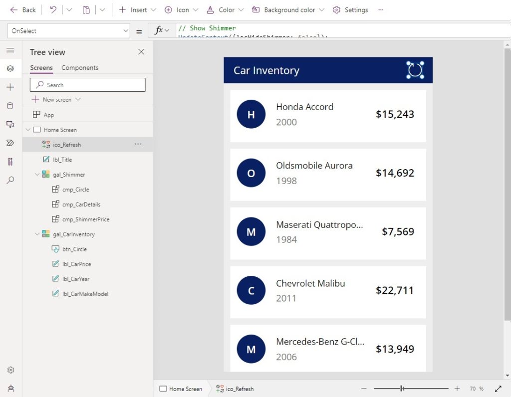
Then once loading is completed, the screen looks like this.
Setup The SharePoint List
Create a new SharePoint list named Car Sales Inventory. Include the following columns:
- year – number
- make – single line text
- mode – single line text
- cost – number
Fill-in the SharePoint list with at least 100 rows of data that looks similar to this. A larger list will have a longer loading time and display the skeleton screen & shimmer effect for longer.
| ID | year | make | model | cost |
| 1 | 2000 | Honda | Accord | 15,242.74 |
| 2 | 1998 | Oldsmobile | Aurora | 14,691.91 |
| 3 | 1984 | Masterati | Quattroporte | 7,568.83 |
| 4 | 2011 | Chevrolet | Malibu | 22,711.39 |
| 5 | 2006 | Mercedes-Benz | G-Class | 13,949.48 |
| … | … | … | … | |
| 100 | 1999 | Cadillac | Seville | 25,137.47 |
Load SharePoint List Data Into A Collection
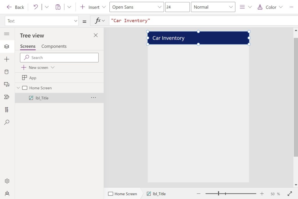
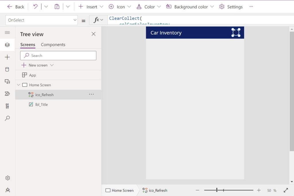
Open Power Apps Studio and create a new mobile app from blank. Insert a label with the text “Car Inventory” and place it at the top of the screen. Then set the background of the screen to a light gray color.
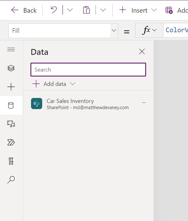
Add the Car Sales Inventory SharePoint list to the app.
When the sales person presses the reload icon data from the SharePoint list will be loaded to the app. Add a reload icon to the screen.
Write this code in the OnSelect property of the reload icon.
Refresh('Car Sales Inventory');
ClearCollect(
    colCarSalesInventory,
    'Car Sales Inventory'
);Code language: JavaScript (javascript)
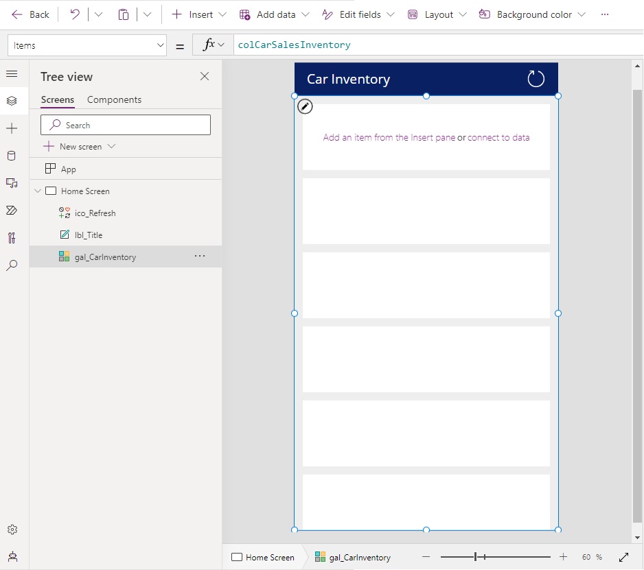
Display Car Inventory Data In A Gallery
Each vehicle in the Car Sales Inventory SharePoint list will be displayed on a card inside a gallery. Add a new vertical gallery to the screen.
Use this code in the Items property of the gallery to populate it with data.
colCarSalesInventory
Update the following gallery properties to make it have cards.
TemplateFill: Color.White
TemplatePadding: 20
TemplateSize: 160Code language: HTTP (http)
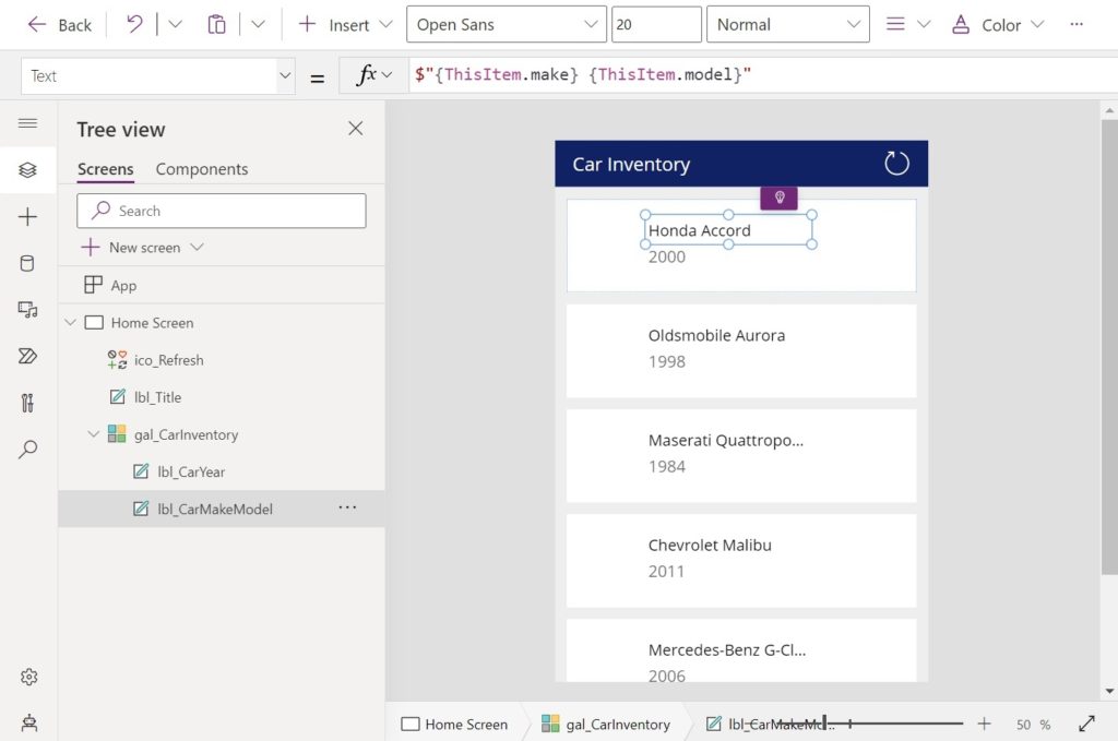
Insert two labels into the gallery to the display a car’s year, make and model. Stack the labels vertically.
Use this code in the Text property of the top label of show the car’s make and model.
$"{ThisItem.make} {ThisItem.model}"Code language: JavaScript (javascript)
Then use this code in the Text property of the bottom label to show the car’s year.
ThisItem.yearCode language: CSS (css)
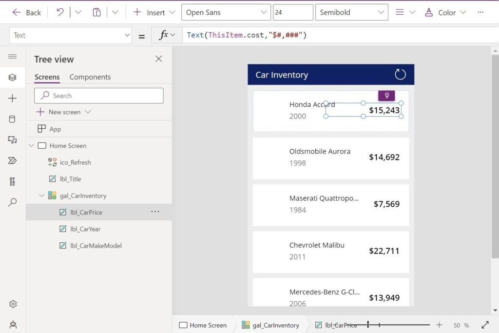
Add another label to the gallery to show the car’s cost.
Write this code in the Text property of the label.
Text(ThisItem.cost,"$#,###")Code language: JavaScript (javascript)
Then add a button to the gallery to display the first initial of car’s make.
Using the values below, style the button to be a solid colored circle that cannot selected
Color: Color.White
DisplayMode: DisplayMode.View
Fill: RGBA(9, 33, 98, 1)
Height: 88
Radius: 180
Width: 88Code language: HTTP (http)
Write this code in the Text property of the label.
Left(ThisItem.make,1)Code language: CSS (css)
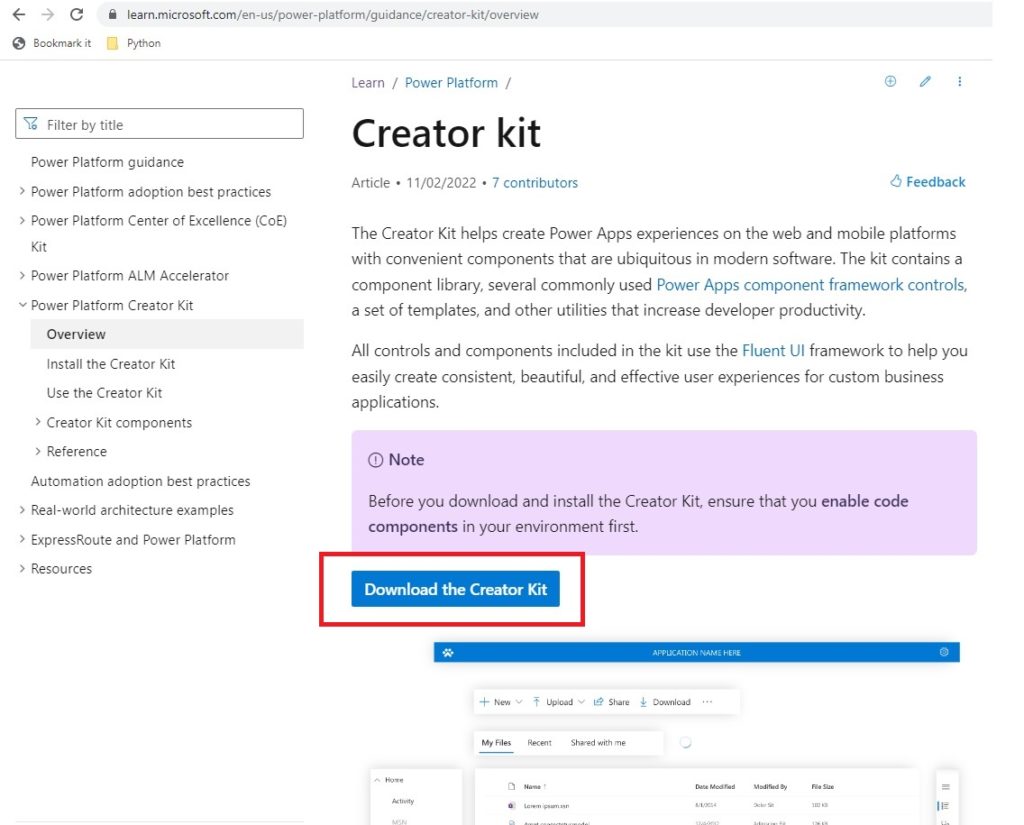
Install The Power Apps Creator Kit
Up until this point we have been creating a basic app to build a skeleton screen and shimmer animation for. Now it’s time to actually build the skeleton & shimmer. To do this, we will need to install the Power Apps Creator Kit. It includes a shimmer control we will need in the next part of the tutorial.
Download the Power Apps Creator Kit and install it in the same environment as the Car Inventory App.
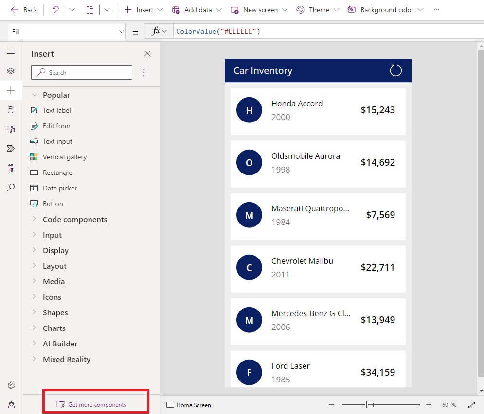
Import The Power Apps Shimmer Control Code Component
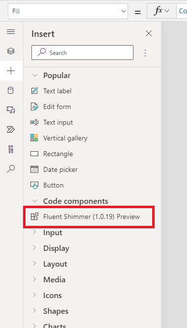
Once the Creator Kit installed we need to import the Power Apps Shimmer Control code component into our app. Open the Insert menu and select the Get More Components button.
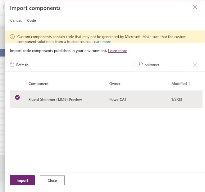
Select the Code tab and search for the Shimmer control. Choose the Fluent Shimmer control from the search results and click Import.
The Shimmer control will now appear under Code Components in the Insert menu.
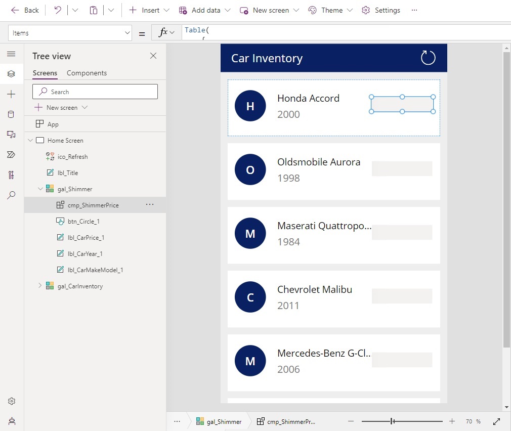
Create A Single Line Shimmer Control
While the Car Sales Inventory data is loading we want to show a skeleton screen and use the shimmer control as a placeholder for the data. Copy the Car Inventory gallery and place it above the original gallery in the Tree View.
Insert a shimmer control inside the gallery and position directly on top of the car price label.
Use this code in the Item property of the shimmer control to configure it as a line (as opposed to a circle). By setting the ItemWidth and ItemHeight properties as shown below we can make the shimmer fill the entire area.
Table(
    {
        ItemKey: "1",
        ItemWidth: Text(Self.Width),
        ItemHeight: Text(Self.Height),
        ItemRowKey: "1",
        ItemType: "line"
    }
)Code language: CSS (css)
Also change the SpaceBetweenShimmer property to this value to eliminate the empty space at the top of the control.
"0px"Code language: JSON / JSON with Comments (json)
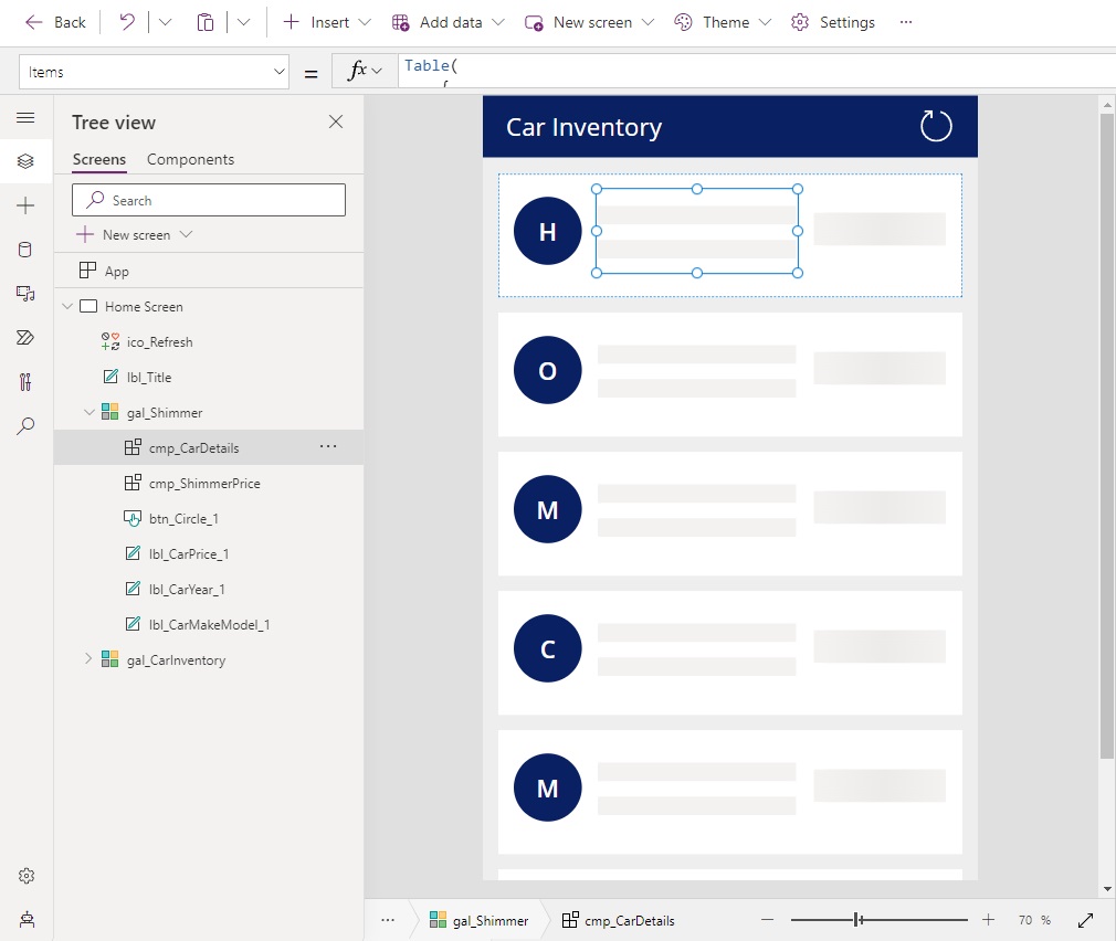
Make A Multiple Line Shimmer Control
Similar to the car price, we want to make a shimmer to cover the car’s make model and year. Insert a new shimmer control and stretch it cover cover the make model and information labels.
Use this code in the Items property of the shimmer control to define it as a line type.
Table(
    {
        ItemKey: "1",
        ItemWidth: Text(Self.Width),
        ItemHeight: 24,
        ItemRowKey: "1",
        ItemType: "line"
    }
)Code language: CSS (css)
Set the SpaceBetweenShimmer property to the value shown below.
"20px"Code language: JSON / JSON with Comments (json)
Then use the RowCount property to show the same shimmer pattern on multiple lines.
2
Insert A Circle Shaped Shimmer Control
The final shimmer will be circle shaped to cover the button showing the car make’s first letter. Add a new shimmer control to the gallery and cover the button.
Use this code in the Items property of the shimmer. The ItemType field changes it into a circle.
Table(
    {
        ItemKey: "1",
        ItemWidth: Text(Self.Width),
        ItemHeight: Text(Self.Height),
        ItemRowKey: "1",
        ItemType: "circle"
    }
)Code language: CSS (css)
Set the SpaceBetweenShimmer property value to 0.
"0px"Code language: JSON / JSON with Comments (json)
Show The Skeleton Screen During Data Load
We want to display the skeleton screen and shimmer controls while the screen’s data is being loaded.
Update the reload icon’s OnSelect property code to this code.
// Show Shimmer
UpdateContext({locHideShimmer: false});

// Do Actions
Refresh('Car Sales Inventory');
ClearCollect(
    colCarSalesInventory,
    'Car Sales Inventory'
);

// Hide Shimmer
UpdateContext({locHideShimmer: true});
Code language: JavaScript (javascript)
We show the shimmer before starting to load data and and we hide the shimmer it once data loading is completed.
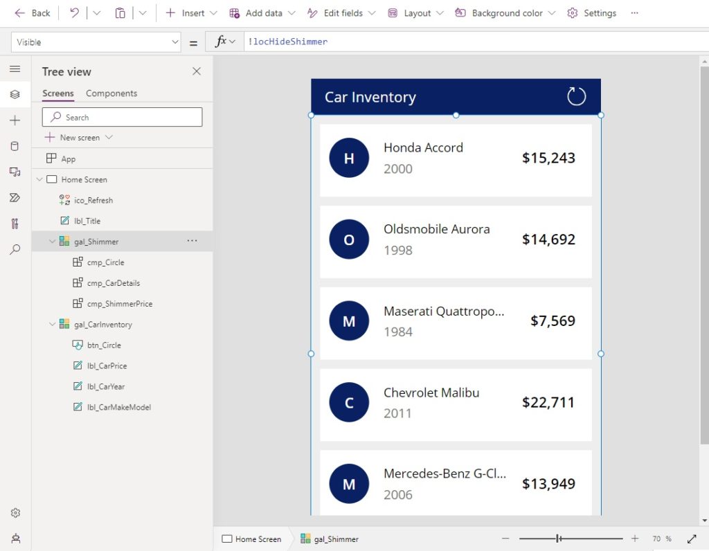
Use this code in the Visible property of the Shimmer gallery.
!locHideShimmer
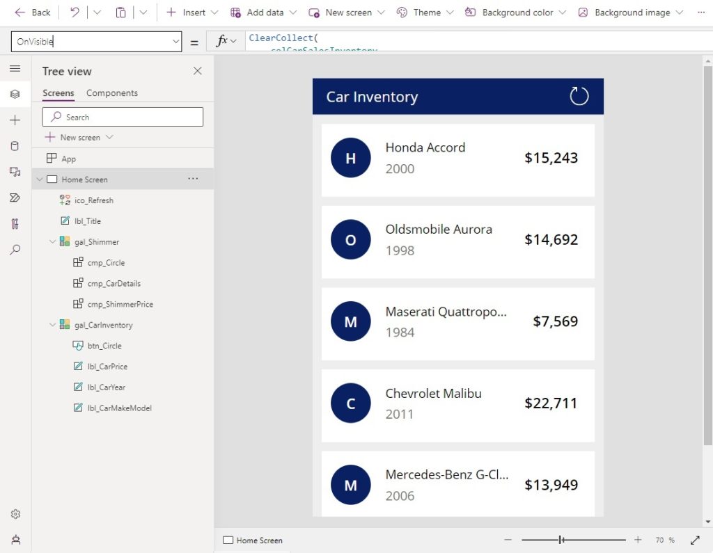
The shimmer must also appear during the screen’s initial load.
Use this code in the OnVisible property of the screen.
ClearCollect(
    colCarSalesInventory,
    'Car Sales Inventory'
);
UpdateContext({locHideShimmer: true});Code language: JavaScript (javascript)
Test The Power Apps Shimmer Control
The skeleton screen and shimmer control are now completed. Press the reload button to test the app.
Did You Enjoy This Article? 😺
Subscribe to get new Copilot Studio articles sent to your inbox each week for FREE
Questions?
If you have any questions or feedback about Power Apps Shimmer Control: Gorgeous Looking Loading Screens please leave a message in the comments section below. You can post using your email address and are not required to create an account to join the discussion.


Hi Matt,
Please tell about the license part of Creator kit. Should I have a premium license to utilise this or any part of it?
Ramesh,
Totally free. Standard license only needed for the Creator Kit. Go out and grab it 🙂
thank you for this great article and example!
I had been previously attempting to use the Shimmer control more like the Progress Indicator – in creating a single instance and placing that over the entire gallery control. In that form I was unable to identify how to create a more customized layout of circles, lines, etc.
This makes much more sense now that you have placed individual shimmer controls over the UX elements placing the Shimmer control directly inside the gallery.
It would be great for the MSFT team would add similar guidance / example in the documentation for the toolkit. This tutorial makes this control considerably more intuitive!
Ryan,
Next we will both want Microsoft to add a another feature… please let us have a way to know when the screen or gallery is done rendering!
How to add shimmers if we are filtering out gallery
Rahul,
What does ‘filtering out’ mean? I have never heard that expression.
Great job !
Anyway using the whole creator kit may be overkill if you ‘just’ need the shimmer effect. And citizens devs may not be allowed to enable PCF components.
That’s why I tried to achieve the same shimmer effect but using animated SVG images.
I would be glad to get your thoughts about it !
This is awesome – thank you! We cannot use PCF components in our environment at this time.
Kyle,
Tis a shame. I’ll wish on that next shooting star I see that you get approved.
Wow awesome, thanks for sharing 😉