Power Apps Button With Icon And Text
Icons can easily be added to Power Apps buttons with a little bit of creative coding. The trick is to place an icon on top of the button. Then trigger both the icon and button to change color when an invisible overlay above them is pressed. We can add a subtle hover effect on the button too. In the Power Apps article, I will teach you how to make a button with an icon and text.
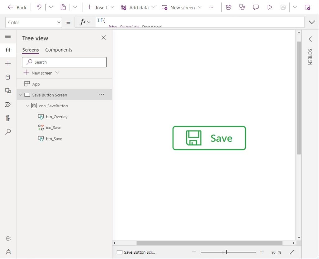
Introduction: The Save Button
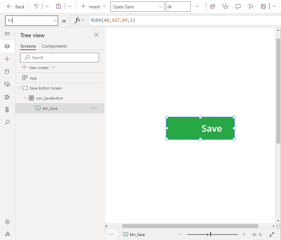
The Save button can be clicked while filling out a form to save the user’s progress. This Power Apps button has an icon and words Save. When a user presses the button both the icon and text change color at the same time.

Add A Container To Hold The Button & Icon
Open Power Apps Studio and start a new app from blank. Add a container control to the app. The Power Apps button with an icon will be built inside of the container to make it easier to maintain.
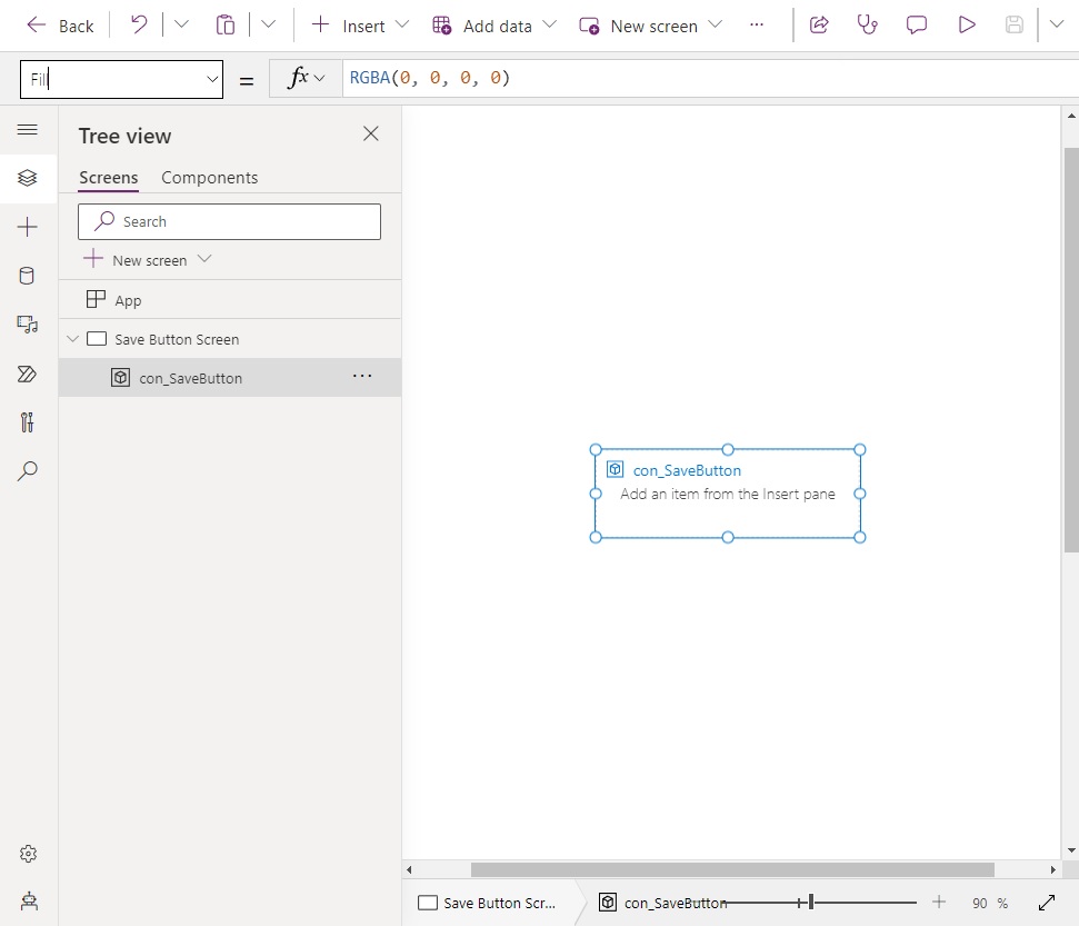
Change the height and width properties of the container to the values below.
Height: 80
Width: 240Code language: HTTP (http)
Create A Power Apps Button Inside The Container
Insert a new button named btn_Save into the container.
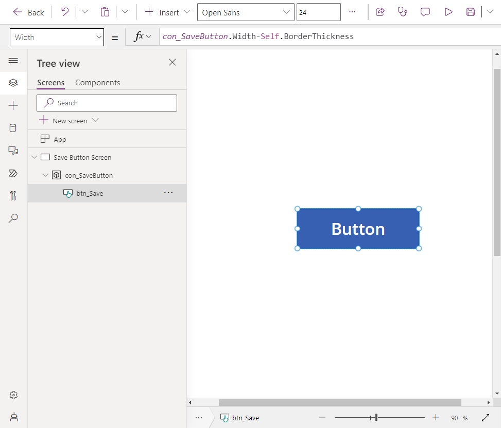
Make the button fill the entire space inside the container by updating its properties with the values below. It the container is re-sized, the button will re-size itself too. This makes our button with an icon re-usable in other places.
Height: con_SaveButton.Height-Self.BorderThickness
Width: con_SaveButton.Width-Self.BorderThickness
X: Self.BorderThickness/2
Y: Self.BorderThickness/2Code language: PHP (php)
Update the button’s text to the word Save. Position the text on the right side of the button. Leave a blank space for a button on the left-side.
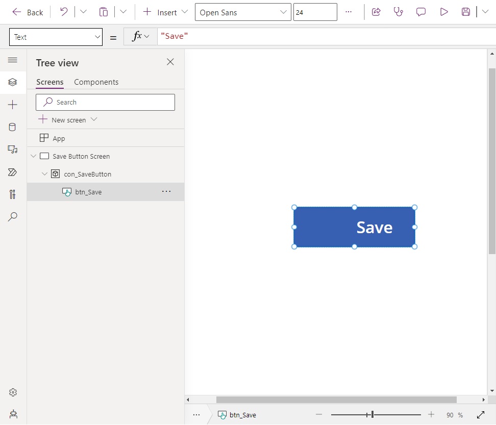
Change the button properties to this code to re-position the text.
Align: Center
PaddingLeft 80
PaddingRight: 0
PaddingTop: 0
PaddingBottom: 0
We want the button background to be green to indicate that saving is a positive action.
Use these values to update the button’s style.
BorderColor: RGBA(40,167,69,1)
Color: White
Fill: RGBA(40,167,69,1)Code language: HTTP (http)
Insert An Icon Into The Container
Create a Save icon named ico_Save and place it in the container. Position the icon to the left of the Save text.

Give the icon these color and fill property values.
Color: White
Fill: TransparentCode language: HTTP (http)
Position An Overlay Button Above The Icon & Save Button
To make the icon and the save button’s color change at the same time they need to be triggered by common event. We will place a transparent button on top of the other controls. Then, when the transparent button’s pressed output property changes to true the icon and button will change color.
Insert a new button called btn_Overlay into the container.
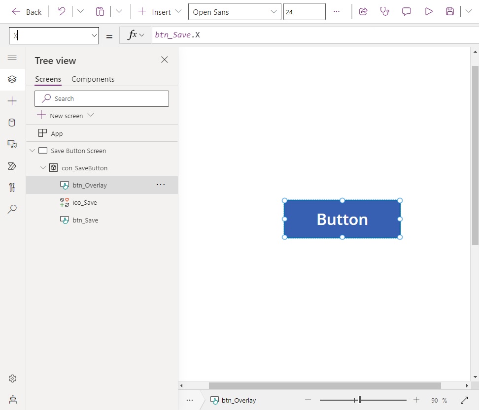
Position the new overlay button directly over top of btn_Save.
Height: btn_Save.Height
Width: btn_Save.Width
X: btn_Save.X
Y: btn_Save.YCode language: CSS (css)
Remove any text from the overlay button and make it transparent.
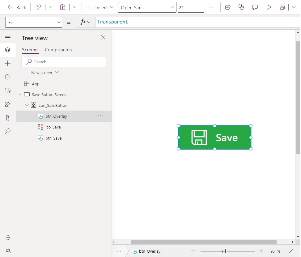
Use this code to make the button see-through. Notice the HoverFill property is not fully transparent. This gives the button a subtle hover effect.
BorderStyle: BorderStyle.None
Color: Transparent
Fill: Transparent
DisabledColor: Transparent
DisabledFill: Transparent
HoverColor: Transparent
HoverFill: RGBA(0,0,0,0.05)
PressedColor: Transparent
PressedFill: TransparentCode language: HTTP (http)
Change Icon & Save Button Color When Pressed
The icon and save button must change color at the same time when pressed. Initially the button is green and the text is white.
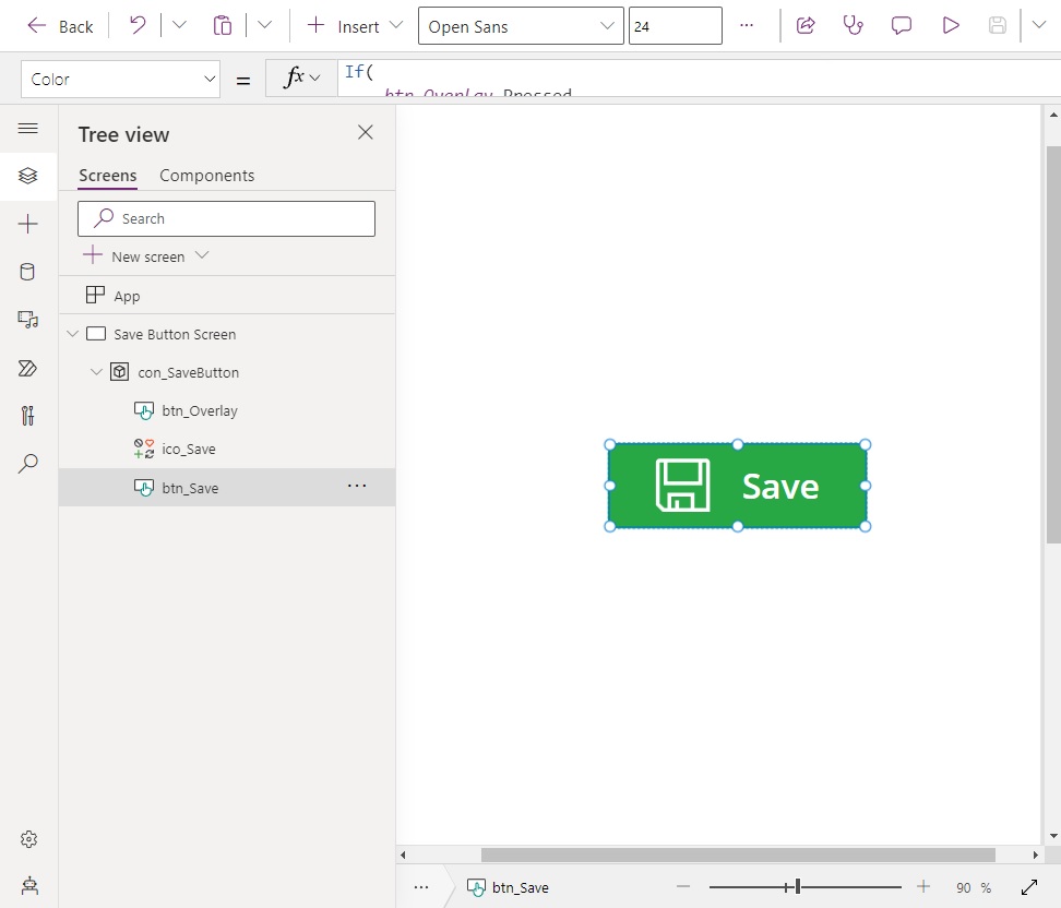
When the button is pressed its colors become inverted. The button is white with a green border and the icon turns green.
Use this code in btn_Save to change its Color property and Fill property when btn_Overlay is pressed.
Color: If(
    btn_Overlay.Pressed,
    RGBA(40,167,69,1),
    White
)

Fill: If(
    btn_Overlay.Pressed,
    White,
    RGBA(40,167,69,1)
)Code language: CSS (css)
And use this code in ico_Save to change its Color when btn_Overlay is pressed.
Color: If(
    btn_Overlay.Pressed,
    RGBA(40,167,69,1),
    White
)Code language: CSS (css)
Test the button to make sure its style properties behave as expected. Add any code that should be executed when the button is pressed in its OnSelect property.

Did You Enjoy This Article? 😺
Subscribe to get new Copilot Studio articles sent to your inbox each week for FREE
Questions?
If you have any questions or feedback about Power Apps Button With Icon And Text please leave a message in the comments section below. You can post using your email address and are not required to create an account to join the discussion.


Another great way to add Icons to your Controls is to use the Windows unicode icons. By pressing Win + . you can add those icons to the text property of your control without having to add multiple controls for just one button. 😍
Andrea,
Yes, that’s another way to do it. Please note, the Unicode symbols will look very different on every device. What you see on Windows will differ from Android and iOS.
Excellent tip 🙂
Won my LIKE. I learned a lot. Thank you !!!
Ciro,
Many thanks.
Great post! I have been using a label, icon and a rectangle shape overlay in a container. Any reason to favor the button over the shape or the label?
Jordan,
A button changes the mouse cursor from a point to a hand on-hover. The hand indicates a clickable element. That’s why I use it.
Dear Matthew,
Many thanks for your kindly sharing. It was really usefull for me. I can lear it step by step and success.
I have one question.Can I use the image as an icon? Beacuse there was no right one I like to use. Then I need to make the self-made. But if I use the seld-made, I can’t totally made the same button as you tought.
so, do you have some ideas?
Many thanks.
Tony,
Yes you can use an SVG with this method and change the fill property when the user presses a button. I’ve accomplished it before.
Hi, Matthew
thanks for your quick reply!
You mean only the SVG formate is OK?
thanks
Tony,
SVG, Image or Unicode are all OK.
Stumbled upon you blog via a search and absolutely love it. I’m going to recommend it to my customers. I do have a question about this post that I feel like I should know but I’m probably doing something stupid. When I try to place the save icon into the container on the button, it ends up below the container/button. In Tree View it is in the container branch but in the GUI is it under the container and can’t be moved. What am I doing wrong?! Thanks!
Nathan,
Which container type did you use? A vertical container will stack its contents up-to-down. I think this is what happened. Please try using a “Container” instead. Not a “Vertical Container” or “Horizontal Container.”
Best of luck 🙂
Do you also have any function that can trigger while hovering over element?
Erik,
No, Power Apps does not have an OnHover property or Hovered property. That is essentially the problem
Please go vote for the idea on Power Apps Ideas:
https://ideas.powerapps.com/d365community/idea/d1087491-c7f9-4356-90a1-8e5af894f9ae
That calls for a component, doesn‘t it??
Reiner,
It sure does. I just did not want to teach two concepts at once 😉
Awesome post and thanks for sharing! I learned heaps.
Question: Where do I add the code in btn_Save
Chris,
You would have to write the code in each individual property indicated by the tutorial (e.g. color, fill, etc.)
I am new to Power apps, but the way this looks, this isn’t low code anymore, this is complexity in the most basic standards of html & CSS.
Mohamad,
The Creator Kit offers a component where you don’t have to build this. An icon + button can simply be placed on the page. I wanted to show a way to do it without importing custom code.
More improvements to the basic controls of Power Apps are coming soon.
Thanks for this post really clear.
Can I ask you Matthew how could you manage changing an icon on click to manage e.g status looping between few icon’s [Office,Home,QuestionMark,Blocked] like a state machine.
Idea is to give the ability to the end user to change a status just clicking, but since I have more than 2 status I do not found a way for.
Nels.
Would be great if I could make this responsive. Is there any way?
thanks a lot !
NickP,
You’re welcome buddy 🙂
Hi Matthew! Great tip.
How can I create that same item in a component library? As many parameters its not available, like the “button.pressed”
I have come to the point where I need to put these functions inside btn_save, but they just don’t work. Specifically, PowerApps for some reason doesn’t recognize “BorderThickness”.
You have efficient and helpful articles. Thank you. Great work and who doesn’t appreciate a cat?
Craig,
Agreed 100%. Cats rule.