Create A Power Apps Custom Theme – Colors, Fonts, Icons & Controls
Creating a custom theme for your Power Apps project is important. The colors, fonts, icons and styles you use for controls (text inputs, dropdowns, date-pickers, etc.) define the unique look-and-feel of an app. Power Apps does not have a feature to generate a custom theme so I have come up a system that I use in my own apps. In this article I will show you how to build a Power Apps custom theme.
Choosing A Color Palette For A Custom Theme
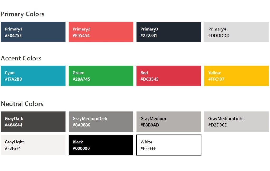
A color palette defines which colors will be used in the Power Apps custom theme. The colors in my palette are organized into 3 categories which I learned from the book Refactoring UI by Adam Wathan and Steve Schoger.
- Primary Colors – the main colors that determine the look and feel of the app. Most companies like these to be their brand colors. We can usually find them in the company’s style guide. Or if you need to come up with your own you can the websites Coolors or Color Hunt to help select a set of primary colors.
- Accent Colors – other colors are necessary to tell the user things about the app. In this palette green indicates success, red means danger, yellow is a warning and cyan is for information.
- Neutral Colors – there are often many grays in an app’s interface. I recommend you pick 5 grays or more to ensure you have enough choices. Also include black and white in this category along with the greys.
I like to visualize my color palette like this:
Using Free Online Tools To Help Build A Color Palette
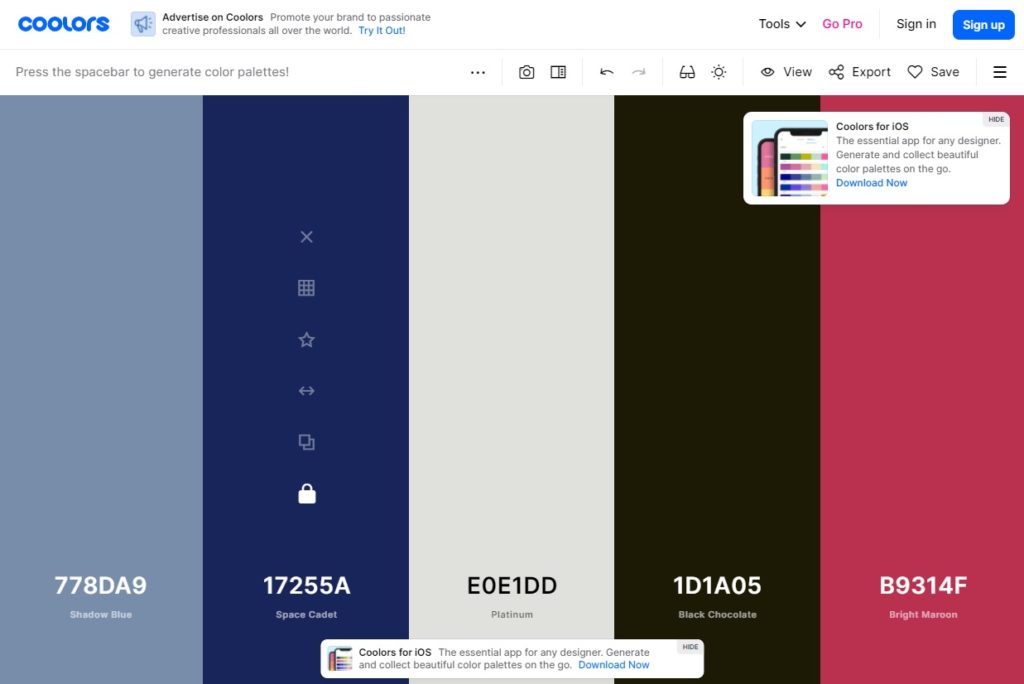
When I need to come up with my own colors palette for an app I there are two free online tools I use. The 1st tool called Coolors randomly generates a set of 5 colors. I keep re-generating the colors until I find one that I like and then I lock it into my palette. Then when I generate the next set of colors I am only presented with colors that go well with my locked in color. I continue to repeat the cycle of locking in colors and regenerating until I have my palette.
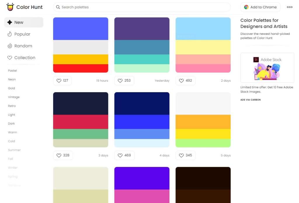
The 2nd tool I use called Color Hunt is an open collection of palettes created by professional designers. I can choose the look and feel I want using the left-side menu (dark, light, warm, cold, pastel, etc.) and then I am presented with the matching color palettes. Each palette has the number of likes beside it to show the color palette’s popularity.
Adding App Colors To A Power Apps Custom Theme
To create the color palette in Power Apps write this code in the OnStart property of the app.
Set(
    gblAppColors,
    {
        // Primary Colors
        Primary1: ColorValue("#30475E"),      // Navy Blue
        Primary2: ColorValue("#F05454"),      // Light Red
        Primary3: ColorValue("#222831"),      // Dark Blue
        Primary4: ColorValue("#DDDDDD"),      // Light Gray

        // Accent Colors
        Black: ColorValue("#000000"),
        Cyan: ColorValue("#17A2B8"),
        Green: ColorValue("#28A745"),
        Orange: ColorValue("#FD7E14"),
        Red: ColorValue("#DC3545"),
        Teal: ColorValue("#20C997"),
        White: ColorValue("#FFFFFF"),
        Yellow: ColorValue("#FFC107"),

        // Neutral Colors
        GrayDark: ColorValue("#484644"),
        GrayMediumDark: ColorValue("#8A8886"),
        GrayMedium: ColorValue("#B3b0AD"),
        GrayMediumLight: ColorValue("#D2D0CE"),
        GrayLight: ColorValue("#F3F2F1")
    }
);Code language: JavaScript (javascript)
Then to use a color in our palette (e.g. Primary1) we some code like this. We always choose a color from the palette rather than use the RGBA or Hex values to ensure we remain consistent. Another advantage is if we ever want to swap the primary color for another we can do it with one simple code change.
gblAppColors.Primary1Code language: CSS (css)
Selecting Fonts & Sizes For A Custom Theme
A custom theme should include fonts and a set of pre-defined fonts sizes. Power Apps comes with 15 standards fonts:
Arial, Courier New, Dancing Script, Georgia, Great Vibes, Lato, Lato Black, Lato Hairline, Lato Light, Open Sans, Open Sans Condensed, Patrick Hand, Segoe UI, VerdanaCode language: PHP (php)
We can also use custom fonts that are not listed in Power Apps Studio. Custom fonts are not guaranteed to display properly across all devices and web browsers so it is best to test them on any devices you plan to use. The following list of fonts are generally regarded as safe.
Arial, Arial Black, Avant Garde, Bookman, Comic Sans MS, Courier, Garamond, Georgia, Helvetica, Impact, Lucida Console, Lucida Sans Unicode, Palatino, Tahoma, Times New RomanCode language: PHP (php)
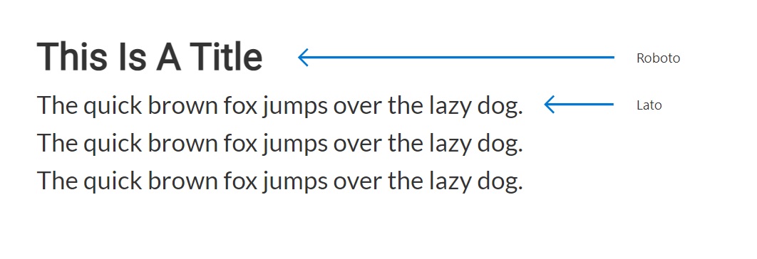
It is common for apps to have both a heading font and a body font. The heading font for our sample app is Roboto and and the body font is Lato. I like to use typ.io to help me find fonts that go together.
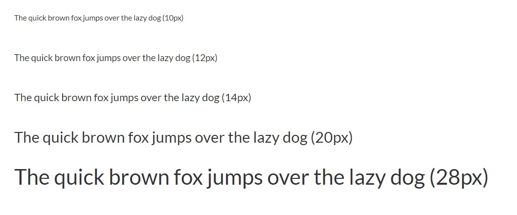
Choosing font sizes is as important as the fonts themselves. Without a set of pre-defined sizes I find that I spend too much time thinking about what size to use and make choices that are inconsistent with the rest of the app. At minimum I choose 5 font sizes: tiny, regular, subtitle, title and huge.
Using The Power Apps Custom Fonts Sample App To Pick A Font
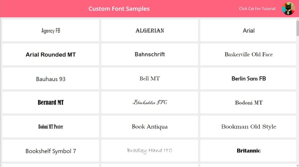
When I am trying to decide which font to use I look at this sample app I built with 177 custom fonts. You can download the msapp file from the Power Apps PNP repo for for free.
Adding Fonts & Font Sizes To A Power Apps Custom Theme
To include fonts and font sizes in our Power Apps custom theme write this code in the OnStart property of the app.
Set(
    gblAppFonts,
    {
        Heading: "Roboto, Open Sans",
        Body: "Lato",
        Size: {
            Tiny: 10,
            Regular: 12,
            Subtitle: 14,
            Title: 20,
            Huge: 28
        }
    }
)Code language: CSS (css)
If we wanted to apply the Roboto font to a label we would use this code in the Font property.
gblAppFonts.HeadingCode language: CSS (css)
Then to make the label’s font size the correct size for a title we can put this code in the Size property.
gblAppFonts.Size.TitleCode language: CSS (css)
Picking Icons For A Custom Theme
Choosing icons for a custom theme is optional but they really make app stand-out visually. We can go beyond the set of standard Power Apps icons and introduce our own by using SVG images. The most popular icon sets are:
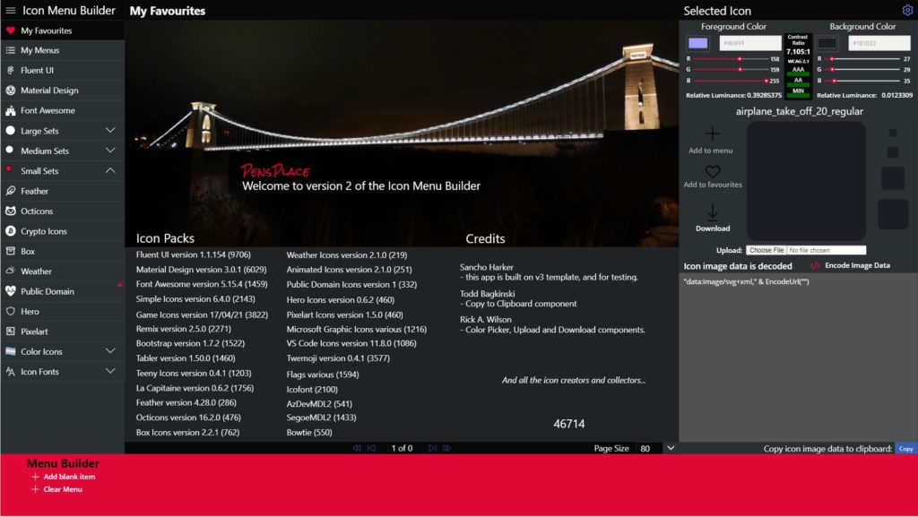
Pen Warner has compiled all of these icon sets and more into a single Power Apps app holding over 45,000 icons which you can download for free. I highly recommend this solution to anyone who wants more icons.
Adding Icons To A Power Apps Custom Theme
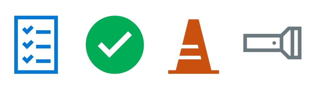
The following icons were chosen from the Power Apps Fluent UI icon set found on my own website.
We can define the set of icons in the custom theme by writing this code in the app’s OnStart property.
Set(
    gblAppIcons,
    {
        Checklist: "data:image/svg+xml;utf8, %3Csvg%20%20viewBox%3D%270%200%202048%202048%27%20xmlns%3D%27http%3A%2F%2Fwww.w3.org%2F2000%2Fsvg%27%3E%3Cpath%20d%3D%27M256%200h1536v2048H256V0zm1408%201920V128H384v1792h1280zM1536%20512v128h-512V512h512zm0%20512v128h-512v-128h512zm0%20512v128h-512v-128h512zM941%20429L704%20666%20531%20493l90-90%2083%2083%20147-147%2090%2090zm0%20512l-237%20237-173-173%2090-90%2083%2083%20147-147%2090%2090zm0%20512l-237%20237-173-173%2090-90%2083%2083%20147-147%2090%2090z%27%20fill%3D%27%230078d4%27%3E%3C%2Fpath%3E%3C%2Fsvg%3E",
        Checkmark: "data:image/svg+xml;utf8, %3Csvg%20%20viewBox%3D%270%200%202048%202048%27%20xmlns%3D%27http%3A%2F%2Fwww.w3.org%2F2000%2Fsvg%27%3E%3Cpath%20d%3D%27M1024%200q141%200%20272%2036t244%20104%20207%20160%20161%20207%20103%20245%2037%20272q0%20141-36%20272t-104%20244-160%20207-207%20161-245%20103-272%2037q-141%200-272-36t-244-104-207-160-161-207-103-245-37-272q0-141%2036-272t104-244%20160-207%20207-161T752%2037t272-37zm603%20685l-136-136-659%20659-275-275-136%20136%20411%20411%20795-795z%27%20fill%3D%27%2300ad56%27%3E%3C%2Fpath%3E%3C%2Fsvg%3E",
        Pylon: "data:image/svg+xml;utf8, %3Csvg%20%20viewBox%3D%270%200%202048%202048%27%20xmlns%3D%27http%3A%2F%2Fwww.w3.org%2F2000%2Fsvg%27%3E%3Cpath%20d%3D%27M1920%201920v128H128v-128h270l96-384h802l-32-128H526l64-256h610l-32-128H622l224-896h356l448%201792h270z%27%20fill%3D%27%23ca5010%27%3E%3C%2Fpath%3E%3C%2Fsvg%3E",
        Flashlight: "data:image/svg+xml;utf8, %3Csvg%20%20viewBox%3D%270%200%202048%202048%27%20xmlns%3D%27http%3A%2F%2Fwww.w3.org%2F2000%2Fsvg%27%3E%3Cpath%20d%3D%27M2048%20384v1152h-475l-256-256H0V640h1317l256-256h475zM128%201152h1152V768H128v384zm1499%20256h37V512h-37l-219%20219v458l219%20219zm293-896h-128v896h128V512zm-832%20384q26%200%2045%2019t19%2045q0%2026-19%2045t-45%2019q-26%200-45-19t-19-45q0-26%2019-45t45-19z%27%20fill%3D%27%2369797e%27%3E%3C%2Fpath%3E%3C%2Fsvg%3E"
    }
)Code language: CSS (css)
To use the checkmark icon, simply add this code the Image property of an Image control.
gblAppIcons.CheckmarkCode language: CSS (css)Defining Default Control Styles For A Custom Theme
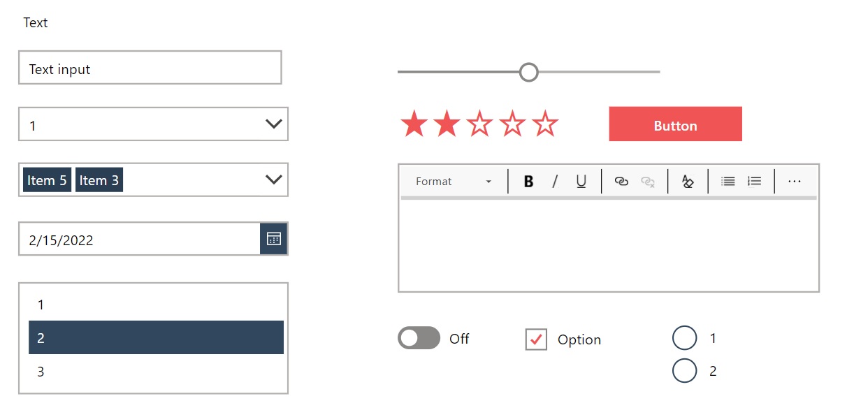
Now that we have a color palette, fonts, sizes and icons for our custom theme the next step is to choose a default value for every property that could appear inside a control. A control is any element in an app a user can interact with: a text input, a dropdown, a button, etc. Figuring out the defaults in advance makes it easier to maintain a consistent style in the app.
Write this code in the OnStart property of the app.
Set(
    gblAppDefaults,
    {
        BorderColor: gblAppColors.GrayMedium,
        BorderStyle: BorderStyle.None,
        BorderThickness: 2,
        CalendarHeaderFill: ColorFade(gblAppColors.Primary1, -30%),
        CheckboxBorderColor: gblAppColors.GrayMediumDark,
        CheckmarkFill: gblAppColors.Primary2,
        ChevronBackground: gblAppColors.White,
        ChevronDisabledBackground: gblAppColors.GrayLight,
        ChevronDisabledFill: gblAppColors.GrayMedium,
        ChevronFill: gblAppColors.GrayDark,
        ChevronHoverBackground: gblAppColors.GrayMediumLight,
        ChevronHoverFill: gblAppColors.GrayDark,
        Color: gblAppColors.Black,
        DisabledBorderColor: Transparent,
        DisabledColor: gblAppColors.GrayMedium,
        DisabledFill: gblAppColors.GrayLight,
        DisabledSelectionColor: gblAppColors.GrayMedium,
        DisabledSelectionFill: gblAppColors.GrayMedium,
        FalseFill: gblAppColors.GrayMediumDark,
        FalseHoverFill: gblAppColors.GrayDark,
        Fill: gblAppColors.White,
        FocusedBorderColor: Transparent,
        FocusedBorderThickness: 4,
        Font: Font.'Segoe UI',
        FontWeight: FontWeight.Semibold,
        HandleActiveFill: gblAppColors.White,
        HandleFill: gblAppColors.White,
        HandleHoverFill: gblAppColors.White,
        Height: 40,
        HoverBorderColor: ColorFade(gblAppColors.Primary1, -30%),
        HoverColor: gblAppColors.White,
        HoverDateFill: gblAppColors.GrayMedium,
        HoverFill: ColorFade(gblAppColors.Primary1, -10%),
        IconBackground: gblAppColors.Primary1,
        PaddingBottom: 5,
        PaddingLeft: 12,
        PaddingRight: 5,
        PaddingTop: 5,
        PressedBorderColor: gblAppColors.Primary1,
        PressedColor: gblAppColors.White,
        PressedFill: ColorFade(gblAppColors.Primary1, -30%),
        RadioBorderColor: gblAppColors.Primary1,
        RadioSelectionFill: gblAppColors.Primary1,
        RadiusBottomLeft: 0,
        RadiusBottomRight: 0,
        RadiusTopLeft: 0,
        RadiusTopRight: 0,
        RailFill: gblAppColors.GrayMedium,
        RailHoverFill: ColorFade(gblAppColors.Primary1, 80%),
        RatingFill: gblAppColors.Primary2,
        SelectedDateFill: gblAppColors.Primary1,
        SelectionFill: gblAppColors.Primary1,
        Size: gblAppFonts.Size.Regular,
        TrueFill: gblAppColors.Primary1,
        TrueHoverFill: ColorFade(gblAppColors.Primary1, -30%),
        ValueFill: gblAppColors.GrayMediumDark,
        ValueHoverFill: gblAppColors.Primary1
    }
);Code language: CSS (css)
Defining Power Apps Controls Styles
Each control must have its style applied manually. The pre-work we’ve done will make it go faster, but its still tedious to do the 1st time. Fortunately, the next time we need a custom theme we can work from the same template. To cut-down on repetition I like to have a copy of each control saved on a special screen in the app that is only accessible in studio-mode.
For each control type, define the style as shown below and place this code in the OnStart property of the app.
Set(
varAppStyles,
{
// COMBO BOX (all default styles)
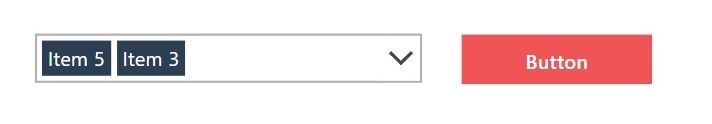
ComboBox: {
BorderColor: gblAppDefaults.BorderColor,
ChevronBackground: gblAppDefaults.ChevronBackground,
ChevronDisabledBackground: gblAppDefaults.ChevronDisabledBackground,
ChevronDisabledFill: gblAppDefaults.ChevronDisabledFill,
ChevronFill: gblAppDefaults.ChevronFill,
ChevronHoverBackground: gblAppDefaults.ChevronHoverBackground,
ChevronHoverFill: gblAppDefaults.ChevronHoverFill,
Color: gblAppDefaults.Color,
DisabledBorderColor: gblAppDefaults.DisabledBorderColor,
DisabledColor: gblAppDefaults.DisabledColor,
DisabledFill: gblAppDefaults.DisabledFill,
Fill: gblAppDefaults.Fill,
Font: gblAppDefaults.Font,
HoverBorderColor: gblAppDefaults.HoverBorderColor,
HoverColor: gblAppDefaults.HoverColor,
HoverFill: gblAppDefaults.HoverFill,
PressedBorderColor: gblAppDefaults.PressedBorderColor,
PressedColor: gblAppDefaults.PressedColor,
PressedFill: gblAppDefaults.PressedFill,
SelectionFill: gblAppDefaults.SelectionFill,
Size: gblAppDefaults.Size
},
// BUTTON (default styles + overrides)
Button: {
BorderColor: gblAppColors.Primary2,
DisabledBorderColor: gblAppDefaults.DisabledBorderColor,
DisabledColor: gblAppDefaults.DisabledColor,
DisabledFill: gblAppDefaults.DisabledFill,
Fill: gblAppColors.Primary2,
FocusedBorderColor: gblAppDefaults.FocusedBorderColor,
Font: gblAppDefaults.Font,
FontWeight: gblAppDefaults.FontWeight,
HoverBorderColor: gblAppColors.Primary2,
HoverColor: gblAppDefaults.HoverColor,
HoverFill: ColorFade(gblAppColors.Primary2, -10%),
PressedBorderColor: gblAppColors.Primary2,
PressedColor: gblAppDefaults.PressedColor,
PressedFill: ColorFade(gblAppColors.Primary2, -30%),
RadiusBottomLeft: gblAppDefaults.RadiusBottomLeft,
RadiusBottomRight: gblAppDefaults.RadiusBottomRight,
RadiusTopLeft: gblAppDefaults.RadiusTopLeft,
RadiusTopRight: gblAppDefaults.RadiusTopRight,
Size: gblAppDefaults.Size
}
/*
Add the rest of the controls here
*/
}
)Code language: JavaScript (javascript)
Full Custom Theme Code Block For App OnStart
Once the custom theme is fully-completed the code block in the app’s OnStart property should look like this:
// COLOR PALETTE
Set(
    gblAppColors,
    {
        // Primary Colors
        Primary1: ColorValue("#30475E"),      // Navy Blue
        Primary2: ColorValue("#F05454"),      // Light Red
        Primary3: ColorValue("#222831"),      // Dark Blue
        Primary4: ColorValue("#DDDDDD"),      // Light Gray

        // Accent Colors
        Black: ColorValue("#000000"),
        Cyan: ColorValue("#17A2B8"),
        Green: ColorValue("#28A745"),
        Orange: ColorValue("#FD7E14"),
        Red: ColorValue("#DC3545"),
        Teal: ColorValue("#20C997"),
        White: ColorValue("#FFFFFF"),
        Yellow: ColorValue("#FFC107"),

        // Neutral Colors
        GrayDark: ColorValue("#484644"),
        GrayMediumDark: ColorValue("#8A8886"),
        GrayMedium: ColorValue("#B3b0AD"),
        GrayMediumLight: ColorValue("#D2D0CE"),
        GrayLight: ColorValue("#F3F2F1")
    }
);
// FONTS & SIZES
Set(
    gblAppFonts,
    {
        Heading: "Roboto, Open Sans",
        Body: "Lato",
        Size: {
            Tiny: 10,
            Regular: 12,
            Subtitle: 14,
            Title: 20,
            Huge: 28
        }
    }
)
// ICONS
Set(
    gblAppIcons,
    {
        Checklist: "data:image/svg+xml;utf8, %3Csvg%20%20viewBox%3D%270%200%202048%202048%27%20xmlns%3D%27http%3A%2F%2Fwww.w3.org%2F2000%2Fsvg%27%3E%3Cpath%20d%3D%27M256%200h1536v2048H256V0zm1408%201920V128H384v1792h1280zM1536%20512v128h-512V512h512zm0%20512v128h-512v-128h512zm0%20512v128h-512v-128h512zM941%20429L704%20666%20531%20493l90-90%2083%2083%20147-147%2090%2090zm0%20512l-237%20237-173-173%2090-90%2083%2083%20147-147%2090%2090zm0%20512l-237%20237-173-173%2090-90%2083%2083%20147-147%2090%2090z%27%20fill%3D%27%230078d4%27%3E%3C%2Fpath%3E%3C%2Fsvg%3E",
        Checkmark: "data:image/svg+xml;utf8, %3Csvg%20%20viewBox%3D%270%200%202048%202048%27%20xmlns%3D%27http%3A%2F%2Fwww.w3.org%2F2000%2Fsvg%27%3E%3Cpath%20d%3D%27M1024%200q141%200%20272%2036t244%20104%20207%20160%20161%20207%20103%20245%2037%20272q0%20141-36%20272t-104%20244-160%20207-207%20161-245%20103-272%2037q-141%200-272-36t-244-104-207-160-161-207-103-245-37-272q0-141%2036-272t104-244%20160-207%20207-161T752%2037t272-37zm603%20685l-136-136-659%20659-275-275-136%20136%20411%20411%20795-795z%27%20fill%3D%27%2300ad56%27%3E%3C%2Fpath%3E%3C%2Fsvg%3E",
        Pylon: "data:image/svg+xml;utf8, %3Csvg%20%20viewBox%3D%270%200%202048%202048%27%20xmlns%3D%27http%3A%2F%2Fwww.w3.org%2F2000%2Fsvg%27%3E%3Cpath%20d%3D%27M1920%201920v128H128v-128h270l96-384h802l-32-128H526l64-256h610l-32-128H622l224-896h356l448%201792h270z%27%20fill%3D%27%23ca5010%27%3E%3C%2Fpath%3E%3C%2Fsvg%3E",
        Flashlight: "data:image/svg+xml;utf8, %3Csvg%20%20viewBox%3D%270%200%202048%202048%27%20xmlns%3D%27http%3A%2F%2Fwww.w3.org%2F2000%2Fsvg%27%3E%3Cpath%20d%3D%27M2048%20384v1152h-475l-256-256H0V640h1317l256-256h475zM128%201152h1152V768H128v384zm1499%20256h37V512h-37l-219%20219v458l219%20219zm293-896h-128v896h128V512zm-832%20384q26%200%2045%2019t19%2045q0%2026-19%2045t-45%2019q-26%200-45-19t-19-45q0-26%2019-45t45-19z%27%20fill%3D%27%2369797e%27%3E%3C%2Fpath%3E%3C%2Fsvg%3E"
    }
)
// DEFAULT STYLES
Set(
    gblAppDefaults,
    {
        BorderColor: gblAppColors.GrayMedium,
        BorderStyle: BorderStyle.None,
        BorderThickness: 2,
        CalendarHeaderFill: ColorFade(gblAppColors.Primary1, -30%),
        CheckboxBorderColor: gblAppColors.GrayMediumDark,
        CheckmarkFill: gblAppColors.Primary2,
        ChevronBackground: gblAppColors.White,
        ChevronDisabledBackground: gblAppColors.GrayLight,
        ChevronDisabledFill: gblAppColors.GrayMedium,
        ChevronFill: gblAppColors.GrayDark,
        ChevronHoverBackground: gblAppColors.GrayMediumLight,
        ChevronHoverFill: gblAppColors.GrayDark,
        Color: gblAppColors.Black,
        DisabledBorderColor: Transparent,
        DisabledColor: gblAppColors.GrayMedium,
        DisabledFill: gblAppColors.GrayLight,
        DisabledSelectionColor: gblAppColors.GrayMedium,
        DisabledSelectionFill: gblAppColors.GrayMedium,
        FalseFill: gblAppColors.GrayMediumDark,
        FalseHoverFill: gblAppColors.GrayDark,
        Fill: gblAppColors.White,
        FocusedBorderColor: Transparent,
        FocusedBorderThickness: 4,
        Font: Font.'Segoe UI',
        FontWeight: FontWeight.Semibold,
        HandleActiveFill: gblAppColors.White,
        HandleFill: gblAppColors.White,
        HandleHoverFill: gblAppColors.White,
        Height: 40,
        HoverBorderColor: ColorFade(gblAppColors.Primary1, -30%),
        HoverColor: gblAppColors.White,
        HoverDateFill: gblAppColors.GrayMedium,
        HoverFill: ColorFade(gblAppColors.Primary1, -10%),
        IconBackground: gblAppColors.Primary1,
        PaddingBottom: 5,
        PaddingLeft: 12,
        PaddingRight: 5,
        PaddingTop: 5,
        PressedBorderColor: gblAppColors.Primary1,
        PressedColor: gblAppColors.White,
        PressedFill: ColorFade(gblAppColors.Primary1, -30%),
        RadioBorderColor: gblAppColors.Primary1,
        RadioSelectionFill: gblAppColors.Primary1,
        RadiusBottomLeft: 0,
        RadiusBottomRight: 0,
        RadiusTopLeft: 0,
        RadiusTopRight: 0,
        RailFill: gblAppColors.GrayMedium,
        RailHoverFill: ColorFade(gblAppColors.Primary1, 80%),
        RatingFill: gblAppColors.Primary2,
        SelectedDateFill: gblAppColors.Primary1,
        SelectionFill: gblAppColors.Primary1,
        Size: gblAppFonts.Size.Regular,
        TrueFill: gblAppColors.Primary1,
        TrueHoverFill: ColorFade(gblAppColors.Primary1, -30%),
        ValueFill: gblAppColors.GrayMediumDark,
        ValueHoverFill: gblAppColors.Primary1
    }
);
//CONTROL STYLES
Set(
    varAppStyles,
    {
    // COMBO BOX (all default styles)
    ComboBox: {
        BorderColor: gblAppDefaults.BorderColor,
        ChevronBackground: gblAppDefaults.ChevronBackground,
        ChevronDisabledBackground: gblAppDefaults.ChevronDisabledBackground,
        ChevronDisabledFill: gblAppDefaults.ChevronDisabledFill,
        ChevronFill: gblAppDefaults.ChevronFill,
        ChevronHoverBackground: gblAppDefaults.ChevronHoverBackground,
        ChevronHoverFill: gblAppDefaults.ChevronHoverFill,
        Color: gblAppDefaults.Color,
        DisabledBorderColor: gblAppDefaults.DisabledBorderColor,
        DisabledColor: gblAppDefaults.DisabledColor,
        DisabledFill: gblAppDefaults.DisabledFill,
        Fill: gblAppDefaults.Fill,
        Font: gblAppDefaults.Font,
        HoverBorderColor: gblAppDefaults.HoverBorderColor,
        HoverColor: gblAppDefaults.HoverColor,
        HoverFill: gblAppDefaults.HoverFill,
        PressedBorderColor: gblAppDefaults.PressedBorderColor,
        PressedColor: gblAppDefaults.PressedColor,
        PressedFill: gblAppDefaults.PressedFill,
        SelectionFill: gblAppDefaults.SelectionFill,
        Size: gblAppDefaults.Size
    },
    // BUTTON (default styles + overrides)
    Button: {
        BorderColor: gblAppColors.Primary2,
        DisabledBorderColor: gblAppDefaults.DisabledBorderColor,
        DisabledColor: gblAppDefaults.DisabledColor,
        DisabledFill: gblAppDefaults.DisabledFill,
        Fill: gblAppColors.Primary2,
        FocusedBorderColor: gblAppDefaults.FocusedBorderColor,
        Font: gblAppDefaults.Font,
        FontWeight: gblAppDefaults.FontWeight,
        HoverBorderColor: gblAppColors.Primary2,
        HoverColor: gblAppDefaults.HoverColor,
        HoverFill: ColorFade(gblAppColors.Primary2, -10%),
        PressedBorderColor: gblAppColors.Primary2,
        PressedColor: gblAppDefaults.PressedColor,
        PressedFill: ColorFade(gblAppColors.Primary2, -30%),
        RadiusBottomLeft: gblAppDefaults.RadiusBottomLeft,
        RadiusBottomRight: gblAppDefaults.RadiusBottomRight,
        RadiusTopLeft: gblAppDefaults.RadiusTopLeft,
        RadiusTopRight: gblAppDefaults.RadiusTopRight,
        Size: gblAppDefaults.Size
    }
    /*
        Add the rest of the controls here
    */
   }
)Code language: JavaScript (javascript)
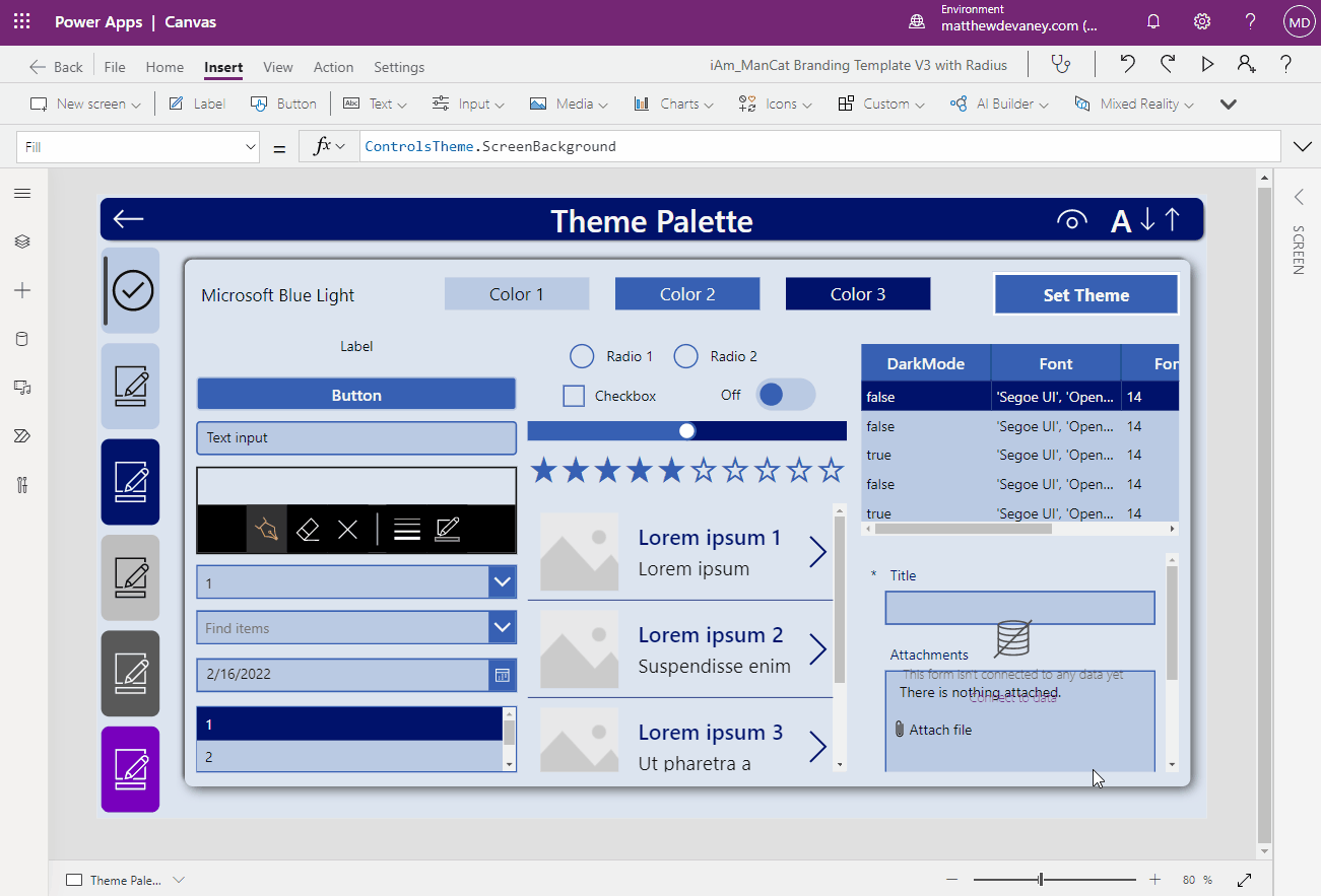
Using A Pre-Built Branding Template App
Building your own Power Apps custom theme is a lot of work. Sancho Harker has created a free Branding Template App to make custom themes easy.
You can the Branding Template App to quickly generate themes and preview how they look in your app. All you have to do is choose 3 primary colors and it will apply them to the app as shown below. We can also override the auto-generated themes and manually define the style for each property of a control type. Both methods are possible here.
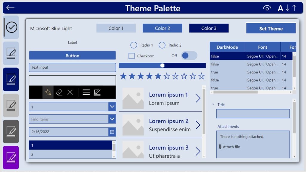
The Branding Template can hold several different themes and change them on-the-fly. This gives us the ability to build a light-mode theme, a dark-mode theme, a high-contrast theme and include them all in the same app. It also generates new controls with the theme already applied to them. This feature is amazing!
Did You Enjoy This Article? 😺
Subscribe to get new Copilot Studio articles sent to your inbox each week for FREE
Questions?
If you have any questions about Create A Power Apps Custom Theme – Colors, Fonts, Icons & Controls please leave a message in the comments section below. You can post using your email address and are not required to create an account to join the discussion.


Nice.
Its painful not doing this one time.
Tx for the icon sets and free templates.
Gus,
You’re welcome. Cheers!
Dear Mathew,
Really useful tips for Custom Themes for PowerApps. Thank You.
Thanks for interesting article. It may be some time before I ret-con our existing apps, but this looks like an interesting way to get some sort of style set on new apps.
Just a small editorial point: where varAppStyles is set, there should be a curly bracket { before ComboBox. This will allow the app to use the settings.
James,
Thanks for alerting me to the typo. It’s now fixed 🙂
Thank You so much for this valuable and comprehensive post! No one who is seriously developing with Power Apps should do it any other way!
Michael,
I appreciate you taking the time to reach out and let me know how much you enjoyed the article!
Thanks for taking the time to put this stuff together.
A great timesaver for the rest of us 🙂
Arild,
I’m glad you enjoyed the resources I use for theming. It took a month to gradually write this in a way that makes sense. It appears it was worth the effort 🙂
Hey Matt – thanks for the write-up.
Can you think of any way to pre-configure native controls in an app template etc such that when my citizen devs drag a control it’s already wired up with the style variables? We can go the route of a design-time template screen but the native option is nice too.
Many thanks!
Mark,
The solution provided by IAmManCat (Sancho Harker) has all of the styles and variables pre-wired up. I think it would require some training for your citizen devs to get started with but its a path towards what you want. When you ‘spawn’ a new control it has all the variables in it already. Its so good! Have you tried it?
Thanks for sharing your knowledge. Great blog!
Kelly,
You’re welcome. I’m glad you enjoyed it.
The Fluent UI Power BI dashboard is great !
Thank you Jon 🙂
Matthew, thanks for setting this out so clearly. I currently use a Theme file – colours only (in a SharePoint list) and import that on start up as a collection. Are there performance benefits to creating the values as variables in App OnStart (as opposed to storing the values in SharePoint and bringing them in as a collection)?
Nicola,
Your method is exactly what you should be doing. Once you understanding theming the next step is to store those themes in a datasource for re-use across the entire organization. Superb!
Thank You so much for sharing all useful information. Create A Power Apps Custom Theme – Colors, Fonts, Icons & Controls this information is very helpful for me! I found some intresting information about reaction time test, here you check your reaction time with this test.
Hannie,
Cool article.
Matthew is it possible to set Default design for all control from App Start ? so that when a control dragged to the screen all default design set for the controls set autmatically.
Pradipta,
Yes. Use the Branding Solution by Sancho Harker that I shared in this article. When you use his branding template all controls dragged to the screen have the proper formatting.
Is there risk of negative impact to app performance with adding these to OnStart?
Jamie,
Adding static values such as themes to the OnStart is the lowest performance impact you could have on load times. Oppositely, calling a datasource is something I believe should not be done in OnStart.
Thank you for this article
Setting a custom theme in Power Apps for all the controls and their properties is a nightmare but pays off when a change is needed. I hoped for an easier way to do it as I saw the article “Branding Template App”, but unfortunately there is not yet.
Let’s hope for a custom-pre-build-theme-template in Power Apps.
Daniela,
Agreed. Very very much agreed. I want custom-pre-build-theme-templates too.
Thanks for this article Matthew. I’m just starting my theme journey and also came across this Microsoft article on PowerApps themes for canvas apps – https://learn.microsoft.com/en-us/power-platform/guidance/coe/theming-components. Is there a reason themes aren’t as useful / effective when using the Theme Gallery App mentioned in the article?
Having said this, I’m having trouble trying to find said “Theme Gallery App”….
Sandy,
I don’t favour The CoE Theming component because it requires Dataverse. Dataverse needs a premium license. Many of readers are SharePoint only (non-premium). Therefore the CoE theming component won’t work for them.
In my humble opinion, custom theming should be built into Power Apps.
Hi Matthew,
This looks really cool. It would save me a whole load of time but it’s not working for me at the moment.
I am guessing that varAppStyles is a special variable that automagically populates control defaults – otherwise I don’t understand how new controls know where to get their properties from.
Here’s my problem …
Any ideas?
Trevor,
varAppStyles is not automagical. It will not automatically populate control properties. You have to apply the variable to each control property one by one. It is tedious. But that’s all Power Apps offers.
If you want a more automated method try the branding template I suggested at the end of the article.
Hi Matthew,
First Thank you for this article, I have just started creating a power app for my 6 months internship, and I wanted to make sure that my app has a Custom Theme so that when a client wants to make a change in a specific color or font, it is easier to just change the code.
When I took the code you provided and I copied it into the OnStart section of the app( and I corrected the missing ‘;’ and wrote “Color.Transparent” instead of “Transparent” cause I have the newer version of power apps which requires me to write “Color.Transparent” )
After I did all that, the code appears to have no mistakes, yet after I run the app, the code is not working, the button and controllers are still in the old default theme.
Syrine,
You will have to apply your theme to each Power Apps manually. Unfortunately, setting the variable will not do it automatically. I wish Power Apps had a built in theming system.
Hi matthew,
i have been trying to use this code for multiple times. As soon as I put it in the On start field it works but as soon as I save and close the App and return back everything is just black, i have the Same issue with the solution provided by IAmManCat (Sancho Harker).
Do you have any Idea how i can fix this? I would be greatful for any Advice.
Selin,
More context needed. Are you getting errors?
Hi Matthew, I was wondering, how exactly would you use Sancho’s app?
As in, would you upload it into an app you’re building as the backend settings pages so the user can make their own changes?
Would you add it, so the developer can use the capability of having the theme already applied to new controls?
Would you just have it so you can set a theme with the 3 colours and then copy and paste the app.onstart code to the new app?
Or would you just use it for inspiration and colour ideas?
Laura,
Here’s a pretty good video introduction on how to use Sancho’s branding template.
https://www.youtube.com/watch?v=JNr19mXwJDY
Hi Mathew, Great Content!
It’s been almost 2 years since you created this post. Is this still the easiest way to use a custom theme, or are there other alternatives?
Do you know if Microsoft intends to solve this in the near future? It really is a pain to have to do it this way.
Thanks for sharing.
Daniel,
These are still the best ways we have to create a custom theme for classic controls. Modern controls look like they are going to support user defined customer themes in some way. But it’s unknown how much Microsoft will allow us to customize Modern Controls because of Fluent 2 standards/guidelines. I for one believe it is 100% necessary to allow fully custom theming and there should not be limits.
Dan,
I’m waiting for custom theming on modern controls. It’s going to get much easier soon.
Hi Matthew,
Can we use your method to customize modern control theme?
Thanks,
XZ
XLZ,
Sorry, nope. This is only for the classic controls.