5 Power Apps Gallery Design UX Tips
An app built with Power Apps can look amazing if you have a strong understanding of design principles and UI UX skills. Most citizen developers don’t. And that’s OK, neither did I when I started building Power Apps. But what I want everyone to know is you can make great designs on this platform if you learn the right skills. In this article, I’ll show you how create an awesome looking gallery screen using 5 simple Power Apps design tips.
Introduction: The Gallery Screen
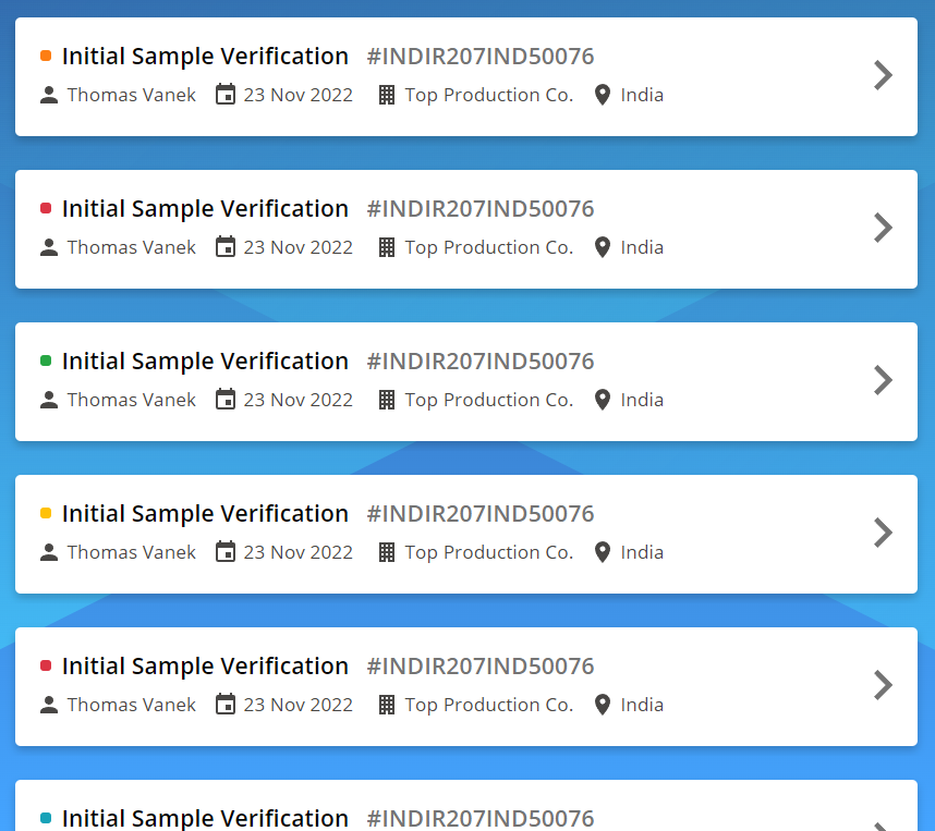
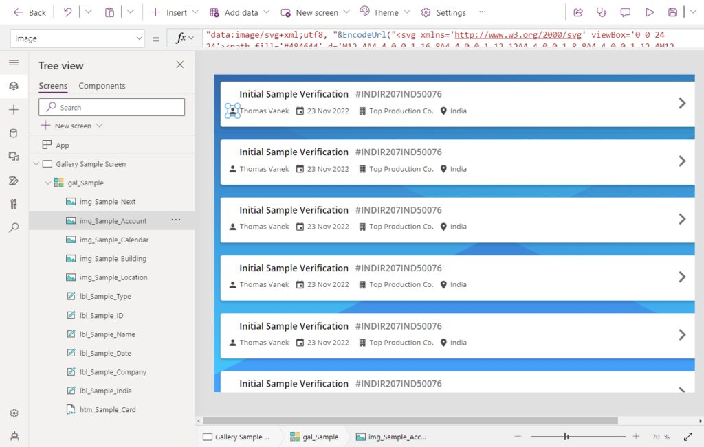
In this tutorial, our goal will be to build the gallery shown below.
1. High Quality SVG Background
I enjoy using SVG images as the backgrounds for my apps for two reasons. Number one, SVG images are high-quality at any screen size. Number two, their patterns give users something more visually interesting to look at than a solid color background. So what is the best website to find cool backgrounds? It’s the aptly named SVGBackgrounds.com. 😉
My buddy Tim Shaw gets full credit for showing me this awesome Power Apps design tip!
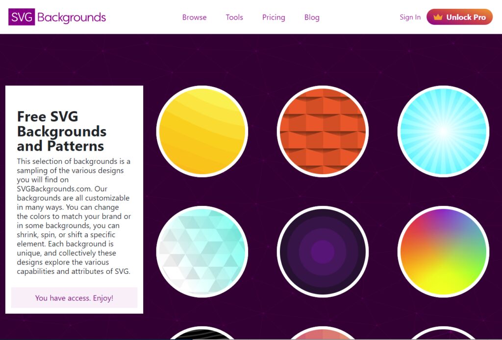
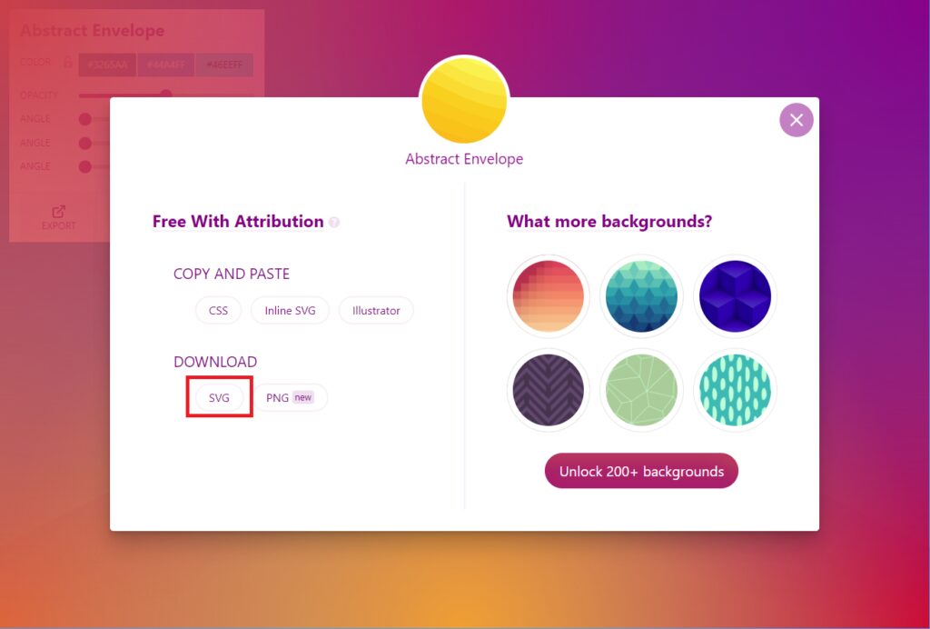
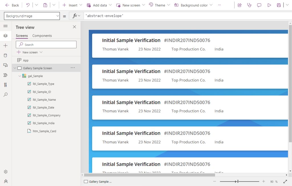
There are several free SVG backgrounds to choose from. I decided to use Abstract Envelope for my app with the colors #3265AA, #44A4FF, #46EEFF. Once you’ve found picked your background, click the export icon to get the image file.
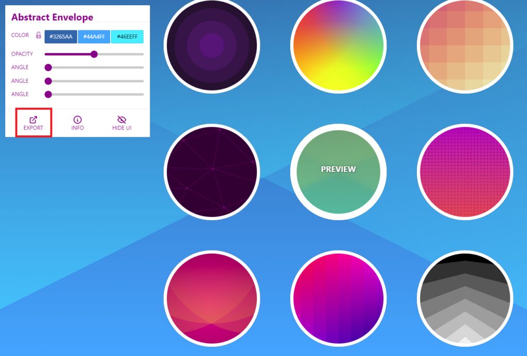
Then select Download SVG.
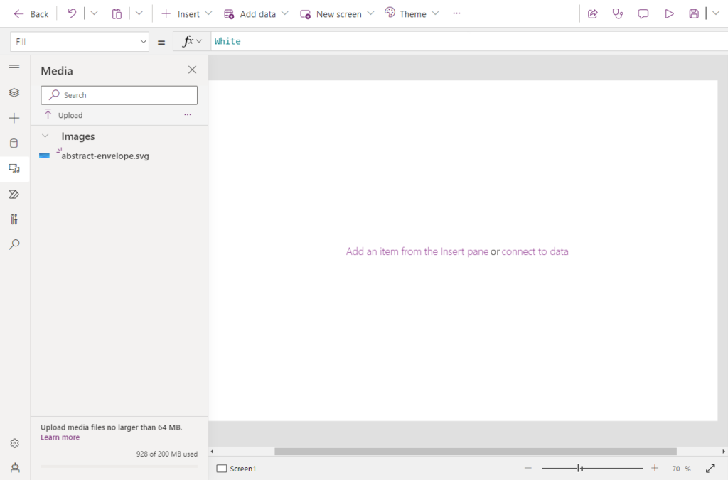
Go to Power Apps studio and create a new app from blank. Upload the SVG image file using the Media menu.
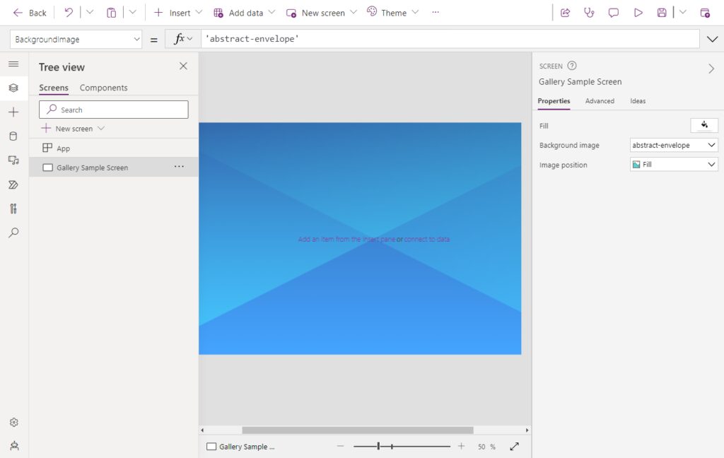
Set the BackgroundImage property of the screen to the name of the SVG image.
2. UX Cards With Drop Shadows
A UX card is a container that shows a few short, related pieces of information about a gallery item. Don’t make UX cards look that flat and boring. Make them look cool using drop shadows. 😎
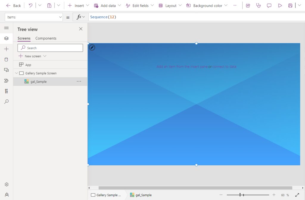
Insert a blank vertical gallery onto the screen and apply the following properties to these values.
Height: App.Height
Items: Sequence(12)
ShowScrollbar: false
TemplateFill: Transparent
TemplatePadding: 0
TemplateSize: 140
Width: App.Width
X: 0
Y: 0Code language: HTTP (http)
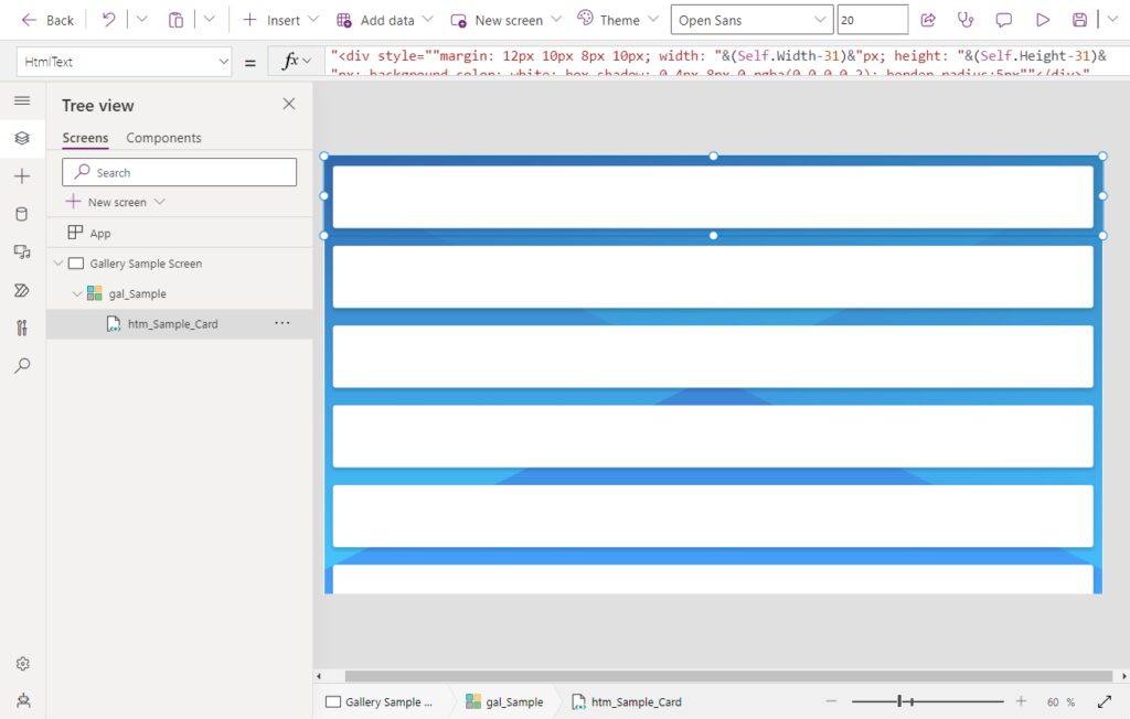
Then create an HTML Text control inside the gallery to use as the card.
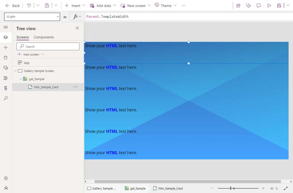
Set the height and width properties of the HTML text control to fill the entire gallery row.
Height: Parent.TemplateHeight
Width: Parent.TemplateWidth
X: 0
Y: 0Code language: HTTP (http)
Then set the HtmlText property to this code. It uses inline CSS to create the UX card with a drop shadow.
"<div style=""margin: 12px 10px 8px 10px; width: "&(Self.Width-31)&"px; height: "&(Self.Height-31)&"px; background-color: white; box-shadow: 0 4px 8px 0 rgba(0,0,0,0.2); border-radius:5px""></div>"Code language: PHP (php)
It really looks amazing doesn’t it? I did not come up with this code on my own. I pieced it together by looking at examples from Geetha Silvasailam, W3 Schools and making adjustments until it looked great.
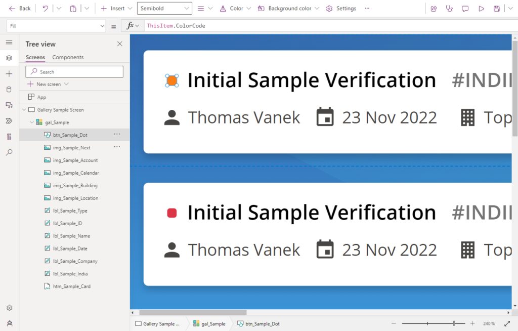
3. Text Hierarchy Using Size, Color & Font Weight
I’m no graphic designer, but I do know that establishing a typographic hierarchy is important when designing a card. 🤓 It means showing the reader what to focus on using size, color, font weight, direction, etc. Of all the Power Apps design tips, this one is my favorite because it’s so simple yet powerful.
In the example below, our eyes are first drawn to the title “Initial Sample Verification”, then to the sample ID number, and finally the less important information on the 2nd row.
Insert a label with the text “Initial Sample Verification”.
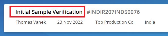
Use these properties to style the label. This label has the biggest size, the darkest color, and the heaviest font weight. App users will look there first.
Font: Font.'Open Sans'
FontWeight: FontWeight.Semibold
Color: ColorValue("#000000")
Size: 16Code language: HTTP (http)
Next, add another label with the ID number “#INDIR207IND50076”.
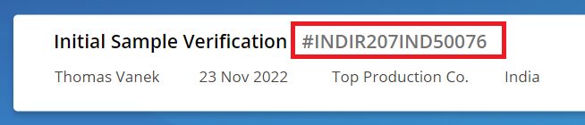
Use these properties to style the label. App users will look at this label 2nd because it has the same size and font weight as the title but it has a slightly lighter color. Positioning is important here too. The label is placed to the right of the title.
Font: Font.'Open Sans'
FontWeight: FontWeight.Semibold
Color: ColorValue("#747474")
Size: 16Code language: HTTP (http)
Insert four more labels on the 2nd row of the card like this.
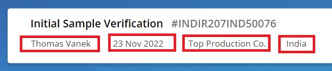
Give all of the labels the following properties. These labels have smaller text, with a normal font weight, and a light color. App users will look here last.
Font: Font.'Open Sans'
FontWeight: FontWeight.Normal
Color: ColorValue("#484644")
Size: 13Code language: HTTP (http)
4. Custom SVG Icons
Power Apps comes with a set of standards icons. They are alright 😐. We can get better ones though by using custom SVG image code instead.
I offer a set of 2,000 Fluent UI SVG icons on my website. In this example, we are going to use Google’s Material Design icons instead from materialdesignicons.com.
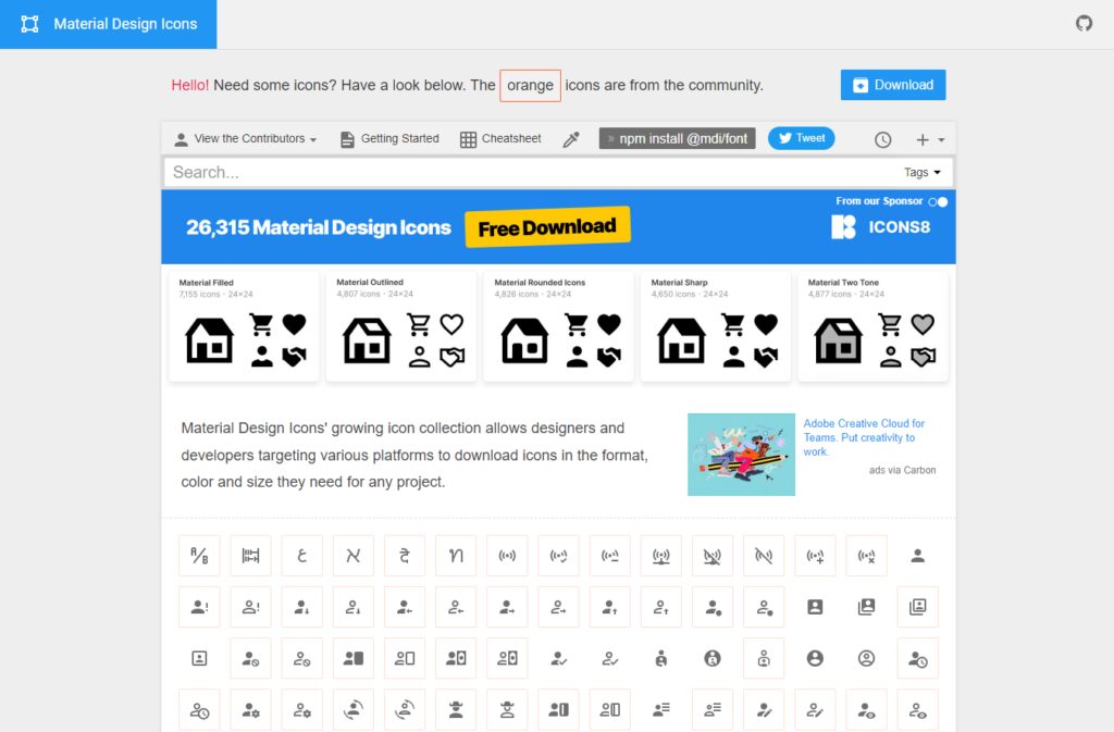
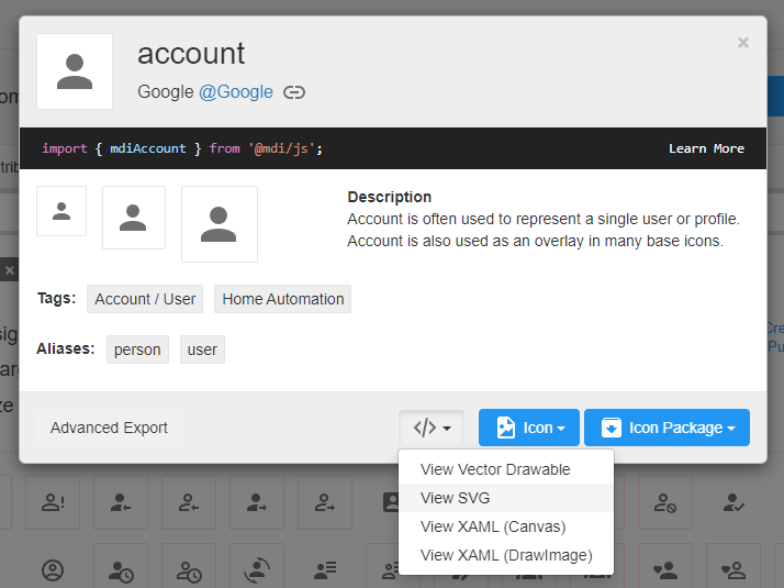
Search the icon set to find the Account icon. Select View SVG and then copy the SVG code that appears.
Go back to Power Apps and add an Image control into the gallery.
Then paste the SVG code into the Image property of the Image control with a few key edits I describe in this post:
- Change all double quotes inside the SVG tag to single quotes
- Encode the SVG code as a URL
- Add the data type at the start
To save you time, here’s all of the code and icon’s I used in my example
Account icon

"data:image/svg+xml;utf8, "&EncodeUrl("<svg xmlns='http://www.w3.org/2000/svg' viewBox='0 0 24 24'><path fill='#484644' d='M12,4A4,4 0 0,1 16,8A4,4 0 0,1 12,12A4,4 0 0,1 8,8A4,4 0 0,1 12,4M12,14C16.42,14 20,15.79 20,18V20H4V18C4,15.79 7.58,14 12,14Z' /></svg>")Code language: HTML, XML (xml)
Calendar icon

"data:image/svg+xml;utf8, "&EncodeUrl("<svg xmlns='http://www.w3.org/2000/svg' viewBox='0 0 24 24'><path fill='#484644' d='M19,19H5V8H19M16,1V3H8V1H6V3H5C3.89,3 3,3.89 3,5V19A2,2 0 0,0 5,21H19A2,2 0 0,0 21,19V5C21,3.89 20.1,3 19,3H18V1M17,12H12V17H17V12Z' /></svg>")Code language: HTML, XML (xml)
Building icon

"data:image/svg+xml;utf8, "&EncodeUrl("<svg xmlns='http://www.w3.org/2000/svg' viewBox='0 0 24 24'><path fill='#484644' d='M5,3V21H11V17.5H13V21H19V3H5M7,5H9V7H7V5M11,5H13V7H11V5M15,5H17V7H15V5M7,9H9V11H7V9M11,9H13V11H11V9M15,9H17V11H15V9M7,13H9V15H7V13M11,13H13V15H11V13M15,13H17V15H15V13M7,17H9V19H7V17M15,17H17V19H15V17Z' /></svg>")Code language: HTML, XML (xml)
Map-marker icon

"data:image/svg+xml;utf8, "&EncodeUrl("<svg xmlns='http://www.w3.org/2000/svg' viewBox='0 0 24 24'><path fill='#484644' d='M12,11.5A2.5,2.5 0 0,1 9.5,9A2.5,2.5 0 0,1 12,6.5A2.5,2.5 0 0,1 14.5,9A2.5,2.5 0 0,1 12,11.5M12,2A7,7 0 0,0 5,9C5,14.25 12,22 12,22C12,22 19,14.25 19,9A7,7 0 0,0 12,2Z' /></svg>")Code language: HTML, XML (xml)
Chevron-right icon

"data:image/svg+xml;utf8, "&EncodeUrl("<svg xmlns='http://www.w3.org/2000/svg' viewBox='0 0 24 24'><path fill='#747474' d='M8.59,16.58L13.17,12L8.59,7.41L10,6L16,12L10,18L8.59,16.58Z' /></svg>")Code language: HTML, XML (xml)
5. Brightly Colored Item Status Dots
I’ll be honest here. I just added a colored dot to each card to make it look interesting 🙄.
No real-world design should do this. Instead, a real-world design should use color to indicate an item’s status, it’s category, or it’s connection to other gallery items. Nonetheless, I’ll show how I did it.
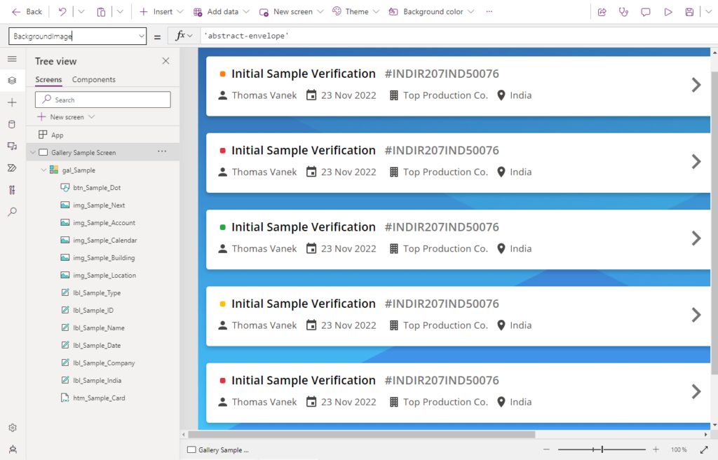
Replace the gallery’s Items property code with this code. Each record in the table contains a color.
Table(
    {ColorCode: ColorValue("#FD7E14")}, // Orange
    {ColorCode: ColorValue("#DC3545")}, // Red
    {ColorCode: ColorValue("#28A745")}, // Green
    {ColorCode: ColorValue("#FFC107")}, // Yellow
    {ColorCode: ColorValue("#DC3545")}, // Red
    {ColorCode: ColorValue("#17A2B8")}, // Cyan
    {ColorCode: ColorValue("#FD7E14")}, // Orange
    {ColorCode: ColorValue("#DC3545")}, // Red
    {ColorCode: ColorValue("#28A745")}, // Green
    {ColorCode: ColorValue("#FFC107")}, // Yellow
    {ColorCode: ColorValue("#DC3545")}, // Red
    {ColorCode: ColorValue("#17A2B8")}  // Cyan
)Code language: JavaScript (javascript)
Then insert a button control into the gallery.
Style the button using these properties. That’s all. We’re done making an awesome looking gallery 😎.
BorderRadius: 3
BorderStyle: BorderStyle.None
Fill: ThisItem.ColorCode
Height: 10
Width: 10Code language: HTTP (http)
Did You Enjoy This Article? 😺
Subscribe to get new Copilot Studio articles sent to your inbox each week for FREE
Questions?
If you have any questions about 5 Power Apps Design Tips To Make An Awesome Looking Gallery please leave a message in the comments section below. You can post using your email address and are not required to create an account to join the discussion.


Nice.
Thank you for this.
Happy new year.
Kylz,
I recognize you from Twitter 🐦. Thank you 🙂
Thank you for this !
Nothing very important, but I noticed a missing > in your shadow box markup for the div element 😉
Alexsolex,
Many thanks. It would be super confusing for most people who are trying to figure out why the drop shadow did not appear.
Thanks for another great set of tips!
I would like to add to step 5 that you should never use color alone to convey information in a real world app. Color blindness is one of the most common visual impairments so it is a good idea to combine color with a symbol or something that can get the same point across.
Coloring text is usually a bad idea because the lines can be too thin that it is difficult to determine anything beyond “dark” and “light” text. Instead, if using text make the background a color and make sure the text has enough contrast to be able to read. Don’t use colored text on a colored background, instead use black text on a lighter background and white on a darker background.
Just wanted to add that quick. It seemed like it fit with the last one and it is one of the biggest challenges I have seen from an accessibility perspective.
Thanks again for all your tips and tricks!
Brandon,
It’s a valid point. I agree. Maybe I should do a post on accessibility. I’m sure I would learn a few new things while doing it 🙂
I would love to see a post on accessibility if you have the time to create one.
I am colorblind so everything color-related is easy for me to think about but I’m sure there are a whole bunch of other things I could be doing to make things better for end users.
Thanks again for all that you have given to the community!
Brandon,
Yes, I’d love to cover the topic of Accessibility and do an article like “10 Easy Tips To Improve Canvas Apps Accessibility.” In fact its on my backlog. Not scheduled yet mind you, but its on there!
Thank you for the Posting. Your articles are Elegant and Life Savers.
Happy New year!
Jaya,
You’re welcome 🙂
Great tips! I’m surprised you didn’t have one about adding cat images to each screen wherever possible 😉
When referencing the icons on the materialdesignicons website, are you actually pointing to the graphics on their site? Or is the encoding you’re describing something that would work even if their site went down one day?
Nic,
Great question! These SVG graphics will still work if the Material Design Icons website goes down. The images are drawn inside Power Apps using SVG code.
OK that’s great to hear – thank you!
So how would bring style to View/Edit/New Forms? SVG background and SVG Icons. I want to have forms look like Gallary view When I tried your method. Thanks.
David,
I don’t have a tutorial on what you asked for but here’s a screenshot I took one month ago of a form with the same theming. If you did my gallery tutorial I have no doubt you can figure out I pulled this off.
Link:
https://twitter.com/mattbdevaney/status/1602135209721626624
Hi Matthew,
Thank you for the post. It works wonders in my D4T apps, and the client is just WOWed. Quick question, how could I reduce the space between the with blocks. I’ve tried to move the htmltext code but it looks it’s not my friend. 😕
Hi, Matthew ! Thank you for sharing..
Since we will have many elements aligned horizontally, it would be nice to recommend using the horizontal container component.
very usefull post! ♥
Thank you so much for this. Your website and instructions have been very valuable as a developer. I have been stuck on getting the html to size according to the auto height of the largest text label. Any help would be greatly appreciated. Thank you!
Josh,
The good news is, we no longer need this HTML. Containers can do shadow and border radius out-of-the-box now. Suggest you check this out.
https://www.matthewdevaney.com/ridiculously-simple-power-apps-drop-shadow-technique/
This is great, thanks
Cesar,
You’re welcome 🙂