Table Of Contents:
• Creating An App Theme
• Theming Variables Sample Code
• Branding Template
Creating An App Theme
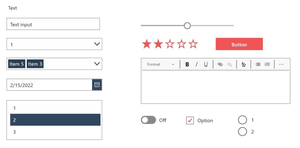
Define an app’s theme in order to achieve a consistent style throughout all screens. Setup theming variables in the app’s OnStart property and manually apply them to each control type.
| Variable Name | Purpose |
| gblAppColors | Color palette for the app |
| gblAppFonts | Heading fonts, body fonts and sizes used in the app |
| gblAppIcons | SVG icons used in the app |
| gblAppDefaults | Default values for common control properties |
Keep a copy of each styled control on a hidden screen. It is more efficient to re-use controls instead of setting up a new control with a style every time.

Theming Variables Sample Code
Use this code in the OnStart property of an app to define its theme.
// App Color Palette
Set(
    gblAppColors,
    {
        // Primary Colors
        Primary1: ColorValue("#30475E"),
        Primary2: ColorValue("#F05454"),
        Primary3: ColorValue("#222831"),
        Primary4: ColorValue("#DDDDDD"),


        // Accent Colors
        Black: ColorValue("#000000"),
        Cyan: ColorValue("#17A2B8"),
        Green: ColorValue("#28A745"),
        Orange: ColorValue("#FD7E14"),
        Red: ColorValue("#DC3545"),
        Teal: ColorValue("#20C997"),
        White: ColorValue("#FFFFFF"),
        Yellow: ColorValue("#FFC107"),

        // Neutral Colors
        GrayDark: ColorValue("#484644"),
        GrayMediumDark: ColorValue("#8A8886"),
        GrayMedium: ColorValue("#B3b0AD"),
        GrayMediumLight: ColorValue("#D2D0CE"),
        GrayLight: ColorValue("#F3F2F1")
    }
);

// App Fonts & Sizes
Set(
    gblAppFonts,
    {
        Heading: "Roboto, Open Sans",
        Body: "Lato",
        Size: {
            Tiny: 10,
            Regular: 13,
            Subtitle: 16,
            Title: 20,
            Huge: 28
        }
    }
)

// App Icons
Set(
   gblAppIcons,
    {
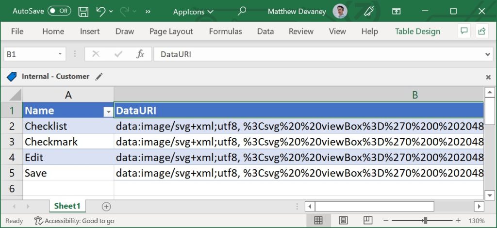
       // SVG icon code is stored in an ‘Import from Excel’ table named AppIcons
       Checklist: LookUp(AppIcons, Name="Checklist", DataURI),
       Checkmark: LookUp(AppIcons, Name="Checkmark", DataURI)
   }
);

// App Default Control Theme
Set(
    gblAppDefaults,
    {
        BorderColor: gblAppColors.GrayMedium,
        BorderStyle: BorderStyle.None,
        BorderThickness: 2,
        CalendarHeaderFill: ColorFade(gblAppColors.Primary1, -30%),
        CheckboxBorderColor: gblAppColors.GrayMediumDark,
        CheckmarkFill: gblAppColors.Primary2,
        ChevronBackground: gblAppColors.White,
        ChevronDisabledBackground: gblAppColors.GrayLight,
        ChevronDisabledFill: gblAppColors.GrayMedium,
        ChevronFill: gblAppColors.GrayDark,
        ChevronHoverBackground: gblAppColors.GrayMediumLight,
        ChevronHoverFill: gblAppColors.GrayDark,
        Color: gblAppColors.Black,
        DisabledBorderColor: Transparent,
        DisabledColor: gblAppColors.GrayMedium,
        DisabledFill: gblAppColors.GrayLight,
        DisabledSelectionColor: gblAppColors.GrayMedium,
        DisabledSelectionFill: gblAppColors.GrayMedium,
        FalseFill: gblAppColors.GrayMediumDark,
        FalseHoverFill: gblAppColors.GrayDark,
        Fill: gblAppColors.White,
        FocusedBorderColor: Transparent,
        FocusedBorderThickness: 4,
        Font: Font.'Segoe UI',
        FontWeight: FontWeight.Semibold,
        HandleActiveFill: gblAppColors.White,
        HandleFill: gblAppColors.White,
        HandleHoverFill: gblAppColors.White,
        Height: 40,
        HoverBorderColor: ColorFade(gblAppColors.Primary1, -30%),
        HoverColor: gblAppColors.White,
        HoverDateFill: gblAppColors.GrayMedium,
        HoverFill: ColorFade(gblAppColors.Primary1, -10%),
        IconBackground: gblAppColors.Primary1,
        PaddingBottom: 5,
        PaddingLeft: 12,
        PaddingRight: 5,
        PaddingTop: 5,
        PressedBorderColor: gblAppColors.Primary1,
        PressedColor: gblAppColors.White,
        PressedFill: ColorFade(gblAppColors.Primary1, -30%),
        RadioBorderColor: gblAppColors.Primary1,
        RadioSelectionFill: gblAppColors.Primary1,
        RadiusBottomLeft: 0,
        RadiusBottomRight: 0,
        RadiusTopLeft: 0,
        RadiusTopRight: 0,
        RailFill: gblAppColors.GrayMedium,
        RailHoverFill: ColorFade(gblAppColors.Primary1, 80%),
        RatingFill: gblAppColors.Primary2,
        SelectedDateFill: gblAppColors.Primary1,
        SelectionFill: gblAppColors.Primary1,
        Size: gblAppFonts.Size.Regular,
        TrueFill: gblAppColors.Primary1,
        TrueHoverFill: ColorFade(gblAppColors.Primary1, -30%),
        ValueFill: gblAppColors.GrayMediumDark,
        ValueHoverFill: gblAppColors.Primary1
    }
);
Store any SVG code for custom app icons in a spreadsheet. Then Use the Import From Excel feature to add the spreadsheet to the app

Branding Template
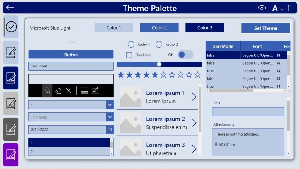
Another option is to use a pre-built-theming template. The Power Apps Branding Template by Sancho Harker is the best solution available for these reasons:
- Quick to setup – choose 3 colors and the theme will automatically create a theme based on
- Fully-customizable – override any control property with a custom value if the default style is not desired
- Applies to new controls – any new control inserted into the app will use the theme colors and properties
- No premium license required – theming information is stored in the msapp itself whereas the Center Of Excellence Theme Editor requires Dataverse

Did You Enjoy This Article? 😺
Subscribe to get new Power Apps articles sent to your inbox each week for FREE
Questions?
If you have any questions about Power Apps Standards: App Settings please leave a message in the comments section below. You can post using your email address and are not required to create an account to join the discussion.

On the template how do you define the buttons fill? Shouldn’t you have a dedicated section for buttons?
Luis,
Please check out this other article I wrote on theming. I’ll update my guide to match its method for theming buttons.
https://www.matthewdevaney.com/create-a-power-apps-custom-theme-colors-fonts-icons-controls/#Full-Custom-Theme-Code-Block-For-App-OnStart
In case anyone is looking to use this style of theming please look at using the same method in formulas as Matthew outlines here: 6 Use-Cases For The Power Apps App Formulas Property (Named Formulas) (matthewdevaney.com). The theming set OnStart will sometimes work but if a value is changed it might not reload, even when run app onstart is done. The Formulas get recalculated each time they are referenced.
Andrew,
I agree it is time to update this article to use Named Formulas instead of the App’s OnStart property.